プレゼンター・アダプティブ
Varicent Incentivesでは、Presenter Adaptiveを使用して、あらゆるデバイスに対して柔軟なレポートを作成できます。
プレゼンターアダプティブレポートにアクセスするには、[レポート] モジュールをクリックし、ドロップダウンメニューで [作成] と [プレゼンターアダプティブ] を選択します。
プレゼンターアダプティブを使用する方法の詳細については、「プレゼンターアダプティブレポートの概要」のコースを受講してください。
Presenter Adaptiveレポートの作成
Incentivesサイドバーの[レポート]モジュールからレポートPresenter Adaptiveを作成できます。
モジュールのをクリックし、を選択します。
空白のレポートを作成するか、テンプレート化されたレポートを作成するかを選択します。
[次へ]をクリックします。
レポートデータモデルに接続するプレゼンターアダプティブレポートを作成するか 、またはレポートデータモデルに接続しないプレゼンターアダプティブレポートを作成するかを選択します。
[レポートを作成]をクリックします。
レポート名を追加します。
注記
レポートは、レポート名を追加した後にのみ保存できます。
レポートにオブジェクトを追加するには、サイドバーの
 アイコンをクリックします。追加するオブジェクトを選択し、レポートキャンバスにドロップします。キャンバスからオブジェクトのサイズを変更できます。
次のオブジェクトを追加できます。
静的テキストと動的値の両方を多くのオブジェクトに追加できます。動的値には、現在のWebユーザー名や、レポートに追加した保存値などの値が含まれます。動的テキストをレポートに追加する方法の詳細については、動的テキストをプレゼンターアダプティブレポートに追加するを参照してください。
次のオブジェクトを追加できます。
テキスト
また、テキストオブジェクトのテキストスタイルと配置を書式設定することもできます。[タイルを非表示]オプションをオンにすると、オブジェクトの背景が透明になります。
画像
[現在のWebユーザーイメージを使用]を選択して、イメージをアップロードするか、現在のWebユーザーのアップロードしたプロフィール画像を使用できます。
テーブル
[データ] タブのデータソースを追加して、テーブルを追加できます。このタブから、データとテーブルの書式を設定し、フィルターとリンクを追加できます。フィルターの詳細については、プレゼンターアダプティブレポートにフィルターを追加するをお読みください。
再形成されたテーブル
再形成されたテーブルを追加して、大規模なデータセットをすばやく集計して表示し、受け取り人のデータ分析と理解を容易にすることができます。再形成されたテーブルの詳細については、プレゼンターアダプティブレポートのテーブルにピボットテーブルを追加するを参照してください。
グラフ
チャートを追加してレポートを強化できます。チャートの詳細については、「プレゼンターアダプティブチャート」をお読みください。
ピック・リスト
[データ] タブのデータソースを追加して、ピックリストを追加できます。このタブから、データをピックリストの書式を設定し、フィルターを追加できます。フィルターの詳細については、プレゼンターアダプティブレポートにフィルターを追加するをお読みください。
複数選択リスト
複数選択リストを追加して複数の値を選択し、レポートのコンテンツを制御できます。レポート全体で条件をフィルタリングして、表示されるレコードを制限したり、レポート上のオブジェクトを非表示にしたりできます。複数選択リストの詳細については、以下を参照してください。 複数選択リストを追加する Presenter Adaptive 報告。
日付ピッカー
単一の日付ピッカーを追加して、プレゼンターアダプティブレポートにフィルターを設定し、表示される記録を制限できます。このオブジェクトの詳細については、単一の日付ピッカーをプレゼンターアダプティブレポートに追加するをお読みください。
日付範囲ピッカー
日付範囲ピッカーを追加すると、ユーザーは開始日と終了日でレポートをフィルタリングできるようになります。日付範囲ピッカーを使用すると、テーブル、グラフ、または選択リストの結果をフィルタリングできます。日付範囲ピッカーの詳細については、日付範囲ピッカーをプレゼンターアダプティブレポートに追加するをお読みください。
コントロールメニュー
選択リスト、単一日付ピッカー、および日付範囲ピッカーをドロップダウンコントロールメニューに直接追加すると、レポートレイアウトをよりクリーンに整理できます。コントロールメニューの詳細については、プレゼンターアダプティブレポートにコントロールメニューオブジェクトを追加するをお読みください。
行入力フォーム
行入力フォームを追加して、テーブルに新しいデータ行を送信できます。行入力フォームの詳細については、プレゼンター・アダプティブ・レポートへの行入力フォームの追加をお読みください。
ビデオ
ビデオを追加したり、レポートに表示する方法を設定したりできます。プレゼンターアダプティブレポートにビデオを追加する方法の詳細については、ビデオをプレゼンターアダプティブレポートに追加するをお読みください。
受取人
受取人オブジェクトをプレゼンターアダプティブレポートに追加すると、受取人情報を表示するのに便利です。詳細については、プレゼンターアダプティブレポートに受取人オブジェクトを追加するをお読みください。
メトリック
メトリックオブジェクトを追加すると、重要なサマリーメトリックにアクセスできるようになります。詳細については、プレゼンターアダプティブレポートにメトリックオブジェクトを追加するをお読みください。
グループ
グループの追加は、オブジェクトを1つのタイルに整理する効果的な方法です。グループを追加するには、以下をお読みください。 プレゼンターアダプティブレポートにグループジェクトを追加する
リスト
レポートのリストオブジェクトを使用して、視覚的な効果を追加できます。詳細については、プレゼンターアダプティブレポートにリストオジェクトを追加するをお読みください。
区切り
区切りは、視覚的な分離によりレポートを整理できる優れた方法です。詳細については、プレゼンターアダプティブレポートに区切り線(Divider)オジェクトを追加するをお読みください。
吹き出し
吹き出しを追加して、レポート内で強調することができます。条件付き表示を使用して吹き出しが表示されるタイミングを制御します。吹き出しの詳細については、プレゼンターアダプティブレポートに吹き出しを追加するをお読みください。
オブジェクトにはデフォルトの名前が付けられます。オブジェクト名はカスタマイズすることもできます。説明を追加し、書式設定することができます。
注記
オブジェクト名は、特定のパラメータまたは保存された値によって使用されているオブジェクトを特定するのに役立ちます。
プレースホルダー・データではなく実際のデータを使用してレポートを作成して表示するには、次の手順を実行します。
 アイコンをクリックし、[ソースデータ] のトグルをオンにします。
データをレポートに追加するWebユーザーを選択し、[適用]をクリックします。
その他のカスタマイズオプションについては、
アイコンをクリックします。ここから、次のことができます。背景画像のアップロード
PDFダウンロードの基本設定を設定し、PDF設定を指定する
単一保存を許可
汎用スタイル基本設定の設定
モダンスタイルとクラシックスタイルの切り替え
注記
新しいレポートはすべて、モダン レポートスタイルで作成されます。
チャートパレットの管理
レポートのセキュリティを管理する
ワークフローをレポートに割り当てる
レポート データ モデルに接続する
[保存] をクリックしてレポートを保存します。
ドラフト を選択して進行中のレポートを保存しますが、共有する準備はできていません。これにより、すべてのデータソースを構成する前にレポートを保存し、後で戻ってレポートを完了できます。
公開済み を選択して、完全に構成されたレポートを保存します。これらのレポートに戻って編集することはできますが、ドラフトステータスに戻すことはできません。レポートを公開済みとして初めて保存しても、セールスポータルには共有されません。レポートを共有するには、「プレゼンターアダプティブレポートを共有・発行する」をお読みください。
プレビューを表示するには、[プレビュー] をクリックします。
プレゼンター・アダプティブ・レポートには3つのビューがあります。
デスクトップ
タブレット
モバイル
各ビューは異なる形式にすることができます。したがって、デスクトップ、タブレット、モバイルのレイアウトは別々に設定してください。
レポートの発行と共有を行う方法ついては、「プレゼンターアダプティブレポートを共有・発行する」をお読みください。
注意
大量のデータを含むレポートを作成する場合、エラーが発生する可能性があります。ピックリストの選択は10,000行に制限されています。大きなテーブルの発行も10,000行に制限されており、タイムアウトエラーが発生する可能性があります。
プレゼンターアダプティブレポートのデザインの詳細は、Applying design principles to Varicent reports course. を参照してください。
オブジェクトに色付きの背景を追加する
テキスト、画像、表、グラフ、ビデオ、行入力フォーム、受取人、メトリック、グループ、リストの各オブジェクトのタイルに色付きの背景を追加できます。背景には単色または色のグラデーションを使用できます。
から レポート モジュールをクリックして
オブジェクトを追加 ボタンをクリックしてメニューを開きます。次のものに色付きの背景を追加できます プレゼンターアダプティブ オブジェクト:
文章
画像
テーブル
チャート
ビデオ
行入力フォーム
受取人
メトリック
グループ
リスト
では スタイル タブのタイルの背景の下で、 背景を表示 トグル。
[en] Select one of the following options:
[en] Solid
[en] Click
 Solid and select a color.
[en] Gradient
[en] Click
 Gradient, then select a starting and ending color, and the angle of the gradient.
クリック 保存。
オブジェクトにヘッダーを追加する
画像、ビデオ、グラフ、表、行入力フォーム、グループ、リスト オブジェクトのタイルにヘッダーを追加できます。
[en] From the Reports module, open a Presenter AdaptivePresenter Adaptive report by clicking on it, or create a new Presenter AdaptivePresenter Adaptive report.
[en] Click the + Add object icon and select an Image, Video, Chart, Table, Row input form, Group, or List object to add to your report.
[en] Drag and drop the object to your desired position on the canvas.
スタイルタブのタイルヘッダーで、 ヘッダーを表示 トグル。
タイトルと説明を追加します。タイトルと説明のフォントの色を変更したり、太字、斜体、下線などのスタイルを設定できます。
[en] [Optional] Click on the Insert value
 icon to select a value as the title and the description.
クリック 保存。
[en] Adding a background color or image to a Presenter Adaptive report
[en] Enhance the look and feel of your Presenter Adaptive report by adding a background color or image.
[en] From the Reports module, click the Reports tab.
[en] Click a Presenter Adaptive report to open it.
[en] Click Report Options
 .
.[en] Under Background, select one of the following options:
[en] Color
[en] Adds a colored background to your report.
[en] Under Color, select a color from the palette, or click HEX or RGB to add a specific color.
[en] Image
[en] Adds an image background to your report.
[en] Under File, drag and drop a file, or click to browse through your files. Once a file has been selected, click Open. The image file size must be less than 2 MB.
[en] [Optional] Under General style, disable the Display all tiles toggle to hide object tile backgrounds. This means objects such as charts or tables appear directly on the report without a different colored tile background.
[en] [Optional] Under General style, enable the Set font color to white toggle. This option is useful if you've chosen a dark background color with tiles hidden or a dark background color for your tiles.
[en] Click Save.
[en] Exploring Sales Portal options in Presenter AdaptivePresenter Adaptive reports
[en] Within Presenter AdaptivePresenter Adaptive reports, admins can find different Sales Portal options where they can allow PDF download, allow single save for table and row input form objects, and manually apply object selections for pick lists and date pickers.
[en] To access the Sales Portal options in Presenter AdaptivePresenter Adaptive:
[en] From the Reports module, open a Presenter AdaptivePresenter Adaptive report by clicking on it, or create a new Presenter AdaptivePresenter Adaptive report.
[en] Click Report Options
.[en] Within Sales Portal options, you can do the following:
[en] Allow PDF download
[en] Enables you to download a PDF of your report in Sales Portal.
[en] To find out more about PDF download in Sales Portal, see: Presenter Adaptiveレポートの共有と発行.
[en] Allow single save
[en] Enables editable table and row input form objects to save all at once.
[en] To learn more about the single save option, read: 編集可能なテーブルと行入力フォームに単一の保存オプションを作成する.
[en] Manually apply object selections
[en] Creates a customizable button that delays the report refresh until clicked. This button applicable to pick lists, date pickers, and control menu objects.
[en] To read more about manually applying object selections, see: [en] Creating a button to manually apply object selections.
[en] Opening reports in a new tab in Sales Portal
[en] The text, image, chart, control menu, row input form, metric, list, and callout objects in Presenter Adaptive reports can be set up to open in a new tab in Sales Portal. This can be useful to provide better visibility, especially for complex or large reports. You may also want to compare the report with data from another tab.
[en] From the Reports module, click the Reports tab.
[en] Create a new Presenter Adaptive report, or click an existing report. Read Creating a Presenter Adaptive report to learn more.
[en] Click the Add object
 icon.
icon.[en] Select a report object noted above.
[en] From the Data tab, click + Add link.
[en] Under Options, turn on the Open link in new tab toggle.
[en] Under Destination, select one of the following options:
[en] Web/Web address
[en] Under Destination, click Web. Under Web address, click
Insert value and select the value. Click Add.[en] Email
[en] Under Destination, click Email. Follow the steps outlined here: プレゼンターアダプティブオブジェクトでのmailtoリンクの作成.
注記
[en] This option might not be visible to all objects mentioned.
[en] Report
[en] Under Destination, click Report. Under Report type, select Presenter Adaptive. Under Report name, select the report you want to add. If a report has more than one assigned web tab, select a web tab and add any necessary parameters, and click Add.
Presenter Adaptiveレポートの共有と発行
Presenter Adaptiveレポートを作成して保存すると、ポータル・アクセスを通じてレポートを発行、および共有できます。
[en] From the Reports module, open a Presenter AdaptivePresenter Adaptive report by clicking on it.
[en] Click Report Options
.[en] Under Sales Portal options, turn on the Allow PDF download toggle to enable Sales Portal payees to download PDF versions of the report.
[en] Click Web user PDF settings to choose the PDF format.
[en] [Optional] Turn on the toggle to Include page numbers on the PDF.
[en] [Optional] Turn on the toggle to Show the total page number.
[en] Set the PDF's orientation as portrait or landscape.
[en] Set the page scaling of the PDF. Page scaling lets you shrink or enlarge the PDF to a specific amount when you print or view the report.
[en] Set the table width in pixels.
[en] [Optional] Add in footer text.
[en] Click Save.
[en] To find out more about viewing a Presenter AdaptivePresenter Adaptive report in Sales Portal, read: セールスポータルでのレポートデータモデルを使用したレポートの使用.
編集可能なテーブルと行入力フォームに単一の保存オプションを作成する
レポートの複数のコンポーネントを編集または更新するための単一の保存ボタンを作成します。
[en] From the Reports module, click the Reports tab.
[en] Click a Presenter AdaptivePresenter Adaptive report to open it.
[en] On the side panel, click the Add object
icon.[en] Select Table or Row input form, then drag and drop the object to your desired position on the canvas.
[en] For more information on adding tables to a report, see: プレゼンター・アダプティブ・レポートへのフィルターの追加。.
[en] To learn more about adding row input forms to a report, read: プレゼンター・アダプティブ・レポートへの行入力フォームの追加.
[en] Create a unique name for the table or row input form to easily identify the object upon export.
レポートオプションをクリック
。下 Webユーザーオプション、有効にする 単一保存を許可する トグル。
単一保存設定を編集するには、 単一保存設定。
[データ] タブでは、単一の保存ボタンのテキストを編集し、どのテーブルや行入力フォームでボタンが使用されているかを確認できます。[スタイル] タブでは、ボタンとテキストの色を設定したり、アイコンを表示するように選択したり、位置を選択したりできます。
[en] Enable the Redirect on submission toggle to configure the save button to link to a website, email, or report.
[en] For more information on the Redirect on submission feature, read: [en] Configuring the save button on your report.
[en] In the Style tab, you can do the following:
[en] Select the button color
[en] Select the text color
[en] Turn on the toggle to Display icon
[en] Select an icon for the button
[en] Select the position to align horizontal left or align horizontal right
[en] Click Reset to default to restore the single save button to its original settings.
[en] Click Save.
重要
[en] Allow column edit settings are not available when single save is enabled.
[en] Configuring the save button on your report
[en] The save button on tables, row input forms, and on the single save button for your report can be configured to link to other content, such as a website, email, or report. For example, you can configure your save button to link to a thank you message screen, or a screen with additional instructions on what the user needs to do offline after saving. You can also use this feature to link to another website where a user must perform additional actions.
[en] Enabling the Redirect on submission toggle for tables
[en] From the Reports module, select the Reports tab.
[en] Click a Presenter AdaptivePresenter Adaptive report to open it.
[en] On the side panel, click the Add object
icon.[en] Select Table, then drag and drop the object to your desired position on the canvas.
[en] In the configuration pane, under the Data tab and Web user options, enable the Allow column edit toggle.
[en] For more information on the Allow column edit feature, read: プレゼンター・アダプティブでのコンポーザーテーブルの編集.
[en] Click Column edit settings.
[en] Enable the toggle on the column to select the editable columns.
[en] Under Rules, click + Add rule.
[en] Select a rule type.
[en] If you select input as the rule type, select the column for the input rule, and add the error message.
[en] If you select validation formula as the rule type, set the formula, and add the error message.
[en] Click Done.
[en] Under Button, enter the text for the button label. You can also click
Insert value to add a text value.[en] Enable the Redirect on submission toggle.
[en] Select one of the following destination types:
[en] Web
[en] Under Destination, click Web. Under Web address, click
Insert value and select the value.[en] Email
[en] Under Destination, click Email. For more information, see: プレゼンターアダプティブオブジェクトでのmailtoリンクの作成.
[en] Report
[en] Under Destination, click Report. Under Report type, select Presenter Adaptive. Under Report name, select the report you want to add. If a report has more than one assigned web tab, select a web tab and add any necessary parameters.
[en] Click Done.
[en] Click Save.
[en] Enabling the Redirect on submission toggle for row input forms
[en] From the Reports module, select the Reports tab.
[en] Click a Presenter AdaptivePresenter Adaptive report to open it.
[en] On the side panel, click the Add object
icon.[en] Select Row input form, then drag and drop the object to your desired position on the canvas.
[en] In the configuration pane, under the Data tab and Button, enable the Redirect on submission toggle.
[en] Select one of the following destination types:
[en] Web
[en] Under Destination, click Web. Under Web address, click
Insert value and select the value.[en] Email
[en] Under Destination, click Email. For more information, see: プレゼンターアダプティブオブジェクトでのmailtoリンクの作成.
[en] Report
[en] Under Destination, click Report. Under Report type, select Presenter Adaptive. Under Report name, select the report you want to add. If a report has more than one assigned web tab, select a web tab and add any necessary parameters.
[en] Click Done.
[en] Click Save.
[en] Enabling the Redirect on submission toggle for the single save button
[en] From the Reports module, click the Reports tab.
[en] Click a Presenter AdaptivePresenter Adaptive report to open it.
[en] On the side panel, click the Add object
icon.[en] Select Table or Row input form, then drag and drop the object to your desired position on the canvas.
[en] For more information on adding tables to a report, see: プレゼンター・アダプティブ・レポートへのフィルターの追加。.
[en] To learn more about adding row input forms to a report, read: プレゼンター・アダプティブ・レポートへの行入力フォームの追加.
[en] Create a unique name for the table or row input form to easily identify the object upon export.
[en] Click Report Options
.[en] Under Sales Portal options, enable the Allow single save toggle.
[en] Click Single save settings to edit the single save settings.
[en] In the Data tab, you can edit the text of the single save button. In the Used by section, you can see which tables and row input forms are using the button.
[en] Enable the Redirect on submission toggle to configure the save button to link to a website, email, or report.
[en] Select one of the following destination types:
[en] Web
[en] Under Destination, click Web. Under Web address, click
Insert value and select the value.[en] Email
[en] Under Destination, click Email. For more information, see: プレゼンターアダプティブオブジェクトでのmailtoリンクの作成.
[en] Report
[en] Under Destination, click Report. Under Report type, select Presenter Adaptive. Under Report name, select the report you want to add. If a report has more than one assigned web tab, select a web tab and add any necessary parameters.
[en] Click Done.
[en] Click Save.
[en] Creating a button to manually apply object selections
[en] Create a customizable button that delays the report refresh until clicked. This lets you choose everything you need, such as items from pick lists, date pickers, and the control menu, and update it all at once with a single click. This feature is applicable to pick lists, multi-select pick lists, date pickers, date range pickers, and control menu objects.
[en] From the Reports module, open a Presenter AdaptivePresenter Adaptive report by clicking on it.
[en] Click the Add object icon
.[en] Select Pick list, Multi-select pick list, Date picker, Date range picker, or Control menu then drag and drop the object to your desired position on the canvas.
[en] Click Report Options
.[en] Under Sales Portal options, turn on the Manually apply object selections toggle to postpone refreshing the report until the button is clicked.
[en] Click Apply selections settings to customize the button.
[en] [Optional] In the Data tab, customize the button text and in the Used by section, view the objects that the button will impact.
[en] [Optional] In the Style tab, select your desired button and text color.
[en] Click Save.
[en] Applying report styles to Presenter AdaptivePresenter Adaptive reports
[en] Apply a classic, modern, or custom report style to display tiles. Set the spacing and customize the margins and padding on your report.
[en] From the Reports module, select the Reports tab.
[en] Click a Presenter AdaptivePresenter Adaptive report to open it.
[en] Click Report Options
.[en] Under General style, select one of the following report styles:
注記
[en] You can click through each of the options to see a preview of the report style.
[en] Classic
[en] No changes will be made to the look of your report. Applies a classic Presenter AdaptivePresenter Adaptive report styling.
[en] Modern
[en] Applies enhanced styling for greater visual appeal.
[en] Custom
[en] Click Edit custom report style. Under the Spacing tab, select Compact, Default, or Spacious as the spacing between and around the report objects, then click Save. This applies your custom report style.
ヒント
[en] If you haven't set one up yet, read: [en] Creating a custom report style.
[en] [Optional] Enable the toggle to Display all tiles.
[en] [Optional] Turn off the Set font color to white toggle. This option would work best for tiles that have a white or light color.
[en] Click Save.
[en] Report style in Presenter AdaptivePresenter Adaptive
[en] You can apply a custom report style to Presenter AdaptivePresenter Adaptive reports. From here, you can adjust the spacing between and around objects.
[en] From the Reports module, select the Report style tab.
[en] Under Spacing, select compact, default, or spacious.
[en] Click Save.
モダンなレポートスタイル
プレゼンターアダプティブレポートは、次の2種類のレポートスタイルで作成できます。
モダン:最新のレポートエクスペリエンスとマッチします
クラシック:クラシックなレポートスタイルです
注記
新しいプレゼンターアダプティブレポートはすべて、モダン レポートスタイルで作成されます。
モダン スタイルでは、次のようにスタイルに変えられます。
レポート内のすべてのタイルの角に丸みをつける
ダークカラーの丸みのあるグリッドスタイル
グラフのヘッダー、罫線、グラフのパディングスタイルの更新
表のヘッダー、罫線、表のパディングスタイルの更新
選択リストのタイトル、罫線、パディングスタイルの更新
バブルグラフおよびシンプルゲージグラフにグラデーションの背景を追加する
レポートスタイルをクラシックに戻すには、次の手順に従います。
レポートで、[レポートオプション]
 をクリックします。
[一般スタイル]で、クラシックをクリックします。
[en] Creating a custom report style
[en] A custom report style allows you to apply various styling customizations to your Presenter AdaptivePresenter Adaptive report.
[en] From the Reports module, select the Reports tab.
[en] Click a Presenter AdaptivePresenter Adaptive report to open it.
[en] Click Report Options
.[en] Under General style, select Custom.
[en] Click Edit custom report style.
[en] Under Spacing, select compact, default, or spacious.
[en] Click Save.
[en] Global Parameters
[en] Global Parameters enable you to retain pick list, multi-select pick list, date picker, and date range picker selections as you navigate to other web tabs and reports in Sales Portal.
[en] With Global Parameters, you can keep track of selections such as currency, time period, or specific payees as you move between reports. For example, you're viewing Emily Snow’s Compensation Summary and now you want to dig a little deeper and view her transaction details. When you open the Transaction Details report, Emily is still your selected payee.
[en] Global Parameters can only be mapped to pick lists or date pickers that have the same data and value type. They cannot be used within the rules and conditions that determine how data is displayed in the report. For example, to filter records, you can only connect directly to a pick list or date picker, and continue to use these within the rest of the logic of the report.
[en] Workflows are exempt from Global Parameters. Instead, they will continue to use the parameter values specified within the report. This exemption ensures that as reports move through approval steps, they maintain a consistent display for the same set of parameter values.
[en] To learn more about how to create and apply Global Parameters, see: [en] Creating and applying Global Parameters to Presenter AdaptivePresenter Adaptive reports.
[en] Creating and applying Global Parameters to Presenter AdaptivePresenter Adaptive reports
[en] A Global Parameter can be applied to a pick list, multi-select pick list, date picker, and date range picker in Presenter AdaptivePresenter Adaptive. For example, you're viewing Emily Snow’s Compensation Summary and now you want to dig a little deeper and view her transaction details. When you open the Transaction Details report, Emily is still your selected payee. In this scenario, the Global Parameter was applied to Emily Snow who was the payee selected in the pick list.
[en] Global Parameters can only be mapped to pick lists or date pickers that have the same data and value type. A single pick list and date picker can map to single value Global Parameters, while a multi-select pick list and date range picker can map to a list of Global Parameters.
[en] Here's how you can create Global Parameters in Presenter AdaptivePresenter Adaptive:
[en] Creating Global Parameters in the Reports tab
[en] From the Reports module, click the Global Parameters tab.
[en] Click + Add global parameter.
[en] Enter a unique name.
[en] Select the data type.
[en] Select the value type.
[en] Click + Add.
[en] Creating Global Parameters in a Presenter AdaptivePresenter Adaptive report
[en] From the Reports module, click the Reports tab.
[en] Click a Presenter Adaptive report to open it.
[en] Click the Add object
icon.[en] Select pick list, date picker, multi-select pick list, or date range picker, then drag and drop the object to your desired position on the canvas.
[en] In the configuration pane, under the Data tab, click
Connect value to global parameter.[en] Click + Add global parameter.
[en] Enter a unique name.
[en] Click + Add.
[en] Click the Remove item
 icon to remove the global parameter from the object.
[en] Click Save.
[en] Applying Global Parameters to Presenter AdaptivePresenter Adaptive reports
[en] From the Reports module, click the Reports tab.
[en] Click a Presenter Adaptive report to open it.
[en] Click the Add object
icon.[en] Select pick list, date picker, multi-select pick list, or date range picker, then drag and drop the object to your desired position on the canvas.
[en] In the configuration pane, under the Data tab, click
Connect value to global parameter.[en] Select a Global Parameter from the list or enter a Global Parameter in the Search field.
[en] Renaming Global Parameters
[en] Created Global Parameters can be renamed. Renamed Global Parameters must have a unique name.
[en] From the Reports module, click the Global Parameters tab.
[en] Click the More options
 icon on the Global Parameter you want to rename.
[en] Click the Rename
 icon.
icon.[en] Enter a unique name.
[en] Click Rename
.
[en] Deleting Global Parameters
[en] Created Global Parameters can be deleted.
[en] From the Reports module, click the Global Parameters tab.
[en] Click the More options
icon on the Global Parameter you want to delete.[en] Click the Delete
 icon.
icon.[en] Click Delete
.
[en] Using a template in a Presenter Adaptive report
[en] Report templates are pre-designed structures that help you quickly create reports with a consistent format and layout. These templates provide a foundation, reducing the time and effort required to build reports from scratch. Each template is designed with specific reporting needs in mind, making it easier to create insightful, well-organized reports tailored to various use cases.
[en] Report templates in Presenter Adaptive enable you to create visually appealing and insightful reports with ease. Start with a template that fits your needs. It will be populated with sample data. Select an object and customize it with your own source data to make it your own.
[en] To learn more about how to create and customize reports, see Creating a Presenter Adaptive Report.
[en] Available report templates:
[en] This table provides an overview of the report templates available in Presenter Adaptive and describes their purpose and usage. You can preview the templates before creating your report.
[en] Template name | [en] Description |
|---|---|
[en] Blank Report | [en] A blank slate that you can customize to meet your unique reporting needs. Choose this option if you want to create a report from scratch without any pre-existing report objects. |
[en] Compensation Summary | [en] A comprehensive breakdown of a payee’s compensation for a specific period. Designed with the payee in mind, it provides insights into earnings, performance metrics, and transaction details. Its easy exportability as a PDF ensures convenient sharing and reference. |
[en] Manager Dashboard | [en] A high-level overview of both team performance and personal contributions toward key metrics. Ideal for managers and team leaders, it serves as a central hub and landing page to monitor overall performance and gain quick insights. |
[en] Manager Summary | [en] An in-depth overview of metrics at the team level. A valuable resource for managers and team leaders seeking to monitor progress toward targets and pinpoint key areas for improvement. Covers performance, payout, and transactions, and can be easily exported as a PDF for convenient sharing. |
[en] Payee Dashboard | [en] A high-level overview of the primary metrics influencing a payee's overall compensation. Serving as a landing page for payees, it allows for easy monitoring of attainment and offers quick insight into performance. |
[en] Payout Summary | [en] An overview of an individual’s payouts for a specified period. Tailored for digital viewing, this report breaks down earnings, ensuring clarity and comprehensive insights into compensation details. |
[en] Performance Summary | [en] A concise report of an individual’s performance metrics. Perfect for digital use, this report highlights key achievements and areas needing improvement, offering a clear snapshot of individual performance. |
[en] President's Club Rewards | [en] Designed to inspire and motivate, this dashboard highlights exceptional dedication and outstanding results, encouraging all to strive for excellence. Use this template to track status, rewards, and progress. |
[en] Team Payout | [en] A management report providing managers with an overview of team payouts over a designated period. Ideal for digital viewing, this report details collective earnings, progress towards targets, and related performance metrics, providing a clear understanding of overall team compensation. |
[en] Team Performance | [en] A digital-first, high-level summary of team performance metrics. Designed for team leaders and managers, it offers a quick overview of how the team is performing against key targets, pinpointing strengths and areas for development. |
[en] Team Transactions | [en] A comprehensive breakdown of team transactions. Perfect for digital analysis, this summary helps managers and team leaders track, review, and analyze transaction data to identify trends and areas for improvement. |
[en] Transaction Details | [en] A versatile detail-level report offering a closer look at a specific area of information. It can be used to focus on aspects of higher-level reports or areas requiring deeper analysis. Customize with your data to create a Line of Business Details, Customer Details, and more. |
[en] Transaction Summary | [en] A detailed report of transactions within a specific timeframe. Optimized for digital platforms, it allows for easy tracking and analysis of financial activities, helping users understand transaction flows and trends. |
[en] These report templates provide a starting point, but you can modify the content to suit your specific needs. Adjust data sources, layout, and visual elements to ensure your reports align with your unique business requirements. Presenter Adaptive makes it easy to tailor each report template to reflect the insights that matter most to your organization.
[en] By leveraging report templates, you can streamline your report creation process, ensuring your reports are well-designed and completed efficiently.
プレゼンターアダプティブレポートのデザインの詳細は、Applying design principles to Varicent reports course. を参照してください。
Presenter Adaptive レポートへのテキストオブジェクトの追加
テキストオブジェクトを使用して、使用可能なさまざまなフォントから選択し、色付きの背景を追加し、テキストスタイルを書式設定し、テキストオブジェクトの配置を変更します。
[en] From the Reports module, click the Reports tab.
[en] Click a Presenter Adaptive report to open it.
[en] Click
 Add object.
[テキスト] を選択し、オブジェクトをキャンバス上の任意の位置にドラッグアンドドロップします。
[データ] タブで、必要なテキストを入力し、フォントタイプ、サイズ、色を変更してテキストの書式を設定します。
[en] To apply a font to the text, highlight the text, then click the font drop-down menu, and select your desired font from the list.
注記
[en] You cannot use CSS to customize fonts on reports or Sales Portal.
[スタイル] タブをクリックして背景を表示し、縦方向の配置を設定します。
[表示] タブで、オブジェクトを表示する条件を設定します。
mailtoリンクを作成するには、プレゼンターアダプティブオブジェクトでのmailtoリンクの作成をクリックします。
テキストオブジェクトの名前を追加します。
[保存]をクリックします。
テキストオブジェクトを使用したプレゼンターアダプティブでの区分線の作成
プレゼンターアダプティブレポートに区分線を追加して、関連情報を視覚的に分離します。たとえば、レポートを分割して上部セクションに割り当てを表示し、下部セクションに顧客情報を表示したりできます。区分線を使用すると、さまざまなレポートセクションを視覚的に見やすくすることができます。
[追加]をクリックしてオブジェクトを追加します。
テキストオブジェクトをキャンバスにドラッグアンドドロップします。
ヒント
テキストボックスのサイズを変更して、希望する長さと高さに拡張できます。スクロールバーを使用しないようにするには、水平線を含むテキストオブジェクトは、タイルをオフにするか、タイル2つの高さにする必要があります。
[区分線を挿入]
 アイコンをクリックします。
[保存]をクリックします。
オプション:[スタイル]タブをクリックし、[タイルを表示]トグルを無効にしてタイルを非表示にします。
[プレビュー]をクリックして、レポートのビューアにどのように表示されるかを確認します。
レポートまたはWebアドレスへのテキストアイテムのリンク
テキスト・アイテムからプレゼンター・アダプティブ・レポート、プレゼンター・ストラクチャード・レポート、またはWebアドレスへのリンクを作成します。
[en] From the Reports module, click the Reports tab.
[en] Click a Presenter Adaptive report to open it.
[en] Click the
button to open the menu. Drag and drop a object onto the canvas.キャンバス上のテキストボックスの角をドラッグして、サイズを変更します。
テキストを入力し、リンクを作成するテキストをハイライトします。
[リンクの追加]
 ボタンをクリックし、でまたはを選択します。リンクを新しいタブで開くオプションがあります。これを行うには、[オプション]の[新しいタブでリンクを開く]をオンにします。
Webアドレスをリンクするには、WebアドレスがセキュアURL(https)か、非セキュアURL(http)かを選択します。
URLに変数を挿入する場合は、値を挿入するURLにカーソルを置き、メニューから値を選択します。テキストボックスにURLを入力します。をクリックします。
レポートをリンクするには、またはのいずれかを選択し、追加するレポートを選択します。
レポートに複数のWebタブが割り当てられている場合は、Webタブを選択し、必要なパラメーターを追加します。をクリックします。
メールにリンクするには、以下をお読みください。 プレゼンターアダプティブオブジェクトでのmailtoリンクの作成。
をクリックします。
[en] Click Save.
画像をプレゼンターアダプティブレポートに追加する
レポートの外観と仕様を高めるために画像を追加します。
[オブジェクトを追加]
ボタンをクリックしてメニューを開きます。画像のオブジェクトをキャンバスにドラッグアンドドロップします。[en] Click a Presenter Adaptive report to open it.
[オブジェクトを追加]
ボタンをクリックしてメニューを開きます。画像のオブジェクトをキャンバスにドラッグアンドドロップします。[en] Select Image, then drag and drop the object to your desired position on the canvas.
[スタイル]タブで、[ヘッダーを表示]を選択できます。ヘッダーを表示するには、トグルをオンにします。
条件付き画像をアップロードするには、[設定された条件に基づいて画像をアップロードする]をクリックします。
重要
[en] The image file size must be less than 2 MB.
[en] Upload image
[en] This option uploads a static image.
[en] Under File, drop a file or click the button to upload an image. You can also add alt text.
[en] Upload images based on set conditions
[en] Set the conditions that should be met for the result image to appear.
[en] Upload a default image that will be displayed when no conditions are met by dropping a file or clicking the button to upload an image. Click
 Add condition. Enter the Condition name. Under Result, upload an image that will be displayed when the condition is met. Under Condition, set the condition → Click Add.
[en] Use web user image
[en] This option will display the web user's image based on defined values.
[en] Select the web user ID and the desired image alignment.
リンクを追加するには、[リンクを追加]をクリックします。
注記
[en] You can click through each of the options to see a preview of how the image will scale.
[en] Retain original size
[en] Adjust to use entire space
[en] Scale to space
新しいタブでリンクを開くには、トグルをオンに切り替えます。
[en] You can choose to enable the toggle to open the link in a new tab.
[en] Choose one of the following Destination types:
[en] Web address
[en] This option allows you to link the image to a web address. The web address uses the selected value to create the URL.
[en] Under Web address, type the web address, then select the value, and click Add.
[en] Report
[en] This option allows you to link an image to a specific report.
[en] Under Report type, select Presenter Adaptive, and select the report, then click Add.
宛先タイプとして、Webアドレスまたはレポートを選択します。
Webアドレスの場合は、URLを追加して値を挿入します。
[完了]をクリックします。
[保存]をクリックします。
プレゼンター・アダプティブ・レポートへのフィルターの追加。
データを表示する別の方法のテーブルを、レポートに追加します。
- ボタンをクリックして、メニューを開きます。オブジェクトをキャンバスにドラッグ・アンド・ドロップします。
[en] Click a Presenter AdaptivePresenter Adaptive report to open it.
[en] On the side panel, click the Add object
icon.[en] Select Table, then drag and drop the object to your desired position on the canvas.
エクスポート時にオブジェクトを簡単に識別できるように、テーブルに関連性のある一意の名前を作成します。
タブで、グラフのデータ・ソースを選択します。テーブルに表示する列を選択します。
ソースを選択します。
ソースタイプとしてデータソースが選択されている場合は、テーブルに表示する列を選択します。
ワークフローがソースタイプとして選択されている場合は、ソースとしてワークフローステータスとワークフロー履歴から選択します。
クリック その他のオプション
ボタンをクリックすると、列を非表示にしたり、リンクを追加したり、ピン留めしたり、設定を開いたり、列を新しいグループに追加したり、名前を変更したり、列を削除したりできます。[en] For more information on adding links to a table, see: プレゼンター アダプティブ レポートのテーブルにリンクを追加する.
[en] For more information on creating custom tooltips for table columns and column groups, read: [en] Creating custom tooltips for table columns and column groups.
列をドラッグ アンド ドロップして、表示する並べ替え順序を設定します。
[en] [Optional] Click + Add calculation.
[en] Create a name and formula.
[en] Under Value format, set the value format, display units, decimal places, and set whether you want to use a thousands separator.
[en] Click Add.
[en] Select the Row groups for the table.
[en] Under Values, select the value column.
[en] [Optional] Under Default sort, click Configure sort order. Select the column and the order. To add another column to sort, click + Add sort. Click Done.
[en] [Optional] Turn off the Display sort order toggle to hide the sort order.
ターブルデータをExcelにダウンロードするには、[Webユーザーオプション]で、[Microsoft Excelにエクスポート]のトグルをオンにします。
[en] Read [en] Exporting report table data to .csv or Microsoft Excel to find out more.
[en] [Optional] Assign an inquiry workflow to enable mapping, by turning on the Copy row to inquiry toggle.
[en] Click Inquiry form mappings and select the source columns that map to the inquiry form fields.
[en] Click Done.
[en] [Optional] Enable the Allow table customization toggle to pin, hide, move, and reorder columns.
[en] Read プレゼンター アダプティブ レポートのテーブルに列を固定する and セールスポータルでテーブル列を表示または非表示にする to learn more.
[en] [Optional] Enable the Allow column edit toggle to update table data.
[en] Read プレゼンター・アダプティブでのコンポーザーテーブルの編集 and [en] Configuring the save button on your report to learn more.
タブで、テーブルの外観を変更できます。また、列の幅を調整することもできます。
[en] Add a title and description.
[en] Add formatting to the header.
[en] Click
Insert value to add a header value.
[en] [Optional] Under the Style tab and Tile buttons, select a default, light, or dark button style.
[en] [Optional] Under Tile background, disable the Display background toggle to hide the tile background.
[en] [Optional] Under Table, enable the toggle to Show pagination and the Compact view of the table. Select the font size, formatting, and alignment. Turn off the Display table background toggle to hide the table background.
[en] [Optional] Under Border, enable the Custom borders toggle. Select the table section and the border style.
[en] [Optional] Under Header, enable the toggle to Display header and Wrap text.
[en] Select the font size, format, and alignment.
[en] Turn off the Display background toggle to hide the background.
[en] To set the column width, click Column width and select one of the following options:
[en] Auto-fit data (exclude header) - Auto-fits the content to the table body.
[en] Auto-fit data (include header) - Auto-fits the content to the header.
[en] Turn on the Compact width toggle if you want to set a smaller minimum width than the standard setting.
[en] Fill table width - Columns are automatically resized to fit contents within the table width.
[en] Enable the Specify column width ratio toggle to modify the ratio to expand or shrink the column width.
[en] Specify the width ratio for each of the columns.
[en] Enable the Specify column width ratio toggle to modify the ratio to expand or shrink the column width.
[en] Click Done.
[en] [Optional] Under Row, enable the Display row background toggle, and select the row background color. Enable the Display alternating rows toggle, and select the background color and font color.
[en] [Optional] Under Column, enable the Wrap text toggle.
[en] Select the font size, format, and alignment.
[en] Enable the Display background toggle to show the background, and select the background color.
[en] To set the column width, click Column width and select one of the following options (these options are the same as the column width options for the Header):
[en] Auto-fit data (exclude header) - Auto-fits the content to the table body.
[en] Auto-fit data (include header) - Auto-fits the content to the header.
[en] Turn on the Compact width toggle if you want to set a smaller minimum width than the standard setting.
[en] Fill table width - Columns are automatically resized to fit contents within the table width.
[en] Enable the Specify column width ratio toggle to modify the ratio to expand or shrink the column width.
[en] Specify the width ratio for each of the columns.
[en] Click Done.
[en] [Optional] Under Row group, enable the Expand all rows by default toggle. Enable the Hide count and Display value toggle. Select the font size, format, and background color.
[en] [Optional] Under Conditional format, click + Add condition. Select to apply the condition to the header or values. Select the columns and set the formula. Select the font size, format, alignment, background color, and value format. Click Add.
[en] [Optional] Under Values, when the Display row total toggle is enabled, add a title and select the style. You can add a value as the title by clicking the Insert value
icon.タブから、テーブルのデータにフィルターを適用できます。
基本フィルターを使用すると、列の値に基づいてデータをフィルターできます。高度なフィルターを使用すると、複雑なルールに基づいてデータをフィルターできます。フィルターの詳細については、フィルターのPresenter Adaptiveレポートへの追加を参照してください。
[表示] タブで、表示するデータがない場合のオブジェクトの表示方法を選択できます。[データのないオブジェクトを表示] のオプションでは、データのないオブジェクトは空として表示されます。[データのないオブジェクトを非表示] のオプションでは、オブジェクトが非表示になり、レポート内の他のオブジェクトがスペースを埋めるために上に移動します。[データなしのプレースホルダーを表示] のオプションは、ユーザーに「表示するデータがありません」のメッセージを表示します。
[en] For more information, see: プレゼンターアダプティブオブジェクトへの条件付き表示ルールの設定.
[en] Click Save.
[en] [Optional] Click Preview to see a preview of the report.
[en] [Optional] When you enable the Allow table customization toggle, click the Column Settings
 icon.
icon.[en] [Optional] On each column, click the More options
 icon to group by row, move up, or move down.
[en] [Optional] Click the Reset
 icon to revert the table to its default settings.
プレゼンター・アダプティブでのコンポーザーテーブルの編集
では、ユーザーが新しいデータを送信したり、テーブルを編集したりできます。たとえば、ユーザーがテーブル内の1つ以上の列の欠落、または不正確なデータを修正できるようにします。また、ユーザーが新しい行をテーブルに送信できるようにすることもできます。一度に1人のユーザーのみが、テーブルを編集できます。また、列の編集を有効にすると、自動集計も無効になります。
すべてのソースを編集可能にできるわけではありません。これらのソースを編集可能にすると、エラーが発生する可能性があります。ソース要件は次のとおりです。
ソースは、計算、データ・ストア、または[ビュー]テーブルであってはなりません。
ソースは、有効日付であってはなりません。
表の列を編集可能にするには:
編集可能にするテーブルを選択します。
[en] Click a Presenter Adaptive report to open it.
[en] Select the table that you want to make editable.
[データ]タブの[Webユーザー・オプション]で、チェックボックスを選択します。
をクリックします。
編集可能にする各列のチェックボックスを選択します。
ルールを追加するには、をクリックし、追加するルールのタイプを選択します。
ヒント
[検証ルール]は、全データの最大または最小、平均、合計など、テーブル全体のデータの集計を検証するために使用されます。[入力ルール]は、特定の値を超える値を許可しないなど、個々の値に対して検証するために使用されます。
をクリックします。
クリック 。
クリック 名前を付けて保存 それから 公開済み。
クリック レポートを公開 レポートを見るには。
クリック プレビュー。
テーブル レコードを編集するには、列に異なる値を入力します。
[en] Creating custom tooltips for table columns and column groups
[en] You can create custom tooltips for table columns and column groups in Presenter Adaptive reports. These tooltips provide additional information and context at a glance.
注記
[en] This feature is not available for reshaped tables.
[en] From the Reports module, click the Reports tab.
[en] Create a new Presenter AdaptivePresenter Adaptive report, or click an existing report. Read Creating a Presenter Adaptive report to learn more.
[en] On the side panel, click the Add object
icon.[en] Select Table, then drag and drop the object to your desired position on the canvas or click an existing table.
[en] Select the source type and source.
[en] Select the columns.
[en] Click the More options
menu on the column where you want to add a tooltip.[en] Click Settings.
[en] Under Column tooltip, enter text.
[en] If you wish to add global values and user-defined values, click the Insert value
icon.[en] To add global values or user-defined values, select from the following options:
[en] Current date - Adds the current date to the tooltip.
[en] Current web user - Dynamically sets the value to the logged-in user's ID.
[en] Workflow Form ID - Links the value to an inquiry workflow's ID.
[en] Under Web user options, when the Allow column edit toggle is enabled, you have the option to turn the Enable editable column toggle on or off.
[en] When enabled, you can edit column data in the table from Sales Portal. For example, you might want to change values in a data table such as an updated salary or employee status.
[en] Click Save.
プレゼンター アダプティブ レポートのテーブルに列を固定する
列をピン留めすると、水平方向にスクロールしながら各行の主題を簡単に追跡できます。
クリック オブジェクトを追加 ボタン
メニューを開きます。テーブル オブジェクトをキャンバスにドラッグ アンド ドロップします。[en] Click a Presenter Adaptive report to open it.
[en] On the side panel, click the Add object button
to open the menu. Drag and drop the table object onto the canvas.ソースを選択します。
列を選択します。
その他のオプションをクリック
ボタン。クリック ピン。
ピンを外すには、その他のオプションをクリックします
ボタンを押して選択 ピンを外す。複数の列を固定できます。列をドラッグ アンド ドロップして、列の順序を並べ替えます。
注記
行グループ そして 行グループ 固定された列がある場合、スタイル設定オプションは無効になります。
受取人は列を固定することもできます セールスポータル ローカルビューをカスタマイズします。
プレゼンター アダプティブ レポートのテーブル上の列をグループ化する
列をグループ化してテーブルを整理し、重複する列名を減らします。列グループを作成するには:
テーブルを選択します。
から データ タブで列を選択します。その他のオプションをクリックします
ボタン。クリック 新しいグループに列を追加するデフォルトの名前が付いたグループ ヘッダーが表示されます。
その他のオプションをクリック
ボタンの グループヘッダー データ タブでグループの名前を変更したり、グループを削除したりできます。その他のオプションをクリック
必要に応じて他の列のボタンをクリックし、 グループに列を追加。必要に応じて複数の列グループを作成できます。データ タブ内で列グループをドラッグ アンド ドロップして、テーブル列をグループごとに並べ替えます。
プレゼンター アダプティブ レポートのテーブルにリンクを追加する
テーブル内の 1 つ以上の列にリンクを追加するには:
[データ] タブで、リンクを追加する列の横にあるその他のオプション メニュー (...) をクリックします。
[en] Click the Add object
icon.[en] Select Table, then drag and drop the object to your desired position on the canvas.
[en] Enter a unique name for the table to easily identify the object upon export.
[en] From the Data tab, select the source type.
[en] Select the source.
[en] If data source is selected as the source type, choose the columns you want to display in the table.
[en] If workflow is selected as the source type, choose between workflow status and workflow history as the source.
クリック を選択し、 ウェブ、 メール、 または 報告 下行き先。
[en] To link to a web address and insert a variable in the URL, place your cursor in the URL where you want to insert the value and select a value from the menu. In the text box, enter the URL. Click .
[en] To link to a report, select and the report you want to add.If a report has more than one assigned web tab, select a web tab and add any necessary parameters. Click .
[en] To link to an email, read: プレゼンターアダプティブオブジェクトでのmailtoリンクの作成.
[en] Click Add.
[en] Click Save.
セールスポータルでテーブル列を表示または非表示にする
受取人は、Sales Portal でレポート テーブルを表示するときに列を表示または非表示にすることができます。
では レポート モジュールで、受取人のテーブル列を表示または非表示にするテーブルを選択します。
では データ タブの下 Webユーザーオプションのトグルをオンにして テーブルのカスタマイズを許可する。
クリック 保存。
で セールスポータル受取人は、 テーブルのカスタマイズ
 ボタン。
ボタン。その他のオプションをクリックして、必要な列を表示または非表示にします。
各列の横にあるボタンをクリックします。クリック すべて表示 非表示になっているすべての列を表示します。
[en] Exporting report table data to .csv or Microsoft Excel
[en] Presenter AdaptivePresenter Adaptive report table data can be exported to .csv format or Microsoft Excel. When exporting report table data, different settings such as applied filters, sorting, or any hidden columns are preserved.
[en] From the Reports module, click the Reports tab.
[en] Click a Presenter Adaptive report to open it.
[en] On the side panel, click the Add object
icon. Add a table object to the report and configure all the table data.[en] Read プレゼンター・アダプティブ・レポートへのフィルターの追加。 to learn more.
[en] Under Web user options, enable the toggle to Export to Microsoft Excel.
[en] Enable the Allow table customization toggle to allow column pinning and hiding.
[en] Read プレゼンター アダプティブ レポートのテーブルに列を固定する and セールスポータルでテーブル列を表示または非表示にする to learn more.
[en] Click Save to save the report.
[en] Click Preview to see a preview of the report.
[en] Click Export to Excel
 to download your report.
プレゼンター アダプティブ レポートでテーブル値を集計する
テーブル内の数値データの集計方法を変更します。
重要
データを集計すると列の編集が無効になります。
から データ タブの下 行グループ、テーブル行データをグループ化する列を選択します。複数の行グループを追加できます。
選択した列をドラッグ アンド ドロップして、行グループの階層を変更します。
下 価値観、値を集計する列を選択します。複数の列を集計できます。
デフォルトの集計関数が適用され、行の合計がテーブルの下部に表示されます。
集計値の横にあるその他のオプション メニュー (...) をクリックします。
次の集計関数のいずれかを選択します。
合計: 列の合計値。
平均: 列の平均値。
カウント: 列内の行数。
最大値: 列内の最高値。
最小値: 列内の最小値。
から スタイル タブの下 価値観行の合計の表示方法を変更できます。
タイトルを入力してください。
から スタイル ドロップダウンメニューで選択 カスタム 必要に応じて編集します。
行の合計を表示するには、 行の合計を表示 トグル。
から スタイル タブの下 行グループ、行グループをデフォルトで展開するか折りたたむかを選択できます。
をオンにする デフォルトですべての行を展開する デフォルトですべての行グループを自動的に展開するように切り替えます。
注記
一度に表示できるのは 500 行のみです。すべての行を表示するには、テーブルを Microsoft Excel にエクスポートしてください。
必ず有効にしてください Microsoft Excel にエクスポート 切り替える ウェブユーザー のセクション データ タブ。
プレゼンターアダプティブレポートのテーブルに計算を追加する
テーブル要素、演算子、数式、数字を組み合わせて、テーブルに計算を作成します。
テーブルオブジェクトをキャンバスにドラッグアンドドロップします。
数値を含むソーステーブルを選択し、プレゼンターアダプティブレポートに追加する列を選択します。
レポート名を編集し、[保存] をクリックします。
- ボタンをクリックします。
計算の名前を入力し、使用可能な演算子、関数、およびソースを使用して数式を作成します。
重要
この時点では、平均、合計、最小値、最大値などの集計関数は、計算列行グループに使用できません。
複数の数式関数を使用して、プレゼンターアダプティブレポートの計算を設定できます。
表61 数式関数機能
説明
例
構文
備考
ABS()この演算子を使用して、括弧内の値を正または負の値にするかに関係なく、括弧内の値を正の値として表示することができます。
今月の売上と前月の売上の差異をパーセントで示したいが、パーセントの変更を負の値にしたくない場合は、次の例のような式を使用します。
ABS(Current - Prior)/PriorABS(Value)AND()この演算子は、すべての条件がtrueの場合に結果を返します。
AND演算子を使用して論理テスト1および論理テスト2の結果を返すと、値1と値2の両方を含む結果が返されます。1,000ドルより大きく、10,000ドル未満のトランザクションの結果を表示する場合は、次の例のような式を使用します。
AND(SourceTable.ValueColumn > 1000, SourceTable.ValueColumn < 10000)AND(Logical Test 1, Logical Test 2)AVG()この演算子は、括弧内の値の平均を取ります。
製品に設定価格があり、営業担当者がこの価格より上、または下の価格で販売できる場合、次の式は、月平均の販売価格と設定価格を比較し、粗利益に基づいてコミッションを支払います。
(AVG Sale - Set Price)/ Set PriceAVG(Value)COUNT()この演算子は、値を持つ各レコードに1+の値を与えます。各レコードの値は、前の金額よりも1つ多くなっています。
期間内の案件の合計数を計算するには:
COUNT(SourceTable.ValueColumn)Count(Value)データが受け取り人 IDとMonthで分割されている場合、カウントは毎月ゼロにリセットされ、再度開始されます。
IF()この演算子を使用して論理テストを実行することで、真および偽の結果を導くことが出来ます。
売上額が100ドルを超える場合は、5%の手数料が支払われます。それ以外の場合は、2%のコミッションが支払われます。
IF(Data.Value > 100, Data.Value * 0.05, Data.Value * 0.02)ネストされた
IF()例:売上額が100ドルを超える場合は、5%のコミッションを受け取ります。売上が50ドルを超える場合は3%、それ以外の場合は2%となります。
IF(Data.Value > 100, Data.Value * 0.05, IF(Data.Value > 50, Data.Value * 0.03, Data.Value * 0.02))IF(Logical Test, True Result, False Result)IF関数にテキスト列を含めるには、数式のベストプラクティスを[強制]オプションを無効にする必要があります。
ISEMPTY()この演算子は日付または数値フィールドを使用し、フィールドに値がない場合(データベース内のnullに相当する値)、真の結果を提供します。
If(IsEmpty(Payee.DateOfHire), DefaultDate, Payee.DateOfHire)ISEMPTY (Value)NOT()この演算子は、条件を満たさない場合に結果を返します。この機能を使用して、結果からレコードを除外できます。
すべてのトランザクションに5%のコミッションを適用する場合は、トランザクション金額が1,000ドル未満の場合を除き、次の例のような数式を使用します。
SUM((SourceTable.ValueColumn) *0.05, NOT(SourceTable.ValueColumn < 1000))NOT(Logical Test)OR()この演算子は、1つ以上の条件がtrueの場合に結果を返します。
OR演算子を使用して論理テスト1または論理テスト2の結果を返すと、いずれかの値を持つレコードが返されます。10,000~20,000の間の値には1の結果、その他の値には0の結果を表示する場合は、次の例のような式を使用します。
IF(OR(SourceTable.ValueColumn < 10,000, SourceTable.ValueColumn > 20,000),0,1)OR(Logical Test 1, Logical Test 2)POW()これは、指数を作成するために使用します。[インセンティブ報酬管理]は、AのBに対するパワーにA^Bを使用する代わりに、
POW(A,B)の式を使用します。今日売上がされたが、5年後の完了時に支払われる取引の価値を計算する場合は、次の例に似た式を使用します。
Present Value = Future Value / (1+Interest Rate)^Term金利が5%の場合に5年間で20,000ドルが支払われる場合、この計算式は次のようになります。
20,000 / POW((1+.05),5)POW(Value, Exponent)ROUND()この演算子は、偶数への丸め(バンカーの丸めとも言います)を使用して、括弧内の結果を丸めます。丸めの詳細については、このテーブルを参照してください。
結果を最も近いセントに丸める場合は、次の例のような式を使用します。
ROUND(Result, 2)ROUND (Value, Decimal Places)ラウンドする値、次にラウンドする小数点以下の桁数を指定する必要があります。整数の場合は0、小数第一位の場合は1、小数第二位の場合は2と入力します。
ROUND DOWN()この演算子は、数式で定義した小数点以下の桁数で、任意の数字をゼロに切り捨てます。
結果を小数点以下2桁に切り捨てる場合は、次の例のような数式を使用します。
ROUNDDOWN(Result, 2)ROUND DOWN (Source Table. ValueColumn, num_digits)num_digits数字をラウンドしたい桁数を指定します。num_digits>0の場合、数値は指定された小数点以下の桁数に切り捨てられます。num_digits=0の場合、数値は最も近い整数に切り捨てられます。num_digits<0の場合、数値は小数点の後に切り捨てられます。SUM()この演算子は、括弧内の任意のものの合計を取り、合計を提供します。
各売上額の5%をコミッションとして計算するには:
Sum(SourceTable.ValueColumn) *0.05Sum(Value)ほとんどの計算に、
SUMを使用することをお勧めします。これにより、計算に必要な適切な合計量が得られるためです。MIN()この演算子は、結果セットの最小値を取ります。
各案件について5%の手数料が最高100ドルまで支払われる場合、以下の計算式は5%の手数料、または100ドルのいずれか低い方を支払います。
MIN(Data.Value*0.05 , 100)また、
MIN()は集計関数として使用する単一の値としても使用できます(例:SUM, AVG, COUNT):MIN(Data.Value)MIN(Value1, Value2, Value3, etc.)MAX()この演算子は、結果セットの最大値を取ります。
たとえば、各案件について5%のコミッションを受け取っても、獲得する案件ごとに5ドルの最低金額条件がある場合、次の式を使用して、5%のコミッションが最低金額5ドルより高いかどうかを判断します。
MAX(Data.Value*0.05, $5)MAX集計関数として使用する単一の値にも使用できます(SUM、AVG、COUNTなど)。たとえば、MAX(Data.Value)MAX(Value1, Value2, Value3, etc.)If命令文が、例として
IF(A>B,A,B)のような場合、MAX演算子を使用することができます。ラウンドはどのように機能しますか? [Varicent SPM]では、ラウンド関数は偶数への丸め(バンカーの丸めとも呼ばれる)を使用して、括弧内の結果を丸めます。偶数への丸めの方法は、丸め後の桁が5で始まり、0以外の桁がない場合を除き、一般的な丸め方法に似ています。たとえば、共通のラウンドでは、4.5は5に丸められますが、この値は5に等しいのと同様に4に近くなります。ラウンドツーイーブン法では、0.51を1に、0.5を0に丸めます。
2番目のパラメーターで負の値が渡されると、値はインデックスで最も近い偶数整数に切り上げ、または切り捨てられます。
表62 偶数への丸めと一般的なラウンド方法の比較ラウンド・ツー・イーブン方式
共通方法
3.016は、ラウンドして100分の1にすると3.02になります。
3.016は、ラウンドして100分の1にすると3.02になります。
3.013は、ラウンドして100分の1にすると3.01になります。
3.013は、ラウンドして100分の1にすると3.01になります。
3.045は、ラウンドして100分の1にすると3.04になります。
3.045は、ラウンドして100分の1にすると3.05になります。
値の形式、小数点以下の桁数、表示単位を選択し、千の位の区切り記号を使用するかどうかを決定します。
[追加]をクリックします。
[スタイル]タブでは、列のスタイルと書式を変更できます。
重要
この時点では、平均、合計、最小値、最大値などの集計関数は、計算列行グループに使用できません。
追加された計算がデータグリッドの列の1つになりました。[データ]タブから、列をテーブルに表示する順序を、ドラッグアンドドロップして並べ替えることができます。
注記
計算のその他のオプションメニュー(...)をクリックして、計算列を非表示、リンクを追加、編集、名前変更、削除することができます。
[保存] をクリックします。
テーブル内のデフォルトのカスタムソート列
管理者または受け取り人のテーブルに列のデータを表示する順序をカスタマイズします。デフォルトの順序を設定し、1つ以上の列を昇順または降順に並べ替えることができます。これにより、データをすばやく視覚化して分析できます。
テーブルオブジェクトをキャンバスにドラッグアンドドロップします。
表示するソースと列を選択します。
デフォルトのソートヘッダーで、[ソート順序の設定]を選択します。
並べ替える列と並べ替える順序を選択します。
注記
追加の列を並べ替える、または同じ値を持つ2つ以上の列の並べ替え順序を特定するには、[+ソートの追加]ボタン(ソート順序の設定タブにあります)をクリックして並べ替え順序を調整します。
クリック 終わり、 そして 保存 あなたのレポート。
セールスポータルで、データテーブルの列が、指定した順序で並べ替えられたことを確認できます。列名の横の数字はインデックスとして機能し、列の並べ替え順を示します。
ヒント
セールスポータルで、特定の列のヘッダーでShiftキーをクリックして押し続けることで、並べ替える他の列を追加できます 管理者ページで列の並べ替え順を元に戻すには、更新をクリックします。
照会へのPresenter Adaptiveテーブルの行のコピーの有効化
プレゼンターアダプティブでは、ユーザーがテーブル上の行をレポート内から照会にマップおよびコピーすることを許可できます。レポートに割り当てられた照会ワークフローでは、レポートテーブルの列を照会フォームのフィールドにマップできます。ユーザーがレポートテーブルで行を選択すると、列の値がマップした照会フォームのフィールドに自動入力されます。
注記
この機能は、照会を有効にしたユーザーが使用できます。照会の作業を開始するには、サポートにお問い合わせください。
レポートテーブルの行を照会にコピーできるようにするには:
から レポート モジュールをクリックして Presenter Adaptive 開くには報告してください。
ワークフローをレポートに割り当てます。
レポートオプションの照会ワークフローセクションで、利用可能なワークフローのリストからワークフローを選択します。
の下で お問い合わせワークフロー セクションで、利用可能なワークフローのリストからワークフローを選択します。
注記
リストには、実行中の照会ワークフローのみが表示されます。
照会フォームのフィールドにテーブル列をマッピングします。
レポートのテーブルの選択
データタブで、[照会への行のコピーを許可]オプションをチェックします。
[照会フォームのマッピング]リンクをクリックします。テーブルに、表示可能としてマークされた列のマッピングオプションが表示されます。
各列で、ドロップダウンリストを開いて、列をマップできる照会フォームフィールドを表示します。
注記
特定のフォームフィールドが列にマップされると、同じフォームフィールドを別の列へのマップに使用することはできません。
クリック 終わり。
クリック 保存 レポートへの変更を保存します。
編集可能なテキスト入力フィールドの折り返しテキストの設定
プレゼンターアダプティブテーブル内の編集可能なテキストフィールド(テキスト、電子メール、URL、コメントを含む)は、 テキストを折り返す 大きなテキスト値に対応するために、複数行のスクロール可能なテキスト領域を使用します。 テキストを折り返す オプションを有効にすると、テキスト領域はコンテンツに基づいて動的に調整されます。短いエントリの場合は 1 行として表示され、必要に応じて複数行に収まるように拡張されます。最大高さしきい値 (約 3.5 行または最も高い列の高さ) を超えるコンテンツの場合、列の編集が許可されているときに簡単に移動できるように垂直スクロール バーが表示されます。
ドラッグアンドドロップ テーブル オブジェクトをキャンバス上に配置します。
データ ソースを選択し、テーブル列を追加します。
編集可能な列を設定するには:
から データ タブの下 Webユーザーオプション、オンにする 列の編集を許可する トグル。
クリック 列編集設定。
編集可能にする列の切り替えをオンにします。
から スタイル タブの下 カラム編集可能な列を選択します。
から スタイル タブの下 カラム、オンにする テキストを折り返す トグル。
自動拡張テキスト フィールドを設定するには:
列が編集可能であることを確認してください。
をオンにする テキストを折り返す その列を切り替えます。
保存 あなたのレポート。
[プレゼンター・アダプティブ]テーブルへの条件付き書式の追加
テーブル内の値の書式設定方法を変更します。
注記
条件付き書式は、計算列を含むすべてのテーブル列に追加できます。
タブのでをクリックします。
から スタイル タブの下 条件付き書式、 クリック + 条件を追加。
注記
このオプションにアクセスするには、 データ テーブル設定のタブ。
条件付き書式をテーブルヘッダーに適用するか、またはテーブル値に適用するかを選択します。
条件付き書式を適用する列を選択します。
数式を入力して、値をレンダリングする条件を定義します。
ヒント
条件付き書式をテーブルヘッダーに適用する場合は、式でソースを集計する必要があります。
フォントスタイル、セルの色、または値の表示方法を変更することによって、条件を満たす場合のセルの表示方法を定義します。
をクリックします。
条件を編集する場合は、タブので、コンテキストメニュー[...]をクリックしてをクリックします。
プレゼンターアダプティブレポートのテーブルにピボットテーブルを追加する
プレゼンターアダプティブレポートにピボットテーブルを追加して、大規模なデータセットをすばやく集計して表示し、受取人のデータ分析と理解を容易にすることができます。
[en] A reshaped table allows you to configure the display so that rows of information are converted into columns. This transformation vastly increases data readability—especially for scenarios where comparing values across time periods or categories is important.
[en] For example, monthly data is often stored as individual records for each month. With the reshaped table, you can display each month as a column, making trends and patterns easier to spot.
[en] From the Reports module, click the Reports tab.
[en] Click a Presenter Adaptive report to open it.
[en] Click
Add object.ピボットテーブルを選択し、オブジェクトをキャンバス上の任意の位置にドラッグアンドドロップします。
エクスポート時にオブジェクトを簡単に識別できるように、テーブルに関連性のある一意の名前を作成します。
[データ] タブで、ピボットテーブルのデータソースを選択します。
ソースを選択します。
ソースタイプとしてデータソースが選択されている場合は、再形成されたテーブルに表示する列を選択します。
ワークフローがソースタイプとして選択されている場合は、ソースとしてワークフローステータスとワークフロー履歴から選択します。
[ピボットテーブル構成] セクションで、含める列を選択します。列の順序を変更するには、
 をクリックして目的の順序にドラッグします。
ピボット列として1つの列を選択します。
値列として1つの列を選択します。
[スタイル]タブでは、タイルに背景色を追加 したり、各列の書式を設定したりできます。
フィルタタブでは、レポートにフィルタを追加 して、Webユーザーが使用できるデータを制御できます。
[表示]タブでは、ピボットテーブルオブジェクトに条件付き表示ルールを追加 できます。
[保存]をクリックします。
[en] Adding links to a reshaped table in your Presenter Adaptive report
[en] To add links to one or more columns in the reshaped table:
[en] From the Reports module, open a Presenter Adaptive report by clicking on it.
[en] Click the Add object
icon.[en] Select Reshaped table, then drag and drop the object to your desired position on the canvas.
[en] Enter a unique name for the reshaped table to easily identify the object upon export.
[en] From the Data tab, select the source type.
[en] Select the source.
[en] If data source is selected as the source type, choose the columns you want to display in the table.
[en] If workflow is selected as the source type, choose between workflow status and workflow history as the source.
[en] For each column added onto the reshaped table, you can click the more options
button, select , and choose Web, Email, or Report under Destination.[en] To link to a web address and insert a variable in the URL, place your cursor in the URL where you want to insert the value and select a value from the menu. In the text box, enter the URL. Click .
[en] To link to a report, select and the report you want to add.If a report has more than one assigned web tab, select a web tab and add any necessary parameters. Click .
[en] To link to an email, read: プレゼンターアダプティブオブジェクトでのmailtoリンクの作成.
[en] Click Add.
[en] Click Save.
Presenter Adaptiveレポートにグラフを追加する
ビジュアライゼーションを追加して、Presenter Adaptiveレポートを強化します。
- ボタンをクリックして、オブジェクトメニューを開きます。オブジェクトをキャンバス上にドラッグ・アンド・ドロップします。
[en] Click the
button to open the object menu. Drag and drop a object onto the canvas.キャンバス上のチャートの角をドラッグしてサイズを変更します。
エクスポート時にオブジェクトを簡単に識別できるように、チャートに関連性のある一意の名前を作成します。
[データ] タブのソースタイプで、データソースまたはワークフローを選択します。
ソースを選択します。
ソースタイプとしてデータソースが選択されている場合は、軸に使用する列を選択します。
ワークフローがソースタイプとして選択されている場合は、ソースとしてワークフローステータスとワークフロー履歴から選択します。
軸に使用する列を選択します。
チャートデータをダウンロードするには、[Webユーザーオプション]で、[Microsoft Excelにエクスポート]のトグルをオンにします。
外部リンクまたは既存のレポートをチャートに追加するには、[+ リンクを追加] をクリックします。詳細については、チャートへのリンクの追加をお読みください。
注記
KPIチャートはリンクをサポートしていません。
タブで、チャートの表示方法を変更できます。
タブで、フィルターを適用できます。基本フィルターを使用すると、列の値に基づいてデータをフィルターできます。高度なフィルターを使用すると、複雑なルールに基づいてデータをフィルターできます。フィルターの詳細については、「プレゼンター・アダプティブ・レポートへのフィルターの追加」を参照してください。
設定では、表示するデータがない場合のオブジェクトの表示方法を選択できます。[データなしオブジェクトを表示しない]オプションを選択すると、レポートシフト内のオブジェクトと他のオブジェクトが非表示になり、スペースが埋められます。[データなしプレースホルダーを表示]オプションを使用すると、ユーザーに「表示するデータがありません」というメッセージが表示されます。
チャートに戻り、右上3点のアイコンをクリックして、[チャートデータのダウンロード]を選択します。
注記
KPIチャートを除くすべてのチャートタイプのチャートデータをダウンロードできます。
グラフへの値ラベルの追加
プレゼンターアダプティブチャートに値ラベルを追加し、チャートの表示方法をカスタマイズできます。
値ラベルを追加するには:
レポートキャンバスからグラフを選択します。
[スタイル]タブに移動し、[値ラベル]セクションに移動します。
値の形式ドロップダウンフィールドにはさまざまな形式タイプがあり、次から選択できます。
割合
数字
通貨
システムテーブルに含まれていないカスタム通貨を追加するには、プレゼンターアダプティブオブジェクトへの動的通貨の追加をお読みください。
カスタム
目的の値の形式タイプを選択します。それぞれの選択肢からさらにオプションを選択でき、グラフでの値ラベルの表示方法をカスタマイズできます。
桁区切り記号オプションをチェックして、桁区切り記号に使用する文字をカスタマイズします。
プレゼンター・アダプティブ・レポートのデザイン
プレゼンター・アダプティブのカラーパレットを使用して、ビジネスニーズに合わせてレポートをカスタマイズできます。事前定義済みのパレットから選択するか、会社の色に合わせて独自のパレットを作成できます。
カラーパレットをグラフに追加するには:
プレゼンター・アダプティブのキャンバスから、カラーパレットを追加するグラフを選択します。
[スタイル]タブで[色] → [パレット]をクリックします。
注記
既定のカラーパレットを既に選択している場合は、自動的に選択されます。
すぐに使える質的、分散、または連続のカラーパレットから選択できます。
カスタムパレットを作成するには、をクリックします。
パレット名を入力し、パレット・タイプ・メニューから「質的」、「多角」、または「連続」を選択します。
をクリックして、パレットに色を追加します。各パレットに10色まで追加できます。
カラーピッカーをクリックするか、16進数コードを入力してパレットの色を変更します。
注記
[レポート]オプション→[パレットを管理]の順に移動して、レポートのカラーパレットをすばやく管理することもできます。
グラフに背景色を追加するには、
プレゼンターアダプティブのキャンバスで、背景色を追加するグラフを選択します。
[スタイル]タブで、[グラフ(Chart)スタイリング] をクリックします。
[背景を表示]トグルを有効にします。
[背景色] 選択ボタンをクリックするか、16進コードを入力して、グラフの背景色を変更します。
注記
グラフの背景色はデフォルトでオフになっています。背景色はグラフにのみ適用され、オブジェクトタイルには適用されません。
カラーパレットをデフォルトとして設定
カラーパレットは、レポート内のグラフのデフォルトのパレットとして設定できます。新しいデフォルトパレットを設定する際、現在のレポートのみに適用するか、すべてのプレゼンター・アダプティブ・レポートに適用するかを選択できます。
カスタムカラーパレットをデフォルトとして設定するには、[パレットを追加]メニューから[デフォルトとして設定]トグルをクリックします。
プリインストールされたカラーパレットの1つをデフォルトとして設定するには、コンテキストメニュー[...]→[パレットの編集]をクリックします。ここから、[デフォルトとして設定]トグルをクリックします。
カラーパレットをデフォルトとして設定する場合、そのカラーパレットをモデル全体のデフォルトとして適用して、古いデフォルトパレットを使用するすべてのグラフが新しいパレットを使用するように、自動的に更新するように選択することもできます。これを行うには、[デフォルトパレットを使用するすべてのチャートに適応]チェックボックスを選択します。
グラフにグラデーション効果を設定する
注記
グラデーション効果は、ウォーターフォール、円グラフ、線グラフ、棒グラフの定性的パレット にのみ適用されます。
モダン レポートスタイルに切り替えると、レポートの全グラフにグラデーション効果を適用できます。グラフにグラデーション効果を追加するには、
プレゼンターアダプティブのキャンバスで、グラデーション効果を追加したいグラフを追加 します。
[レポートオプション]
をクリックします。[レポートスタイル] タブで、モダンをクリックします。
レポート内の全グラフにグラデーション効果が適用されます。
無地のグラフに切り替えるには、[レポートスタイルタブ]でクラシック をクリックします。
また、各グラフに異なるカラーパレットを作成および編集することもできます。定性的パレットを編集するには、
プレゼンターアダプティブのキャンバスで、グラデーション効果を追加したいグラフを追加 します。
[レポートオプション]
をクリックします。[レポートスタイル] タブで、モダンをクリックします。
グラフパレットで、[パレットを管理]をクリックします。
定性的パレットを選択します。
[その他のオプションメニュー](...)→ [パレットを編集]の順にクリックします。
パレット名を編集します。
あるカラーパレットをデフォルトに設定するには、[デフォルトとして設定] トグルをクリックします。
[カラー] タブで、色選択記号または16進コードをクリックして別の色を選択するか、[カラーを追加] をクリックしてグラデーションに新しいカスタム色を追加します。
[保存]をクリックします。
チャートへのリンクの追加
プレゼンターアダプティブレポート内のさまざまなチャートにリンクを直接組み込むことができ、データへのアクセスと対話性がさらに向上します。チャートオブジェクトは、Webアドレスまたは他の既存のレポートに簡単にリンクできます。
注記
KPIチャートはリンクをサポートしていません。
チャートを外部Webアドレスにリンクするには:
レポートキャンバスからグラフを選択します。
[en] Click the Add object
icon.[en] Select Charts, then drag and drop the object to your desired position on the canvas.
[データ] タブから、[リンクの追加]をクリックします。
ターゲットから、[Webアドレス]を選択します。
テキストボックスに、チャートにリンクするウェブアドレスを入力します。
変数をURLに挿入するには、値を挿入するURLにカーソルを置き、メニューから値を選択します。
[追加]をクリックします。
レポートを保存してプレビューします。棒グラフの棒などのグラフ要素をクリックすると、指定したWebアドレスにリダイレクトされます。
チャートを既存のレポートにリンクするには:
注記
チャートを既存のプレゼンターアダプティブレポートにのみリンクできます。
レポートキャンバスからグラフを選択します。
[データ] タブから、[リンクの追加]をクリックします。
ターゲットから、[レポート]を選択します。
ドロップダウンリストから既存のレポートを選択します。
レポートに複数のWebタブが割り当てられている場合は、特定のタブにリダイレクトするようWebタブを選択します。レポートにWebタブが1つしかない場合、レポートと同じページにリダイレクトされます。
パラメーターを選択し、ドロップダウンから値タイプと列を選択します。
チャート内のパラメーターがターゲットレポートにも存在することを確認します。
注記
単純なゲージチャートやブレットチャートにはリンクを割り当てることができますが、これらのチャートは数値列のみを受け入れるため、パラメーターを割り当てることはできません。
チャート値:このオプションは、ユーザーが列をクリックしたときに表示されるターゲットレポートを決定します。
例: レポート管理者は、チャートを接続してさまざまなユーザーのレポートを参照できます。例えば、チャートの「US2002」 (受け取り人ID) をクリックすると、すぐにジェーン・ドウのレポートにリダイレクトされます。
値:このオプションでは、レポートパラメーターまたは保存値を選択できます。
例: チャートへのリンクを設定する際は、アクセス制限を維持しながら、ユーザーが関連レポートに簡単に移動できるようにすることが重要です。たとえば、チャート内にリンクパラメーターを追加することで、ユーザーは、チャートのバーなどの特定のエレメントに基づいて、関連するレポートにドリルダウンできます。アクセスを制限する場合は、特定のレポートを表示できるユーザーを制限するようにパラメーターを設定できます。たとえば、「受け取り人名」 に基づいてパラメーターを設定し、その名前を持つ個人のみがそれぞれのレポートにドリルダウンできるようにすることができます。つまり、ジョン・ドウは、チャート内の自分のバーをクリックしてレポートを表示することができますが、他のユーザーに関連付けられたレポートにはアクセスできません。
[追加]をクリックし、レポートを[保存] します。
mailtoリンクを追加するには、プレゼンターアダプティブオブジェクトでのmailtoリンクの作成を参照してください。
プレゼンター・アダプティブ・チャート
プレゼンター・アダプティブ・レポートを強化するために、さまざまなチャートを追加できます。
チャート | 説明 | いつ使用するか? | 互換性のあるパレット |
|---|---|---|---|
縦棒グラフ  | 縦棒グラフは、縦の長方形の棒で表されるデータを示します。長方形の長さは、それが表す値に比例します。 | このチャートを使用して、異なるグループ化されたカテゴリーの相対値を表示したり、順位付けされた値を表示したりできます。 | 質的、分散、連続。 |
棒グラフ  | 棒グラフは、横の長方形の棒で表されるデータを示します。長方形の長さは、それが表す値に比例します。 | このチャートを使用して、異なるグループ化されたカテゴリーの相対値を表示したり、順位付けされた値を表示したりできます。 | 質的、分散、連続。 |
折れ線グラフ  | 折れ線グラフは、線で接続された一連のデータポイントとして情報を表示します。 | 時間の経過とともに大きさや変化を表示したい場合に使用します。 | 質的。 |
円グラフ  | 円グラフは、データセット内の値の比率を示します。 | 異なるグループの割合が、互いにどのように関連しているかを示す場合に使用します。 | 質的。 |
ドーナツグラフ 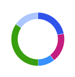 | ドーナツグラフは、データセットの値の比率を示します。 | 異なるグループの割合が、互いにどのように関連しているかを示す場合に使用します。 | 質的。 |
散布図 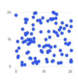 | 散布図は、座標を使用してデータセット内の2つ以上の変数の値を表示します。各点は、1つの値を表します。水平軸と垂直軸上の位置は、2つの変数によって決定されます。 | 2つの変数間の相関関係を示す場合に使用します。相関性を示すときは注意してください。相関性は因果関係と等しくないことに注意してください。結論を出すのではなく、関係を探るのに適している。 | 質的、分散、連続。 |
ツリーマップ  | ツリーマップは、データの階層表示を提供することによって、データ内のパターンを見つけるのに役立ちます。 | 階層内で比率を比較する場合に使用します。 | 分散と連続。 |
ダンベルチャート 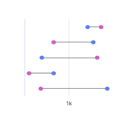 | ダンベルグラフは、円と線を使用した2つのデータポイント間の変化を示します。 | 2つのデータポイント間の変更、および距離を表示する場合に使用します。 | パレットと互換性がありませんが、表示色はカスタマイズできます。 |
簡易ゲージチャート  | シンプルなゲージチャートは、異なる色と針が最小から最大までの数値を示す専用ダイヤルを使用します。このグラフでは、色分けされたダイアルの線形プログレッシブ・データを簡単に視覚化し、スケールを使用して値の変化を確認できます。 | 売上実績を、目標を示し、達成できたかどうかを示すために使います。 | パレットと互換性がありませんが、表示色はカスタマイズできます。 |
活動ゲージ  | 活動ゲージは、中心点の周りに複数のペインを円で囲むことによって、値が許容範囲内にあるかどうかを表示します。 | データポイントが、範囲内にある場所を表示する場合に使用します。 | 質的。 |
ヒートマップ・チャート  | ヒートマップでは、色を使用して、変数がどのようにクラスター化されているか、または最も頻繁に発生するかを示します。 | パターンを表示したり、イベントの集中度を表示したい場合に使用します。 | 分散と連続。 |
バブル・チャート  | バブル・チャートには、データの3つのディメンションが表示されます。 各バブルは、3つの変数を持つデータポイントを表します。「変数1」および「変数2」は、バブルの位置を水平軸と垂直軸で決定します。「変数3」は、バブルのサイズを決定します。 | マグニチュードを表示したい場合に使用します。 | 質的。 |
ウォーターフォール・チャート  | ウォーターフォール・チャートは、初期値と、初期値を正または負に変動させる中間値を持つ最終値を示します。 | ウォーターフォール・チャートは、値の累積効果を理解するのに役立ちます。 | パレットと互換性がありませんが、表示色はカスタマイズできます。 |
クラスター化された棒グラフ  | クラスター化された棒グラフは、クラスター化された縦棒グラフの同じ値について、同じソースの2つのフィールドを表します。 | 複数のデータ系列を比較する場合に使用します。 | 質的、分散、連続。 |
複数線グラフ  | 複数の線グラフでは、複数の線を使用して、同じソースからのデータ間の相関関係を示します。 | 同じソースからのデータ間の関係を表示するのに使用します。 | 質的。 |
箇条書きチャート  | 箇条書きチャートは、ゲージおよびメーターの代わりに使用できる棒グラフのバリエーションです。 | ある値のパフォーマンスを、他の値と比較するのに使用します。 | パレットと互換性がありませんが、表示色はカスタマイズできます。 |
積み上げ棒グラフ  | 積み上げ棒グラフは、縦の長方形の棒で表されるデータを表し、比較値は互いの上に積み上げられています。 各グループは、2つ以上の垂直バーで表されます。長方形の長さは、それが表す値に比例します。 | このチャートを使用して、異なるグループ化されたカテゴリーの相対値を表示したり、順位付けされた値を表示したりできます。 | 質的および連続。 |
100%積み上げ棒グラフ  | 100%積み上げ棒グラフは、積み上げられた縦棒の複数のデータセットの相対的な割合を示し、積み上げられた縦棒の合計は100%になります。 | このグラフを使用して、データの一部がデータセット全体にどのように関連しているかを示します。 | 質的および連続。 |
積み上げ棒グラフ  | 積み上げ棒グラフは、比較値が互いの上に積み上げられた水平長方形の棒で表されるデータを示します。 長方形の長さは、それが表す値に比例します。各グループは、2つ以上の水平バーで表されます。 | このチャートを使用して、異なるグループ化されたカテゴリーの相対値を表示したり、順位付けされた値を表示したりできます。 | 質的および連続。 |
100%積み上げ棒グラフ  | 100%積み上げ棒グラフは、積み上げ棒グラフにおける複数のデータセットの相対的な割合を示し、積み上げ棒グラフの合計は100%に相当します。 | このグラフを使用して、データの一部がデータセット全体にどのように関連しているかを示します。 | 質的および連続。 |
クラスター化された棒グラフ  | クラスター化された横棒グラフは、クラスター化された横の列に複数のデータセットを表示します。 | 所定のカテゴリー内の複数のデータセットを比較する場合に使用します。 | 質的、分散、連続。 |
面グラフ  | 面グラフは折れ線グラフと似ていますが、線と軸の間に影付きの領域があります。 | 時間の経過とともに大きさや変化を表示したい場合に使用します。 | 質的。 |
積み上げ面グラフ  | 積み上げ面グラフは、関連データポイントと比較値を積み重ねた面グラフの一種です。 このグラフは、開始値のセットを示し、その後、開始値の上に値を示すためのシェーディングを使用します。 | サブグループ別に、細分化した一部のデータの合計値を表示するのに使用します。 | 質的。 |
複数の面グラフ  | 複数の面グラフは、各データポイントが同じベースライン値と比較される、接続されたデータポイントを示す面グラフの一種です。 データポイントは複数の面グラフで重複する場合があるため、すべての線が見やすいように、網掛けにある程度の透明度があります。最も視認可能な色を持つデータポイントは、最大値です。 | 同じベースラインのデータポイントを比較する場合に使用します。 | 質的。 |
複数の散布図  | 複数の散布図グラフは散布図グラフに似ていますが、単一のデータセットではなく複数のデータセットを使用します。 | このグラフを使用して、複数のデータセットが各軸で値と交差する方法を比較します。 | 質的および連続。 |
折れ線と棒の複合グラフ  | 折れ線と棒の複合グラフは、折れ線グラフと棒グラフを組み合わせたものです。折れ線と棒の複合グラフはどちらもx軸を共有しますが、それぞれに独自のy軸があります。 | 2つのデータセット間の範囲が大きく異なる場合に、2つのデータセットを同時に表示するのに使用します。 | 質的。 |
折れ線と棒の複合グラフ 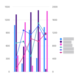 | 線と縦棒の複合グラフは、複数の線と折れ線を使用し、複数のy軸を使用して異なるデータセットを表示します。ここで、各シリーズには個別の軸があります。 | 1つのビジュアライゼーションで傾向を比較、および分析する場合に使用します。 | 質的。 |
レーダーチャート 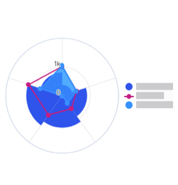 | レーダーチャートは、同じ点から始まる1つの軸上に3つ以上の変数を表示します。 | このチャートを使用して、質的データポイントが互いにどのように比較されるかを示します。 | 質的。 |
KPIチャート  | KPIチャートは、カスタマイズ可能な視覚化とスタイリングオプションを含む主要値を表示します。 | このチャートを使用して、数値目標に対する進捗状況を追跡します。 | なし。ユーザーが変更できるデフォルトの色があります。 |
棒グラフおよび縦棒グラフの単一の系列データに複数の色を適用する
棒グラフまたは縦棒グラフの[スタイル] タブで、[複数色を有効にする] トグルをオンにして、グラフに複数色を適用します。
[パレット] ボタンをクリックします。あらかじめ設定したパレットからパレットを選択するか、[+パレットを追加] をクリックして独自のパレットを作成します。
新しいパレットを追加するときは、パレット名を作成します。
パレットタイプを選択します。
トグルをオンにして、パレットをデフォルトに設定します。
パレットの色を設定するには、[カラーを追加] をクリックします。
[保存]をクリックします。
[完了]をクリックします。
プレゼンターアダプティブレポートに選択リストを追加する
選択リストをプレゼンターアダプティブレポートに追加して、受取人が選択できるようにオプションのリストを作成します。
[en] From the Reports module, click the Reports tab.
[en] Click a Presenter Adaptive report to open it.
[en] Click the Add object
icon.選択リストを選択し、オブジェクトをキャンバス上の任意の位置にドラッグアンドドロップします。
エクスポート時にオブジェクトを簡単に識別できるように、選択リストに関連性のある一意の名前を作成します。
[データ] タブで、選択リストのデータソースを選択します。
ID列 と表示列を選択します。
[並べ替え]で、データを整理する列を選択します。
[順序]で、昇順または降順のいずれかの列の並べ替え順序を選択します。
コントロール パネルで、[タイトルを表示] トグルをオンにして、選択リストの名前を表示し、指定されたテキスト領域にカスタムタイトルを入力します。
[デフォルト値]を選択します。
[必要な値] トグルをオンにして、その値を必須フィールドにします。
[ID列を表示] と[エクスポートで値を表示] トグルをオンにします。
選択リストでプレースホルダーテキスト として表示するテキストを入力します。
[使用者(Used by)] セクションには、選択リストが使われたレポートに含まれる他のオブジェクトが一覧表示されます。
[Slack選択リストの設定]で、[Slackを表示] トグルをオンにして、Varicent Incentives Slackアプリに選択リストを表示します。
注記
Incentives Slackアプリは、Varicent Incentives 北米の一部のお客様のみが利用できます。詳細情報またはopen a Support case ticket if you require assistance.については、担当のCSMにお問い合わせください。
[スタイル] タブで、水平 または垂直のいずれかの任意の配置オプションを選択します。
[水平スペースを埋める] トグルを使うと、水平スペース全体を占めるようにオブジェクトを引き伸ばしたり、元のサイズを維持したりできます。このトグルをオフにすると、コンテナ内で任意の水平方向に自由にオブジェクトを配置できます。
注記
選択リストオブジェクトは、選択した配置軸に合わせてコンテナ内で調整されます。
[フィルター] タブでは、選択リストオブジェクトに[フィルターを追加] できます。
[可視化(Visibility)] タブでは、選択リストオブジェクトに条件付き可視化ルールを追加 できます。
複数選択リストを追加する Presenter Adaptive 報告
複数選択リストを使用して複数の値を選択し、レポートのコンテンツを制御します。レポート全体で条件をフィルタリングして、表示されるレコードを制限したり、レポート上のオブジェクトを非表示にしたりできます。
重要
単一の値をサポートするように構築されたレポート内の場所は、複数選択の選択リストでは機能しません。これには、行入力フォームと動的テキストが含まれます。
クリック オブジェクトを追加 アイコン
。[en] Click a Presenter Adaptive report to open it.
[en] Click the Add object icon
.選択 複数選択リスト次に、オブジェクトをキャンバス上の目的の位置にドラッグ アンド ドロップします。
エクスポート時にオブジェクトを簡単に識別できるように、複数選択リストに一意の名前を作成します。
では データ タブで、選択リストのデータ ソースを選択します。
選択してください ID列 そして 表示列。
並べ替え順序を決定する列を選択します。
列を昇順または降順のどちらにするかを選択します。
では コントロール タブで、タイトルを表示する切り替えを有効にします。
含めるすべてのデフォルト値を選択して入力します。複数の値を選択できます。
[en] No default value
[en] No default value will be set.
[en] Specify report values
[en] The report values will pull from global values, parameters, or stored values and set them as the default value.
[en] All multi-select pick list values
[en] All multi-select pick list values will be set as the default value, however, if the values exceed the maximum of 500, no default value will be set.
下 オプション、必要な値を設定する、ID 列を表示する、エクスポート時に値を表示するなどの切り替えは、デフォルトで有効になっています。好みに応じて、これらを無効にすることもできます。
プレースホルダーテキストの値を選択します。
では スタイル タブで、選択リストの配置を設定します。
の水平方向のスペースを埋める トグルは、オブジェクトを引き伸ばして水平方向のスペース全体を占めるようにするか、元のサイズを維持するのに役立ちます。このトグルをオフにすると、コンテナー内で水平方向に自由に配置できます。
では フィルター タブ、 フィルターを追加する 複数選択リストに追加します。
注記
複数選択の選択リストには、「含まれる」および「含まれない」フィルターから選択するオプションがあります。
クリック 追加。
では 可視性 タブ、 条件付き表示ルールを追加する 複数選択リストに追加します。
クリック 保存。
クリック 名前を付けて保存レポートを下書きとして保存するか、公開済みとして保存するかを選択します。
重要
複数選択選択リストは、Presenter Adaptive の他のオブジェクトと一緒に使用できます。たとえば、作成した複数選択選択リストをソース タイプとして使用するテーブルを追加できます。設定されたフィルターと条件とともに、さまざまなユーザーが特定のデータにアクセスできます。
重要
複数選択リストを含むレポートが別の Presenter Adaptive レポートにリンクされている場合、複数選択リストは、渡される値を指定するためのパラメーターとして使用できます。渡される値のリストは、複数選択リスト、グローバル値、パラメーター、保存された値、およびテキスト値の組み合わせにすることができます。
[en] Click Preview to see the report.
注記
[en] Multi-select pick lists with a higher number of records will display the records in batches of 50.
[en] For multi-select pick lists with multiple items, click Select all to select all items at once. Click Clear selection to deselect all items.
注記
[en] This functionality is limited to 500 items.
複数選択リストへのリンク
複数選択選択リストを含むレポートにリンクすると、選択リストの選択を通過するレポートに簡単にアクセスして共有できます。複数選択選択リストは、次の Presenter Adaptive オブジェクトにリンクできます。 文章、 画像、 テーブル、 チャート、テーブル、メトリック、リスト、吹き出しの形状を変更しました。
重要
ソース レポートの複数選択選択リストの値は、ターゲット レポートの選択リスト オブジェクトに渡すことはできません。
から レポート モジュールで、クリックして Presenter Adaptive レポートを開きます。
クリック オブジェクトを追加
アイコン。選択 複数選択リスト次に、オブジェクトをキャンバス上の目的の位置にドラッグ アンド ドロップします。
エクスポート時にオブジェクトを簡単に識別できるように、複数選択リストに一意の名前を入力します。
複数選択リストにリンクするオブジェクトを選択するには、 オブジェクトを追加
アイコン。文章
テーブル
チャート
参照: チャートへのリンクの追加
画像
選択 画像 クリック + リンクを追加。
テーブルの変形
選択 テーブルの変形、ソースタイプ、ソース、列データ。列で、その他のオプションをクリックします
ボタンを押して選択 リンクを追加。メトリックオブジェクト
選択 メトリック、ソースタイプ、ソース、メトリック値。クリック + リンクを追加。
リストオブジェクト
選択 リスト、ソースタイプ、ソースを選択します。クリック + リンクを追加。
吹き出しオブジェクト
選択 叫ぶをクリックし、 + リンクを追加。
追加されるリンクには、複数選択リスト値を含む Web アドレス、電子メール アドレス、または複数選択リストを含むレポートを含めることができます。
クリック 追加。
単一の日付ピッカーをプレゼンターアダプティブレポートに追加する
単一の日付ピッカーを追加して、プレゼンターアダプティブレポートにフィルターを設定し、表示される記録を制限します。日付ピッカーを使用して、条件付き可視化ルールを設定し、選択した日付に基づいてどのオブジェクトを表示または非表示にするかを制御することもできます。
[オブジェクトを追加]
ボタンをクリックしてメニューを開きます。日付ピッカーをキャンバスにドラッグアンドドロップします。[en] Click a Presenter Adaptive report to open it.
[en] Click the Add object
icon.[en] Select Date picker, then drag and drop the object to your desired position on the canvas.
[スタイル]タブで、[ラベルを表示]を選択できます。ラベルを表示するには、トグルをオンにします。
ラベルを作成し、日付フォーマットを設定します。
デフォルト値を設定し、プレースホルダーテキストを追加します。
記録をフィルタリングする日付を要求するには、トグルをオンにします。
エクスポート時に値を表示するには、トグルをオンにします。
[スタイル]タブで、水平および垂直の配置を選択し、オンに切り替えると水平スペースを埋めることができます。
[可視化(Visibility)]タブで、画像を表示する条件を設定できます。
[en] To learn more about conditional visibility, read: プレゼンターアダプティブオブジェクトへの条件付き表示ルールの設定.
[保存]をクリックします。
日付範囲ピッカーをプレゼンターアダプティブレポートに追加する
日付範囲ピッカーを追加して、開始日と終了日でプレゼンターアダプティブレポートのデータをフィルタリングします。日付範囲ピッカーを使用すると、テーブル、グラフ、または選択リストの結果をフィルタリングできます。
[オブジェクトを追加]
ボタンをクリックしてメニューを開きます。日付範囲ピッカーをキャンバスにドラッグアンドドロップします。[en] Click a Presenter Adaptive report to open it.
[en] Click the Add object
icon.[en] Select Date range picker, then drag and drop the object to your desired position on the canvas.
[スタイル]タブで、[ラベルを表示]を選択できます。ラベルを表示するには、トグルをオンにします。
ラベルを作成し、日付フォーマットを設定します。
注記
入力形式は、北米の日付形式(MM/DD/YYYY)のみがサポートされています。支援が必要な場合は、サポートにお問い合わせください。
開始日と終了日のデフォルト値を設定し、プレースホルダーテキストを追加します。
記録をフィルタリングし、エクスポート時に値を表示する終了日を要求するには、トグルをオンにします。
[スタイル]タブで、水平および垂直の配置を選択し、オンに切り替えると水平スペースを埋めることができます。
[可視化(Visibility)]タブで、画像を表示する条件を設定できます。
[保存]をクリックします。
テーブル(表)、チャート(グラフ)、または選択リストを選択します。
[フィルター] タブをクリックして、[フィルターを追加]します。
[フィルターを追加]をクリックします。
フィルタータイプを選択します。
日付範囲ピッカーが結果をフィルタリングするときに使用するルールを定義します。
[追加]をクリックします。
[保存]をクリックします。
プレビュー をクリックして、レポート内の日付でフィルタリングします。
プレゼンターアダプティブレポートにコントロールメニューオブジェクトを追加する
選択リスト、単一日付ピッカー、および日付範囲ピッカーをドロップダウンコントロールメニューに直接追加すると、レポートレイアウトをよりクリーンに整理できます。また、コントロールメニューではレポートの新しいオブジェクトと既存のオブジェクトの両方を追加できるため、ユーザー自身がこれらのオブジェクトをレポートに個別に追加する手間が省けます。
[en] From the Reports module, open a Presenter AdaptivePresenter Adaptive report by clicking on it.
[en] Click the Add object
icon.[コントロールメニュー]を選択し、オブジェクトをキャンバス上の任意の位置にドラッグアンドドロップします。
サイド設定パネルのテキスト ボックスを使用して、コントロール メニュー名を更新します。
[データ] タブで、[グループを構成] をクリックして、メニューにオブジェクトを追加します。ドロップダウンリストで、追加したい既存のオブジェクト名の横にある
 をクリックします。特定のオブジェクト名を検索することもできます。
ドロップダウンリストから、 メニューに新しいオブジェクトを追加をクリックし、追加するオブジェクトの名前をクリックします。特定のオブジェクトの名前を検索することもできます。
注記
[en] To remove an object from the group, click
 next to the name of the object you want to remove.
オブジェクトを選択すると、設定パネルでオブジェクトを設定できます。
 戻る矢印 コントロール メニュー名を入力して、コントロール メニュー オブジェクトの構成を続行します。
[ラベル]で、コントロールメニューオブジェクトの名前を作成します。
[エクスポート]で、[PDFエクスポートのコントロールメニューを表示] トグルをオンにして、PDFファイルエクスポートにコントロールメニューを表示します。
注記
エクスポート時にのみコントロールメニューを表示するように選択できます。コントロールメニュー内のオブジェクトはすべて、コントロールメニュー内でエクスポートできません。エクスポートにオブジェクトを含めるには、コントロールメニューでオブジェクトを削除し、レポートキャンバスに個別に表示する必要があります。
[スタイル] タブで、水平 または垂直のいずれかの任意の配置オプションを選択します。
[水平スペースを埋める] トグルを使うと、水平スペース全体を占めるようにオブジェクトを引き伸ばしたり、元のサイズを維持したりできます。このトグルをオフにすると、コンテナ内で任意の水平方向に自由にオブジェクトを配置できます。
注記
コントロールメニューオブジェクトは、選択した配置軸に合わせてコンテナ内で調整されます。
[可視化(Visibility)]タブでは、コントロールメニューオブジェクトに[条件付き可視化ルールを追加] できます。
コントロールメニューを削除するには、オブジェクトの上にカーソルを置いて
[削除]をクリックします。注記
コントロールメニューを削除すると、関連付けられたすべてのオブジェクトと、それらにリンクされたオブジェクトまたは保存された値が削除されます。
プレゼンター・アダプティブ・レポートへの行入力フォームの追加
行入力フォームをレポートに追加して、Webユーザーがデータをテーブルに送信できるようにします。
- ボタンをクリックして、オブジェクトメニューを開きます。オブジェクトをキャンバスにドラッグ・アンド・ドロップします。
[en] Click a Presenter AdaptivePresenter Adaptive report to open it.
[en] On the side panel, click the Add object
icon.[en] Select Row input form, then drag and drop the object to your desired position on the canvas.
タブで、行入力フォームのデータ・ソースを選択します。ユーザーがデータを送信できるようにする列を選択します。
列の名前の横にあるその他のオプションメニュー(...)をクリックし、 をクリックして、ラベル、プレースホルダーテキスト、デフォルト値、選択した列の説明を追加します。
ルールを追加するには、をクリックし、追加するルールのタイプを選択します。
ヒント
[検証ルール]は、全データの最大または最小、平均、合計など、テーブル全体のデータの集計を検証するために使用されます。[入力ルール]は、特定の値を超える値を許可しないなど、個々の値に対して検証するために使用されます。
[en] Under Button, enable the Redirect on submission toggle to configure the save button to link to a website, email, or report.
[en] For more information, see: [en] Configuring the save button on your report.
タブでは、行入力フォームの外観を変更できます。
ビデオをプレゼンターアダプティブレポートに追加する
ビデオを追加してレポートを強化します。
から レポート モジュールをクリックして Presenter Adaptive 開くには報告してください。
[オブジェクトの追加]
ボタンをクリックします。ビデオを選択し、オブジェクトをキャンバス上の任意の位置にドラッグアンドドロップします。
[スタイル]タブで、[ヘッダーを表示]を選択できます。ヘッダーを表示するには、トグルをオンにします。
拡大する タイルヘッダー セクション。
をオンにする ヘッダーを表示 トグル。
ビデオのタイトルを入力し、太字、斜体、下線、フォント色などの書式をテキストに適用します。
ビデオの説明(オプション)を入力し、太字、斜体、下線、フォント色などの書式をテキストに適用します。
背景色を表示することもできます。背景色を表示するには、??? をお読みください。
ビデオのURLを追加します。
注記
URLが正しくフォーマットされているYouTubeおよびVimeoのビデオのみがサポートされています。
ビデオタイルの表示、自動再生、ミュート、またはビデオのループ再生のトグルを有効にします。
[可視化(Visibility)]タブで、画像を表示する条件を設定できます。
クリック + 条件を追加。
次のいずれかを選択します。
もしあれば - いずれかの条件が満たされた場合、ビデオが表示されます。
もしすべてが - すべての条件が満たされた場合、ビデオは表示されます。
条件の値を選択します。現在の日付、ワークフロー フォーム ID、現在の Web ユーザー (現在ログインしているユーザー) などのグローバル値、または保存された値を選択できます。
演算子を選択します。
値を入力または選択します。たとえば、条件は次のようになります。 現在の日付は 2024/01/01 以降ですつまり、動画は 2024 年 1 月 1 日以降にのみレポートに表示されます。
[保存]をクリックします。
注記
レポートをPDFとして公開する場合、ビデオタイルは表示されません。
プレゼンターアダプティブレポートに受取人オブジェクトを追加する
受取人オブジェクトをプレゼンターアダプティブレポートに追加すると、受取人情報を表示するのに便利です。
- [オブジェクトを追加]をクリックします。
[en] Click
Add object.受取人を選択し、オブジェクトをキャンバス上の任意の位置にドラッグアンドドロップします。
データソースと受取人情報を選択します。
[フィルター]タブで、[フィルターを追加] して、一度に1人の受取人のデータしか表示できないようにします。
注記
受取人オブジェクトは、現時点では受取人ごとに1行のデータのみサポートが可能です。
受取人オブジェクトの名前フィールドを入力する列を選択します。
列を選択して、受取人IDと受取人オブジェクトのタイトルフィールドに入力します。
注記
受取人プロフィール画像を追加するには、まず受取人IDフィールドに列を追加します。
追加する列を選択して、追加のカスタムフィールドを追加します。フィールド名を変更するには... → [名前の変更]を順にクリックします。
フィールドをクリックして希望の順序にドラッグすることで、
受取人オブジェクトに表示されるフィールドの順序を並べ替えることができます。[スタイル]タブでは、タイルに[カラーの背景を追加] すると、各フィールドを書式設定できます。
[可視化(Visibility)]タブでは、受取人オブジェクトに[条件付き可視化ルールを追加] できます。
[保存]をクリックします。
プレゼンターアダプティブレポートにメトリックオブジェクトを追加する
メトリックオブジェクトを使用すると、売上に関する重要なサマリーメトリックに簡単にアクセスできます。
から レポート モジュールをクリックして Presenter Adaptive 開くには報告してください。
[オブジェクトを追加]
をクリックします。メトリックを選択し、オブジェクトをキャンバス上の任意の位置にドラッグアンドドロップします。
[データ] タブで、メトリック情報を含むデータソースを選択します。
ソースを選択します。
ソースタイプとしてデータソースが選択されている場合は、メトリックオブジェクトのソースを選択します。
ワークフローがソースタイプとして選択されている場合は、ソースとしてワークフローステータスとワークフロー履歴から選択します。
メトリック値の列名を入力します。
注記
選択した列に複数の行がある場合、結果のメトリック値はすべての行の合計になります。
[フォーマット]で、メトリック値のフォーマット、通貨の種類、小数点以下の桁数、表示単位を選択し、千の位の区切り記号を使用するかどうかを決定します。
システムテーブルに含まれていないカスタム通貨を追加するには、プレゼンターアダプティブオブジェクトへの動的通貨の追加をお読みください。
[アイコンとラベル]で、メトリック値のアイコン、ラベル、説明を選択します。
[リンク]で、 [+ リンクを追加] をクリックして、メトリックオブジェクトにリンクを追加します。
Webアドレスにリンクするには、Webアドレスが安全なURLか、安全でないURLかを選択します。変数をURLに挿入する場合は、値を挿入するURLにカーソルを置き、メニューから値を選択します。テキストボックスでURLを入力し、[追加]をクリックします。
電子メールにリンクするには、プレゼンターアダプティブオブジェクトでのmailtoリンクの作成を参照してください。
[en] To link to a report, select Presenter Adaptive and the report you want to add. If a report has more than one assigned web tab, select a web tab and add any necessary parameters, and click Add.
メトリックオブジェクトにフィルターを適用する方法は、フィルターのPresenter Adaptiveレポートへの追加をお読みください。メトリックオブジェクトに条件付き可視化ルールを設定する場合は、プレゼンターアダプティブオブジェクトへの条件付き表示ルールの設定をお読みください。
メトリックオブジェクトに条件付きフォーマットを適用する
メトリックオブジェクトの値に基づいて、テキストや背景色を決定する条件付きフォーマットルールを定義することができます。ソース列または数値を使用してしきい値を設定すると、メトリック値がしきい値を満たすか超えると、フォーマットが自動的に適用されます。値、説明、ラベル、およびリンクのオプションなど、メトリックオブジェクトに適用する書式設定スタイルを選択することができます。プレビュー機能を使用すると、リアルタイムで変更を表示したり、フォーマットを確定する前に表示したりできます。
注記
条件付きフォーマットは、設定されたしきい値以上のメトリック値に適用されます。
から レポート モジュールをクリックして Presenter Adaptive 開くには報告してください。
クリック オブジェクトを追加 アイコン
。選択 メトリック次に、オブジェクトをキャンバス上の目的の位置にドラッグ アンド ドロップします。
[オブジェクトを追加]
ボタンをクリックしてメニューを開きます。メトリックオブジェクトをキャンバスにドラッグアンドドロップします。データソースの選択、およびメトリック値、フォーマット、アイコン、リンクの設定については、[メトリックオブジェクトを追加] を参照してください。
条件付きフォーマットで、[+ 条件を追加]をクリックします。
ソース列または静的値を選択してしきい値 を設定します。
タイルの背景で、メトリックオブジェクトタイルに背景色を適用する場合は、[背景を表示] トグルをオンにします。
背景色は単色(Solid)またはグラデーションから選択できます。
メトリック値のフォーマットを設定する のカラーブロックをクリックし、メトリック値に適用する色を選択します。
[ラベルと説明]で、個々のカラーブロックをクリックし、メトリックオブジェクトのラベルと説明に適用する色を選択します。
[リンクのフォーマットを設定する] のカラーブロックをクリックし、メトリックオブジェクトのリンクに適用する色を選択します。
メトリックオブジェクトのフォーマットをプレビューして、[追加]をクリックします。
[条件]に保存された条件が表示されます。
注記
単一のメトリックオブジェクトに対して複数の条件を作成できます。条件付きフォーマットは、リストの最初の有効な条件に適用されます。
プレゼンターアダプティブレポートにグループジェクトを追加する
グループオブジェクトをプレゼンテーターアダプティブレポートに追加すると、複数のオブジェクトを1つのタイルに簡単にグループ化できます。
注記
レポートキャンバスに表示するには、グループオブジェクトに1つ以上の可視オブジェクトを追加する必要があります。グループオブジェクトに非表示オブジェクトのみが含まれている場合、非表示のままになります。
- [オブジェクトを追加]をクリックします。
[en] Click
Add object.グループを選択し、オブジェクトをキャンバス上の任意の位置にドラッグアンドドロップします。
グループ設定ペインのテキスト ボックスを使用してグループ名を更新します。
[グループを設定] をクリックして、グループにオブジェクトを追加します。ドロップダウンリストで、追加したい既存のオブジェクト名の横にある
をクリックします。特定のオブジェクト名を検索することもできます。をクリックして、グループに新しいオブジェクトを追加することもできます。 グループに新しいオブジェクトを追加 をクリックし、リストからオブジェクトを選択して、グループ オブジェクトに新しいオブジェクトを追加します。レポート キャンバスで個別に設定するのと同じように、グループ内の各項目を設定します。
グループ内のオブジェクトを設定するには、
戻る矢印 グループ名を入力して、グループ オブジェクトの構成を続行します。注記
グループからオブジェクトを削除するには、削除したいオブジェクト名の横にある
をクリックします。グループのレイアウトを設定するには、移動するオブジェクトをクリックして、グループキャンバス上の任意の位置にドラッグします。
注記
グループキャンバス内のオブジェクトのサイズを変更すると、レポートキャンバス内のオブジェクトのサイズも変更されます。
スタイルタブでは、タイルに[ヘッダーを追加] したり、[カラーの背景] を追加したりできます。
ヒント
タイルにヘッダーを追加する場合は、セールスポータルでグループを折りたためるようにするか、またはデフォルトでグループを展開するかを選択できます。
[可視化(Visibility)]タブでは、グループオブジェクトに[条件付き可視化ルールを追加] できます。
プレゼンターアダプティブレポートにリストオジェクトを追加する
リストオブジェクトを使用すると、視覚的に魅力的でカスタマイズ性の高いリストを作成できます。
- [オブジェクトを追加]をクリックします。
[en] Click a Presenter Adaptive report to open it.
[en] On the side panel, click the Add object
icon.[リスト]を選択し、オブジェクトをキャンバス上の任意の位置にドラッグアンドドロップします。
[データ] タブで、データソースを選択します。
ソースを選択します。
ソースタイプとしてデータソースが選択されている場合は、リスト オブジェクトのソースを選択します。
ワークフローがソースタイプとして選択されている場合は、ソースとしてワークフローステータスとワークフロー履歴から選択します。
[項目]で、リストに表示する項目を選択します。
[en] Main
[en] Click + Add column and select the main column. Click Remove column
to remove the column and select a different main column.[en] [Optional] Description
[en] Click + Add column and select the description column. Click Remove column
to remove the column and select a different description column.[カウント]で、[番号付きリストを表示] トグルをオンにして、リストの項目に番号をつけます。
[カウント]で、[番号付きリストを表示] トグルをオンにして、リストの項目に番号をつけます。
[値]で、[+ 列を追加] をクリックして、リスト内の各項目に対応する値を追加します。
リストを昇順 または降順 どちらかで表示するように選択します。
注記
日付フィールドでは、最も古い日付が最低値とみなされ、最近の日付(将来の日付になる可能性あり)が最高値とみなされます。
[en] [Optional] If the selected data source contains a numeric value, under Data aggregation, enable the Aggregate values toggle to show the value total on the list.
[en] [Optional] Under Value total, disable the Display total toggle to hide the list total.
[en] Under Numeric Format, select the value format, display units, and decimal places of the list.
[en] [Optional] Enable the Use thousands separator toggle to add a comma to the list value. You can also select where the comma will be placed in the value.
[リンク]で、 [+ リンクを追加] をクリックして、リストオブジェクトにリンクを追加します。
[en] Web
[en] Under Destination, click Web. Under Web address, click
Insert value and select the value. Click Add.[en] Email
[en] Under Destination, click Email. Follow the steps outlined here: プレゼンターアダプティブオブジェクトでのmailtoリンクの作成.
[en] Report
[en] Under Destination, click Report. Under Report type, select Presenter Adaptive. Under Report name, select the report you want to add. If a report has more than one assigned web tab, select a web tab and add any necessary parameters, and click Add.
[Excelへのエクスポートを有効にする] トグルをオンにして、リストをExcelにエクスポートします。
注記
リストオブジェクトに表示される記録のみがExcelにエクスポートされます。
[en] [Optional] Under the Style tab and Tile header, enable the Display header toggle. Add a title and description, and add formatting to the header. Click
Insert value to add header value.[en] [Optional] Under Tile buttons, select the button style.
[en] [Optional] Under Tile background, disable the Display background toggle to hide the tile background.
[en] [Optional] Under Items, set the formatting for the name, description, and list number.
[en] [Optional] Under Values, set the formatting for the value and total.
[en] [Optional] Under Item background, disable the Display background toggle to hide the item background.
[en] [Optional] Under Link, set the label formatting.
[en] [Optional] To apply filters to your list object, read: フィルターのPresenter Adaptiveレポートへの追加.
[en] [Optional] To set conditional visibility rules to your table, see: プレゼンターアダプティブオブジェクトへの条件付き表示ルールの設定.
[en] Click Save.
プレゼンターアダプティブレポートに区切り線(Divider)オジェクトを追加する
区切り線(Divider) オブジェクトを使用してレポートセクションを視覚的に分離し、レポートを整理します。
- [オブジェクトを追加]をクリックします。
[en] Click
Add object.区切り線(Divider)を選択し、オブジェクトをキャンバス上の任意の位置にドラッグアンドドロップします。
キャンバス上のデバイダーの角をドラッグしてサイズを変更します。
[データ] タブで、[PDFエクスポートに区切り線を表示] トグルをオンにして、PDFファイルのエクスポートに区切り線(Divider)を表示します。
[スタイル] タブで、カラーパレットメニューを選択して、区切り線(Divider)の色を選択します。また、カラーピッカーでカスタムカラーを選択するか、カラーフィールドに16進コードを入力することもできます。
区切り線(Divider)に条件付き可視性ルールを設定する場合は、プレゼンターアダプティブオブジェクトへの条件付き表示ルールの設定をお読みください。
プレゼンターアダプティブレポートに吹き出しオジェクトを追加する
必要に応じて、読者の関心を引くために吹き出しを追加します。メッセージを目立たせるために、さまざまな吹き出しタイプがあります。条件付き表示を使用して吹き出しが表示されるタイミングを制御します。
[オブジェクトの追加]
ボタンをクリックしてメニューを開きます。吹き出しオブジェクトをキャンバスにドラッグアンドドロップします。[en] Click the Add object
button to open the menu. Drag and drop a callout object onto the canvas.キャンバス上で吹き出しの角をドラッグしてサイズを変更します。
[データ] タブで、タイトルを表示するよう選択できます。タイトルを表示するには、トグルをオンにします。表示されるテキストボックスにタイトルを入力します。
メッセージテキストボックスに吹き出しのメッセージを入力します。
リンクを追加するには、[リンクを追加]をクリックします。
テキストボックスにラベルを追加します。
トグルを使用して、新しいタブでリンクを開くことができます。
リンク先としてWebアドレス またはレポート を選択します。
[en] To link to a web address and insert a variable in the URL, place your cursor in the URL where you want to insert the value and select a value from the menu. In the text box, enter the URL, and click Add.
[en] To link to an email, see プレゼンターアダプティブオブジェクトでのmailtoリンクの作成.
[en] To link to a report, select Presenter Adaptive and the report you want to add. If a report has more than one assigned web tab, select a web tab and add any necessary parameters, and click Add.
[追加]をクリックします。
[スタイル] タブでメッセージタイプを選択できます。吹き出しの始めのアイコンを表示または削除するには、[表示アイコン] トグルを使用します。
配置 セクションを使用して、キャンバスの指定のスペース内で吹き出しメッセージを垂直の配置 に設定します。
[表示] タブから、吹き出しオブジェクトの条件付き表示 を設定するよう選択できます。
[条件の追加] ボタンをクリックしてメニューを開きます。
必要に応じてドロップダウンを[いずれかが] または[すべてが] に設定します。
ドロップダウンからソースを選択し、ルールを設定します。
プラスボタン
 をクリックして、必要に応じて条件またはサブ条件を追加します。
[保存]をクリックします。
プレゼンターアダプティブレポートでのワークフローステータスと履歴の追跡
ワークフローのステータスと履歴は、テーブル、再形成されたテーブル、チャート、メトリック、リストオブジェクトのデータストアとして選択できます。ワークフローステータスは、ワークフロー内のアクションノードに基づいてパーセンテージで表されます。ワークフロー履歴には、進行中のワークフローと完了したワークフローの完全な履歴が表示されます。
レポートを作成または編集します。
システムデータストア、ワークフローステータス、およびワークフロー履歴は、次のプレゼンターアダプティブオブジェクトにデータ ソースとして追加できます。
グラフ
テーブル
再形成されたテーブル
メトリック
リスト
ワークフローのソースタイプを選択します。
ワークフローステータスまたはワークフロー履歴データソースのいずれかを選択します。
レポートに使用する列を選択します。
注記
詳細な手順については、各オブジェクトタイプの追加に関し該当するマニュアルを参照してください。
テーブルのピックリストフィールドへのフィルター追加
テーブルのピックリストフィールドにフィルターを追加して、ピックリストフィールドで使用できる値に制限を設定します。
- [オブジェクトの追加]をクリックし、テーブルを選択します。
[en] Click
Add object and select Table.データソースを選択します。
列を選択します。
Webユーザーオプションで、[列編集を許可]を有効にします。
ピックリスト列で、その他のオプションボタン
をクリックします。[設定]をクリックします。
[編集可能な列を有効にする]に切り替えます。
- [フィルターの追加]をクリックします。
注記
フィルターの詳細については、フィルターのPresenter Adaptiveレポートへの追加をお読みください。
フィルタータイプと列、テキストでフィルターするか値を表示するか、およびルールを選択します。
[追加]をクリックします。
[保存]をクリックします。
テーブルのピックリストフィールドでフィルターを編集するには、フィルターとその他のオプション
をクリックします。[編集]をクリックします。
テーブルのピックリストフィールドでフィルターを削除するには、フィルターとその他のオプション
をクリックします。[削除]をクリックします。
フィルターのPresenter Adaptiveレポートへの追加
フィルターをレポートに追加して、Webユーザーに使用できるデータを制御できます。フィルターをテーブル、チャート、ピック・リストに追加できます。
テーブル
テーブルの形状を変更する
チャート
選択リスト
複数選択リスト
受取人
メトリック
リスト
フィルターには 2 つの種類があります。
基本フィルターの追加
基本フィルターは、ユーザーが選択した列の値に基づいて表示できるデータを制御します。
から レポート モジュールをクリックして Presenter Adaptive 開くには報告してください。
[en] Click a Presenter AdaptivePresenter Adaptive report to open it.
フィルターを適用するオブジェクトをクリックします。
クリック フィルター タブ。
クリック + フィルターを追加。
メニューからを選択します。
フィルターする値を含む列を選択します。
またはのどちらでフィルターするかを選択します。
列タイプ (文章、 日付、 または 数値) - 手順 8 に進み、フィルターのルールを適用します。
値を表示する - リストからフィルタリングする値を選択し、クリックします 追加。
でフィルタリングする場合は、演算子と値を選択してルールを作成します。また、WebユーザーID(現在ログインしているユーザー)や、現在の日付などのグローバル値を選択することもできます。
注記
日付フィルターを追加する場合は、次のルールと制限記号が同等です。
「前/以前」は < 次の値より小さい:に相当
「後/以降」は > 次の値より大きい:に相当
「以降」は >= 次の値以上:に相当
「以前」は <= は次の値以下:に相当
ルールの値を入力するか、保存された値またはグローバル値を選択します。
ヒント
グローバル値には、現在の Web ユーザー (現在ログインしているユーザー)、ワークフロー フォーム ID、または現在の日付が含まれます。
有効にする 大文字と小文字を区別 切り替えると、大文字と小文字が完全に一致する値がフィルタリングされます。または、切り替えを無効にすると、大文字と小文字が区別されなくなります。
必要に応じて、追加のルールを追加します。
ヒント
基本フィルターに 1 つのルールを追加できます。3 つ以上のルールを含むより複雑なフィルターの場合は、代わりに高度なフィルターを使用します。
クリック 追加。
詳細フィルターの追加
高度なフィルターにより、さらにカスタマイズされたデータとのインタラクションが可能になります。
から レポート モジュールをクリックして Presenter Adaptive 開くには報告してください。
[en] Click a Presenter AdaptivePresenter Adaptive report to open it.
フィルターを適用するオブジェクトをクリックします。
クリック フィルター タブ。
クリック + フィルターを追加。
から フィルタータイプ ドロップダウンメニューで選択 高度な。
フィルターの説明を入力します。
ヒント
詳細な説明は、フィルターの目的を記憶するのに役立ちます。これは、同じレポートに多数の複雑なフィルターがある場合に便利です。
クリック 次。
ソース列、演算子、値を選択して、最初のフィルタールールを選択します。また、WebユーザーID(現在ログインしているユーザー)や、現在の日付などのグローバル値を選択することもできます。
注記
日付フィルターを追加する場合は、次のルールと制限記号が同等です。
「前/以前」は < 次の値より小さい:に相当
「後/以降」は > 次の値より大きい:に相当
「以降」は >= 次の値以上:に相当
「以前」は <= は次の値以下:に相当
- ボタンをクリックして、別のルールまたはグループを追加します。
ルールを追加 - 別のルールを追加します。
グループを追加 - グループを追加します。グループを追加すると、最初のグループの下層にサブレベルが追加されます。次に、 または 操作タイプを変更します。
ヒント
ルールとグループをドラッグ アンド ドロップして操作の順序を変更します。
ルールとグループの設定が完了したら、 追加。
プレゼンター・アダプティブ・レポートへの値の追加
レポートに値を追加して、追加データを表示するか、データ・ソースの結果を1つのセルに拡大縮小します。
[en] Stored values are variables that return a single value pulled from a data source in your Varicent IncentivesVaricent Incentives model. You can dynamically display these stored values in a variety of your report objects. You can also use stored values within the data, filter, and visibility tabs of many of the report objects.
[en] Parameter is a variable that is loaded by a pick-list selection, or a value you hard code or pass in from another linked report.
[en] In comparison, a stored value pulls a value from a data source in your model. The data source could be a table, calculation, or data store. A stored value often uses the value within a parameter to pull the desired record from its data source.
[en] To add values to your Presenter Adaptive report:
 アイコンをクリックして、をクリックします。
[en] From the sidebar, click the Values icon, and then click + Add.
[en] To add a parameter:
[en] Select Add parameter.
[en] Enter a name for the parameter
[en] Select the appropriate Data type for the parameter from the following options: Text, Numeric or Date, depending on the type of data you want to capture.
[en] Set the input or default value for the parameter.
[en] You can choose from the available Global Values:
[en] Current Web User: Dynamically sets the parameter to the ID of the logged-in user
[en] Workflow Form ID: Links the parameter to an inquiry workflow's ID
[en] If applicable, you can select a value from a list of existing stored values or parameters in the system. Alternatively, you can manually input a fixed value.
[en] Turn on the Value required toggle to require the parameter to be selected before the report displays results.
[en] Click Add.
[en] To add a stored value:
[en] Select Add stored value.
[en] Enter a name for the stored value.
[en] In the Source field, choose the data source that contains the information you want to query.
[en] For example, if you are retrieving payee names, select your Payee table.
[en] In the Column field, select the column in the data source that holds the desired information. (for example, "Name").
[en] In the Set the ID column values section, map the appropriate ID column (for example, "PayeeID") to a corresponding parameter or value. The number of values you have to set depends on the number of key columns in the source table.
[en] For example, if the stored value is linked to a pick list parameter, select the parameter that corresponds to the set pick list.
[en] Click Add.
[en] To edit a value, click on the more options button beside the value's name, and select Edit.
[en] Click Save.
[en] To check where a parameter or value is being used, click on the More options menu (...) beside the value's name, and select Used by. If the parameter or value is used in other reports, they will be listed under the Used by section.
[en] Refer to Lessons 2 and 3 of the Creating Presenter Adaptive Reports course for more detailed information.
プレゼンターアダプティブオブジェクトへの動的通貨の追加
次のプレゼンターアダプティブオブジェクトでは、さまざまな通貨を動的に表示できます。
テーブルオブジェクト
チャートオブジェクト
メトリックオブジェクト
パラメーターと保存値を使用して、プレゼンターアダプティブオブジェクトを表示する受け取り人に基づいて、さまざまな通貨を動的に表示できます。これにより、システムテーブルに含まれていないカスタム通貨を追加できます。
プレゼンターアダプティブオブジェクトを選択します。
通貨記号を決定するパラメーターまたは保存値を追加 します。
注記
保存値のソーステーブルには、受け取り人IDと通貨列を含める必要があります。
ソーステーブルは、任意の通貨でカスタマイズできます。
[書式]で、通貨の保存値を選択します。
受け取り人がレポートを表示すると、受け取り人IDに関連付けられた通貨記号が表示されます。
[プレゼンター・アダプティブ]テーブルへの条件付き書式の追加
テーブル内の値の書式設定方法を変更します。
注記
条件付き書式は、計算列を含むすべてのテーブル列に追加できます。
タブのでをクリックします。
から スタイル タブの下 条件付き書式、 クリック + 条件を追加。
注記
このオプションにアクセスするには、 データ テーブル設定のタブ。
条件付き書式をテーブルヘッダーに適用するか、またはテーブル値に適用するかを選択します。
条件付き書式を適用する列を選択します。
数式を入力して、値をレンダリングする条件を定義します。
ヒント
条件付き書式をテーブルヘッダーに適用する場合は、式でソースを集計する必要があります。
フォントスタイル、セルの色、または値の表示方法を変更することによって、条件を満たす場合のセルの表示方法を定義します。
をクリックします。
条件を編集する場合は、タブので、コンテキストメニュー[...]をクリックしてをクリックします。
プレゼンターアダプティブオブジェクトへの条件付き表示ルールの設定
条件付き表示ルールを設定して、プレゼンターアダプティブレポート内のオブジェクトを表示または非表示にします。テキスト、画像、表、チャート、ピックリスト、行入力フォーム、ビデオなど、プレゼンターアダプティブのすべてのオブジェクトを表示または非表示にするルールを設定できます。
オブジェクトをキャンバスに追加した後、[表示]タブをクリックします。
[en] Click a Presenter Adaptive report to open it.
[en] Click the Add object icon
and drag and drop the object onto the canvas to resize.[en] To set the conditional visibility rules for the object, click on the Visibility tab.
- [条件の追加]をクリックします。
条件を適用するのが、すべてのルールが真である場合か、いずれかのルールが真である場合かを選択します。
ソース、演算子、値を選択します。
[保存]をクリックします。
条件を編集するには、
[編集]をクリックします。条件を削除するには、
[削除]をクリックします。別の条件を追加するには、
[条件の追加]をクリックします。注記
条件が設定されているオブジェクトには
 アイコンが表示されます。
 [サブ条件の追加]をクリックして、条件セットごとに1つのサブ条件を追加できます。
表とグラフでは、データのないオブジェクトを表示または非表示にするか、データのないプレースホルダーを表示するかを選択することもできます。
動的テキストをプレゼンターアダプティブレポートに追加する
動的テキストを使用すると、受取人のレポートをカスタマイズし、動的に変化するコンテンツを使用してレポートを効率的に管理できます。プレゼンターアダプティブレポートには、動的テキストを使用できる場所が多数あります。
- 値の挿入ボタンをクリックして、パラメータと保存された値をレポートに追加します。パラメータは、直接追加することも、データソースから保存値をインポートすることもできます。
レポートでオブジェクトを設定すると、動的テキストが使用できるフィールドの横に
値の挿入ボタンが表示されます。 値の挿入ボタンをクリックして、ドロップダウンリストから追加する動的フィールドを選択します。
注記
一部のフィールドでは、動的テキストの要素と 静的テキストの要素を組み合わせることができます。それ以外の場合は、動的または 静的テキストのみを使用できます。
プレゼンターアダプティブレポートのプレビュー表示
[en] You can preview Presenter Adaptive reports via the Reports module.
注記
[en] Changes cannot be submitted while in Preview mode - the submit button will be disabled.
[en] Option 1:
レポートを作成したら、[保存]をクリックします。
[en] In the Report viewer, you can select a report from the dropdown at the centre of the page.
[en] You can select the user you are previewing your report as.
[en] Option 2:
注記
[en] The preview feature is only available once the Presenter Adaptive report has been saved.
[en] From the Reports module, select the report you would like to preview.
[en] Click the Preview button. This will open this specific report in the Report Viewer.
[en] You can select the user you are previewing the report as.
プレゼンターアダプティブレポートのパフォーマンスを確認する
レポートのパフォーマンスをチェックし、どのコンポーネントがレポートの読み込みを遅らせているかを確認します。レポートの読み込み時間を短縮するために、さまざまなコンポーネントを変更します。
レポートの[プレビュー] をクリックします。
[en] Click on Preview on your report.
パフォーマンスを確認するレポートの管理者または受け取り人を選択します。
[パフォーマンスをチェック]をクリックします。
[開始]をクリックします。
さまざまなレポートコンポーネントを選択して、レポートのパフォーマンスをテストします。
[停止] をクリックして、パフォーマンスチェックの結果を表示します。
パフォーマンスチェックには、各オブジェクトの読み込み時間とコンポーネント数が表示されます。
[en] Stored value evaluation: Time spent generating the values associated with the report’s local stored values.
[en] Source data fetch: Time spent fetching the object’s filtered source data.
[en] Visibility calculation: Time spent determining the objects’ visibility conditions.
チャート上の色付きのバーをクリックして、レポートのパフォーマンスに影響するアクションとプロセスを特定します。
パフォーマンスログを.jsonファイルとしてエクスポートするには、[ログファイルをエクスポートする]をクリックします。
プレゼンターアダプティブオブジェクトでのmailtoリンクの作成
注記
[en] This functionality requires both Admin and Payee users to have a default email client. We recommend contacting your organization's IT department to ensure all machines accessing a report using the email mailto feature have a default email client configured.
[en] You can add email hyperlinks to the following Presenter Adaptive objects:
[en] From the Reports module, click the Reports tab.
[en] Click a Presenter Adaptive report to open it.
[en] Click the Add object
icon.[en] Select one of the objects listed above.
[en] For the text object, highlight the text which you want to use as a link, and click the Add link
icon.[en] In the Data tab, under Link, click + Add link.
リンク先として[電子メール] を選択します。
[宛先] と [Cc] セクションに電子メールアドレスを入力し、件名を追加します。
注記
各電子メール アドレスの後に Enter キーを押すか、フィールド外の任意の場所をクリックして登録します。
[値を挿入]
アイコンをクリックして、受信者フィールドと件名フィールドに既存の保存値 とパラメータを使用します。[追加]をクリックし、レポートを[保存] します。
設定リンクをクリックすると、デフォルトの電子メールクライアントが開き、入力済みのフィールドがあれば、それらが表示されます。
外部ページまたはレポートにリンクする画像の追加
- ボタンをクリックして、メニューを開きます。オブジェクトをキャンバスにドラッグ・アンド・ドロップします。
[en] Click the Add object
icon.[en] Select Image, then drag and drop the object to your desired position on the canvas.
[en] Enter a unique name for the multi-select pick list to easily identify the object upon export.
[スタイル]メニューで、アップロードするイメージファイルを選択します。
をクリックし、でまたはを選択します。
Webアドレスをリンクするには、WebアドレスがセキュアURL(https)か、非セキュアURL(http)かを選択します。
URLに変数を挿入する場合は、値を挿入するURLにカーソルを置き、メニューから値を選択します。テキストボックスにURLを入力します。をクリックします。
レポートをリンクするには、またはのいずれかを選択し、追加するレポートを選択します。
レポートに複数のWebタブが割り当てられている場合は、Webタブを選択し、必要なパラメーターを追加します。をクリックします。
レポート名を含め、をクリックします。
プレゼンターアダプティブレポートのコンポーネントの複製
レポートの作成にかかる時間を短縮するために、レポートコンポーネントを複製できるようになりました。
レポートコンポーネントを複製するには:
既存のコンポーネントを選択し、左下隅にある重複
 アイコンをクリックします。
カーソルをレポート キャンバスに移動します。複製されたコンポーネントのプレビューが表示されます。
複製したコンポーネントをレポートキャンバスの任意の場所に配置します。
各複製には順番に名前が付けられます。たとえば、「トランザクション チャート」を複製すると「チャート 1」が作成され、「チャート 1」を複製すると「チャート 2」が作成されます。
複製したコンポーネントにカスタム名を付けるには、複製したコンポーネントを選択し、 データ タブ。コンポーネントの名前が表示されているテキスト ボックスをクリックして編集し、必要に応じて名前を変更します。
左パネルを使用して作成した項目と同様に、重複コンポーネントを更新します。ソースの変更、スタイルやタイルの更新など、必要に応じて変更できます。
Presenter Adaptiveレポートの移行
1つのモデルから別のモデルへのPresenter Adaptiveレポートの移行は、他の移行と同じように機能します。Presenter Adaptiveレポートを通常の移行プロセスの一部として移行することも、個別に移行することもできます。
レポートを移行するターゲット モデルにログインします。
管理パネルからクリック モデル設定
 → 移住。
→ 移住。ソース・モデル(移行元のモデル)を選択し、をクリックします。
モデル内のオブジェクトのリストが表示されます。
移行するオブジェクトを選択します。
クリック依存関係を選択オブジェクトが依存するソース モデル内のすべての項目を自動的に選択します。
たとえば、 Presenter Adaptive レポートをクリックすると 、それらのレポートで使用されるデータ ソースとカレンダーが選択されます。この手順により、すべての依存オブジェクトが移行されます。このオプションを選択しない場合は、再マッピングを使用して依存関係を解決する必要があります。移行中に、コンポーネントの外部で使用されるアイテムを、一致するローカル アイテムに再マッピングするように求められます。一致しない場合は、ローカル アイテムの移行を続行できません。
選択してください 競合を置換 チェックボックスをオンにすると、宛先モデル内の同じ名前のオブジェクトがソース モデルのオブジェクトで上書きされます。
をクリックします。
[ステータス]ページには、移行に関する問題が表示されます。オブジェクトの名前をクリックすると、エラーの解決方法の詳細が表示されます。
問題がない場合は、をクリックします。
プレゼンターアダプティブレポートのPDFバージョンをエクスポートする
[en] As an Varicent IncentivesVaricent Incentives admin, you now have the capability to bulk export PDF versions of Presenter Adaptive reports. There are no file size limits for exports in Presenter Adaptive. This feature provides flexible options for managing your report exports efficiently:
[en] One-time publication: Export reports as a one-time publication for immediate use.
[en] Saved publication: Save the exported PDFs for future access, with added functionalities like email distributions and automated scheduling.
1回限りの発行:
[en] You have the option to export your Presenter Adaptive report immediately without saving it as a publication. This is especially useful if you want to quickly share or archive a snapshot of the report without creating a formal version in the system. Additionally, Presenter Adaptive one-time exports have no file size limits, giving you the flexibility to export even large reports without restrictions.
[en] From the Reports module, click the Reports tab.
[en] Click a Presenter Adaptive report to open it.
[en] From your Presenter Adaptive report, click Export
 .
.[en] Hover over New publication → One-time publication.
ドロップダウンから[ポータルアクセスグループ] を選択します。選択したポータルアクセスグループの各メンバーにレポートが生成されます。
[次へ]をクリックします。
PDFの書式設定オプションを選択します。
向きを縦または横に設定します。
すべての明細書を1つのPDFファイルに含めるか、個別のPDFファイルに分けるか、エクスポートを設定します。
自動スケールまたはカスタムスケールを選択します。
オプションのヘッダー画像を追加する
[次へ]をクリックします。
[en] Turn on the Fill column width to table width toggle to resize table columns so they evenly span the full width of the table, eliminating any unused space.
[en] Turn on the Expand all table row groups toggle to see the contents of every group in the table without having to expand them one by one.
[en] Turn on the Compact view toggle to reduce extra spacing and condense the layout. This is especially useful for exporting summary reports or when printing is limited.
[en] Under Footer, add footer text and include page numbers by selecting the Include page numbers checkbox. If you're exporting a report with multiple pages, you can also select the Show total page numbers checkbox to see the overall page count of the report.
[en] Click Next.
[en] Define the publication path under My account\Downloads\Publisher. You can customize the file path by using folder names separated by backslashes and add a prefix to the file name if desired.
[エクスポート]をクリックします。
アクティビティモジュール
 に移動して、発行プロセスを監視します。
[en] If necessary, you can cancel the export by clicking the Delete
icon next to the respective export activity log.エクスポートを表示するには、[マイアカウント]
 、[ダウンロード]
  をクリックします。
[en] From the Admin panel, click My account
, and then select Downloads .[en] Click the Publisher tab.
[en] Click on the More options icon (...) of the export that you want to download, and select Download.
保存済み発行:
[en] By selecting the Saved publication option, you can export your report to PDF while simultaneously saving it as a publication. This feature streamlines report distribution by allowing admins to efficiently export and send saved reports to selected recipients.
[en] From the Reports module, click the Reports tab.
[en] Click a Presenter Adaptive report to open it.
[en] From your Presenter Adaptive report, click Export
.[新しい発行]、[1回限りの発行]をクリックします。
ドロップダウンから[ポータルアクセスグループ] を選択します。選択したポータルアクセスグループの各メンバーにレポートが生成されます。
[en] Apply parameters to generate the report. The parameter selections will be populated based on the report.
[en] Click Next.
PDFの書式設定オプションを選択します。
向きを縦または横に設定します。
すべての明細書を1つのPDFファイルに含めるか、個別のPDFファイルに分けるか、エクスポートを設定します。
自動スケールまたはカスタムスケールを選択します。
オプションのヘッダー画像を追加する
[en] Under Tables, you can customize the column settings:
[en] Turning on the Fill column width to table width toggle will resize table columns so they evenly span the full width of the table, eliminating any unused space.
[en] Turning on the Expand all table row groups toggle will enable you to see the contents of every group in the table without having to expand them one by one.
[en] Turning on the Compact view toggle will reduce extra spacing and condense the layout. This is especially useful for exporting summary reports or when printing is limited.
[en] Under Footer, you can add footer text and include page numbers by selecting the Include page numbers checkbox. If you're exporting a report with multiple pages, you can also select the Show total page numbers checkbox to see the overall page count of the report.
[en] Click Next.
[en] Customize how the email will appear to recipients using the following options:
[en] To: Select the main recipient from this drop-down.
[en] Additional recipients: Enter additional email addresses, separated by new lines.
[en] Email each payee their individual report (BCC): Select this option if you would like to send separate PDF files to individual payees.
[en] Customize email: Click to add or change the subject and body of the email. Use dynamic variables like Recipient name and Report name for personalization.
[保存]をクリックします。電子メールオプションに戻ります。電子メール受信者に必要な変更を加えます。
[次へ]をクリックします。
[en] You can define the file path under the publication path setting My account\Downloads\Publisher. You can customize the file path by using folder names separated by backslashes and add a prefix to the file name if desired. For example, you can type "prefix-filename.pdf". The prefix is a set of characters or text added at the beginning of a file's name.
[発行物の保存] では、発行物名があらかじめ入力されています。必要に応じて、[発行物名] フィールドに新しいタイトルを入力して、発行物の名前を変更します。
[このエクスポートを今すぐ実行] がデフォルト設定です。ファイルをすぐにエクスポートしない場合は、このオプションのチェックを外します。ファイルは、[保存済み発行物]から必要に応じて発行、またはスケジューラーモジュールからスケジュールできるようになります。
[エクスポート]をクリックします。
[en] Viewing saved publications
[en] You can access your saved publication by following the steps outlined here: 保存済み発行物の管理.
[en] Monitoring the publication process
[en] Navigate to the Activity
module to see the status of the publication.[en] To cancel the export, click the Delete
icon next to the respective export activity log.
[en] Scheduling exports
[en] Exports can also be scheduled by following the steps outlined here: 発行物をスケジュールする.
[en] Downloading PDFs exports to your local device
[en] From the Admin panel, click My account
, and then select Downloads .[en] Click the Publisher tab.
[en] Click on the More options (...) icon of the export that you want to download, and select Download.
保存済み発行物を管理する
[en] You can run, edit, and delete your saved publications from Model settings.
[モデル設定]
をクリックします[管理] ドロップダウンをクリックします。[保存済み発行物]を選択します。
発行物で、[その他のオプション]
 をクリックします。
[en] Run: Export your report immediately by clicking Run.
[en] Edit: Modify your export settings by clicking Edit, which opens the export to PDF wizard.
[en] Delete: Permanently delete a publication by choosing the Delete option.
すべての保存済み発行物は、プレゼンターアダプティブレポート内で表示できます。
[レポートモジュール]
 をクリックします。
[エクスポート] ボタンをクリックします。
保存済みレポートがドロップダウンメニューに表示されます。
発行物をスケジュールする
発行物が保存されると、スケジューラーにタスクとして追加できます。
スケジューラーモジュール
 をクリックします。スケジュールを開きます。
[タスクの追加] をクリックします。
[en] From the Task type dropdown, select Publish.
[発行物の選択]ドロップダウンから、保存済みの発行物を選択します。
[en] From the Frequency section, turn on the Add run toggle to run this schedule automatically on a set frequency.
[en] Configure the task to run at a daily, weekly, monthly, or yearly frequency at any designated time.
[保存]をクリックします。
セールスポータルでのレポートデータモデルを使用したレポートの使用
セールスポータルでレポートデータモデルを使用してレポートを表示できます。セールスポータルでは、値を変更して、結果と計算の変更をリアルタイムで表示することができます。レポートが保存されると、システムは入力および計算されたすべての情報を取得し、レポートを更新します。
[en] When you first create a Presenter Adaptive report in the IncentivesIncentives Admin client, it will not automatically be visible in the Sales Portal to your users. To enable your payee users to view a Presenter Adaptive report in the Sales Portal, you must first activate it in the Portal Access module:
[en] From the Portal Access module:
[en] Configure web tab:
[en] Click the Web Tabs tab, and expand the web tab group for the section where the report will be displayed.
[en] Confirm that the desired web tab is present, or create a new web tab.
[en] Assign a name to the web tab and specify the Presenter Adaptive report to which it should be pointing.
[en] For more information on creating a web tab group, read: Webタブグループの追加.
[en] Manage report visibility:
[en] In the Web tab configuration, review and configure visibility toggles:
[en] Visibility option
[en] Description
[en] Display in main navigation
[en] Shows the web tab in the top navigation bar of the Sales Portal.
[en] Display in footer navigation
[en] Shows the web tab in the footer navigation.
注記
[en] Make sure the Enable footer toggle is turned on in the More options tab of Model Settings.
[en] Display in mobile app
[en] Allows the web tab to appear in the Varicent mobile app.
[en] For additional Sales Portal configurations, read: セールスポータルのメニュー位置のカスタマイズ, and セールスポータルでナビゲーションアイコンを表示する.
[en] Configure report assignment:
[en] Click the Assignment tab, expand the Web Tabs folder, and locate the web tab you created in the previous step.
[en] From the Access column, assign the appropriate access tree to the web tab.
[en] The access tree determines which groups of users can view the web tab and its associated report.
[en] Expand the Presenter Adaptive folder and locate your report.
[en] From the Access column, assign the report to the same access tree as step 3b.
[en] For more information on Portal Access assignments, read: 割り当て.
[en] Verify tree access:
[en] Click the Trees tab, and select the same access tree assigned in the previous step.
[en] Verify that the access tree contains the correct groups (for example, Account Executives, Sales Managers) who should have permission to view the report.
[en] For more information on Portal Access trees, read: ポータル・アクセスツリーの作成.
[en] Verify group membership:
[en] Click the Groups tab, and locate the relevant group(s) associated with the previously assigned access tree.
[en] Verify that all intended Sales Portal users are members of the group.
[en] For more information on Portal Access groups, read: ポータル・アクセスグループ.
[en] Test the configuration:
[en] Log in to the Sales Portal as a user who belongs to the set access tree.
[en] Navigate to the section where the web tab was configured (for example, main navigation or footer).
[en] Confirm that the report is displayed and accessible.
[en] The above procedure is further illustrated with an example demonstrating how the Portal Access module is configured to display a Presenter Adaptive report on the Sales Portal. For a detailed video demonstration, take the Explain how reports are made accessible on the Sales Portal course.
[en] For more information on how to download a Presenter Adaptive report in Sales Portal, read: Presenter Adaptiveレポートの共有と発行.