Editing an agreement
To build and edit your agreement:
Click on the plan document tile.
From the Build and review agreement section, click Create agreement.
You can also click Agreement from the left sidebar panel.
Click Edit.
Or
Click  from the plan document tile, and click Edit agreement.
To add objects to your agreement, click the
 icon on the sidebar. Select the object that you want to add and drop it onto the agreement canvas. You can resize the object from the canvas.
You can add these objects:
Text
You can add both static text and dynamic values to the same text object. Dynamic values includes values like the current web user name or any stored values you've added to the agreement.
You can also choose from different available fonts, add a colored background, format the text style and change alignment of the text object. By checking the Hide tile option, the background of the object becomes transparent.
Image
You can upload an image or use the current web user's uploaded profile picture by selecting Use current web user image.
Table
You can add a table by adding a data source under the Data tab. From this tab, you can format the data and table and add filters and links. For more information about filters, read: Adding filters to a plan document.
Reshaped table
You can add a reshaped table to aggregate and showcase large datasets, facilitating data analysis and comprehension for your payees. To learn more about reshaped tables, see: Adding a reshaped table object to an agreement.
Charts
You can add charts to enhance your agreement. For more information about charts, read: Plan document charts.
Payee
You can add a Payee object to your agreement for a convenient way to view payee information. For more information, read: Adding a payee object to an agreement.
Metric
With the Metric object, you can access essential summary metrics about your sales with ease. For more information, read: Adding a metric object to an agreement.
Group
You can add a Group object to your agreement for an easy way to group multiple objects into one tile. For more information, read: Adding a group object to an agreement.
List
With the List object, you can create visually appealing and highly customizable lists. For more information, read: Adding a list object to an agreement.
Divider
Keep your reports organized with the Divider object to visually separate report sections. For more information, read: Adding a divider object to an agreement.
Callout
You can add callouts to grab attention in your agreements. Control when your callouts appear with conditional visibility. To learn more about callouts, read: Adding a callout object to an agreement.
To build and view the agreement with user's data instead of placeholder data, complete the following steps:
Click on the
 icon and turn on the Display data toggle.
Select a web user to populate the report with their data, and click Apply.
For more customization options, click on the Report options
 icon. From here, you can:
Display source data for a selected user on agreement objects
Upload a background image to be visible behind your agreement, adjust the scale, and set your preferred level of transparency.
Change the font color to white
Toggle between a Modern or Classic style. For more information about the different report styles, read Modern agreement style.
Note
All new agreements are created in the Modern style.
Manage chart palettes
You can generate PDF of your agreement in 3 different layouts:
Letter
Legal
A4
Each view can be formatted differently, so make sure to set the layout for letter, legal, and A4 separately.
Adding charts to an agreement
You can add visualizations to enhance your agreement.
Note
Chart data can be downloaded for all chart types except for KPI charts.
Click
 to open the object menu. Drag and drop a object onto the canvas.
Drag the corner of the chart on the canvas to resize it.
In the tab, select a chart type and a data source. Choose the columns you want to use for the axes.
Under settings, you can choose how the object renders if there is no data to show. The Show object with no data option will have objects with no data render as empty. The Hide object with no data option hides the object and other objects in the report shift up to fill the space. The Show placeholder with no data option gives the user a "No data to show" message.
In the tab, you can change how your chart looks.
In the tab, you can apply filters. Basic filters allow you to filter out data based on a value in a column. Advanced filters allow you to filter out data based on complex rules. For more information on filters, read: Adding filters to a plan document.
To download the chart data into Excel, click on the Data tab. Under Web user options, turn on the toggle for Export to Microsoft Excel.
You can now go back into your chart and click on the three dotted icon on the top right and select Download chart data.
Adding value labels to charts
You can add value labels to your agreement charts and customize how they appear on your chart.
To add value labels:
Select a chart from the report canvas.
Go to the Style tab and navigate to the Value labels section.
The Value format drop-down field has different value format types that you can choose from:
Percentage
Number
Currency
Custom
Select the desired value format type. Each selection gives you the capability to choose from additional options to customize how the value labels appear on your chart.
Turn on the toggle for thousands separator option to customize which character will be used to separate thousands.
Designing your agreements
Use the color palettes to customize your agreements to meet your business needs. You can choose from out-of-the-box palettes or create your own to match your company colors.
To add a color palette to a chart:
From the canvas in Plan documents, select the chart you would like to add a color palette to.
In the Style tab, click Colors → Palettes.
Note
If you have already chosen a default color palette, it will automatically be selected.
Choose from one of the out-of-the-box Qualitative, Divergent, or Sequential color palettes.
To create a custom palette click .
Type a palette name and select either Qualitative, Divergent, or Sequential from the Palette type menu.
Click to add more colors to the palette. You can add up to 10 colors to each palette.
Click on the color picker or type a hex code to change the colors in the palette.
Note
You can also quickly manage the color palettes for your reports by going to  Report options → Manage Palettes.
Setting a color palette as the default
You can set a color palette as the default palette for the charts in your report. When setting a new default palette, you can choose to apply it to just the current or all agreements.
To set a custom color palette as the default, from the Add palette menu, click the Set as default toggle.
To set one of the pre-installed color palettes as the default, click the more options menu (…) → Edit palette. From here, click the Set as default toggle.
When you set a color palette as the default, you can also choose to apply that color palette as the default for your whole model so that any charts using the old default palette will automatically update to use the new palette.. To do this, select the Apply to all charts using a default palette checkbox.
Adding links to charts
You can incorporate links directly into various charts within your agreement, making your data even more accessible and interactive. You can easily link chart objects to either a web address or another existing report.
Note
KPI chart does not support links.
To link a chart to an external web address:
Select a chart from the report canvas.
From the Data tab, click Add link.
From Destination, select Web address.
Select if the web address is a secure or a non-secure URL.
In the text box, enter a web address you'd like to link your chart to .
To insert a variable in the URL, place your cursor in the URL where you want to insert the value, and choose a value from the menu.
Click Add.
Save and preview the agreement. Click on any chart element, such as a bar in the bar chart, and it will be redirected to the specified web address.
To link a chart to an existing agreement:
Note
You can only link a chart to an existing Presenter Adaptive report.
Select a chart from the report canvas.
From the Data tab, click Add link.
From Destination, select Report.
Choose an existing report from the drop-down list.
If a report has more than one assigned web tab, select a web tab to redirect to that specific tab. If a report has only one web tab, it will redirect to the same page of the report.
Select parameters, and choose a value type and column from the drop-down.
Make sure that the parameters in your chart also exist in your target report.
Note
Simple gauge and Bullet charts can have a link assigned to them, but parameters cannot be assigned because these charts only accept numeric columns.
Chart value: This option determines which target report the user will see when a column is clicked.
Example: As an admin, you can connect charts to reference various users' reports. For instance, clicking on 'US2002' (PayeeID) in the chart would immediately redirect you to Jane Doe's report.
Value: This option lets you choose a report parameter or a stored value.
Example: When setting up links to your charts, it's important to make sure that users can easily navigate to relevant reports while also maintaining access restrictions. For example, by adding a link parameter within a chart, users can drill down to associated reports based on specific elements, like bars in the chart. If you want to restrict access, you can configure parameters to limit who can view certain reports. For instance, you can set a parameter based on 'Payee name' and make sure that only individuals with that name can drill down into their respective reports. This means that user John Doe can click on their own bar in the chart to view their report, while not being to access reports associated with other users.
Click Add, and Save your agreement.
Plan document charts
You can add a variety of different charts to enhance your Plan documents.
Chart | Description | When to use? | Compatible palettes |
|---|---|---|---|
Column chart 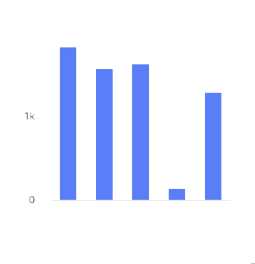 | A column chart shows data represented by vertical rectangular bars. The length of the rectangle is proportional to the value it represents. | The Column chart requires numeric columns. | Qualitative, divergent, and sequential. |
Bar chart 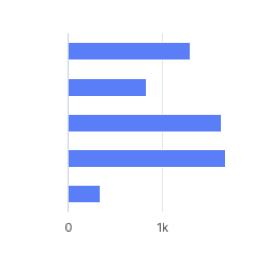 | A bar chart shows data represented by horizontal rectangular bars. The length of the rectangle is proportional to the value it represents. | The Column chart requires numeric columns. | Qualitative, divergent, and sequential. |
Line chart 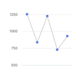 | A line chart shows information as a series of data points connected by a line. | Use when you want to show magnitude or change over time. | Qualitative. |
Pie chart 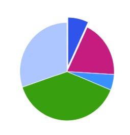 | A pie chart shows proportions of values in a data set. | Use when you want to show how the proportion of different groupings relate to one another. | Qualitative. |
Donut chart 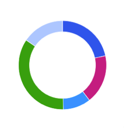 | A donut chart shows proportions of values in a data set. | Use when you want to show how the proportion of different groupings relate to one another. | Qualitative. |
Scatter plot 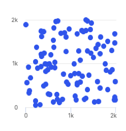 | A scatter plot uses coordinates to show values for two or more variables in a data set. Each point represents one value. The position on the horizontal and vertical axis are determined by two variables. | Use when you want to show correlation between two variables. Use caution when showing correlation - remember, correlation does not equal causation. Good for exploring relationships rather than drawing conclusions. | Qualitative, divergent, and sequential. |
Treemap  | A treemap helps you find patterns in your data by providing a hierarchical view of your data. | Use when you want to compare proportions within the hierarchy. | Divergent and sequential. |
Dumbbell chart 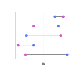 | A dumbbell chart shows the change between two data points using circles and lines. | Use when you want to display the change and distance between two data points. | Not compatible with palettes, but you can customize the displayed colors. |
Simple gauge chart 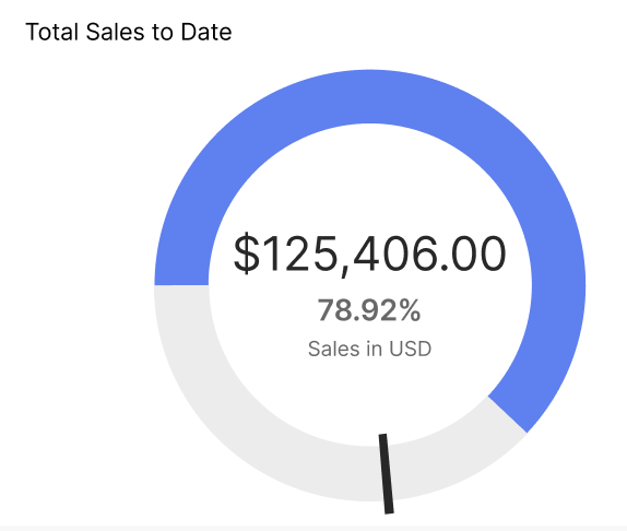 | A simple gauge chart uses a dedicated dial with different colours and a needle pointing to a numeric value from a minimum to a maximum. With this chart, you can easily visualize linear progressive data on the colour-coded dial and see the change in values using the scale. | Use to depict sales performance by representing targets and if they've been achieved. | Not compatible with palettes, but you can customize the displayed colors. |
Activity gauge  | An activity gauge shows whether values fall within an acceptable range by having multiple panes circle around a center point. | Use when you want to show where data points fall within a range. | Qualitative. |
Heat map chart 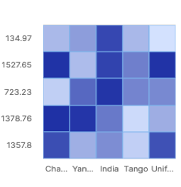 | A heat map uses color to show how a variable is clustered or occurs most frequently. | Use when you want to reveal patterns or show the concentration of events. | Divergent and sequential. |
Bubble chart 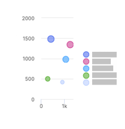 | A bubble chart shows three dimensions of data. Each bubble represents a data point with 3 variables. Variable 1 and variable 2 determines the bubble's location on the horizontal and vertical axis. Variable 3 determines the bubble's size. | The Bubble chart can use both text and numeric input. | Qualitative. |
Waterfall chart 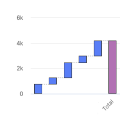 | A waterfall chart shows an initial value and final value with floating intermediate values that affect the initial value positively or negatively. | A waterfall chart can help you understand cumulative effects of values. | Not compatible with palettes, but you can customize the displayed colors. |
Clustered column chart 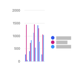 | A clustered column chart represents two fields from the same source for the same value in clustered vertical columns. | Use when you want to compare multiple series of data. | Qualitative, divergent, and sequential. |
Multiple lines chart 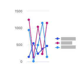 | A multiple lines chart uses multiple lines to show the correlation between data from the same source. | Use to show the relationship between data from the same source. | Qualitative. |
Bullet chart 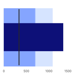 | A bullet chart is a variation of a bar graph that can be used as an alternative to gauges and meters. | Use to compare the performance of a value to other values. | Not compatible with palettes, but you can customize the displayed colors. |
Stacked column chart 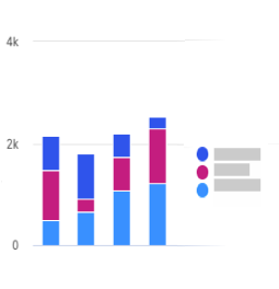 | A stacked column chart shows data represented by vertical rectangular bars with comparative values stacked on top of each other. Each group is represented by two or more vertical bars. The length of the rectangle is proportional to the value it represents. | The Column chart requires numeric columns. | Qualitative and sequential. |
100% stacked column chart 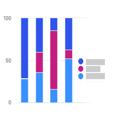 | A 100% stacked column chart shows the relative percentage of multiple data sets in stacked columns, where the total of the stacked columns equals 100%. | Use this chart to show how parts of the data relates to the whole data set. | Qualitative and sequential. |
Stacked bar chart 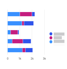 | A stacked bar chart shows data represented by horizontal rectangular bars with comparative values stacked on top of each other. The length of the rectangle is proportional to the value it represents. Each group is represented by two or more horizontal bars. | The Column chart requires numeric columns. | Qualitative and sequential. |
100% stacked bar chart 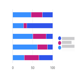 | A 100% stacked bar chart shows the relative percentage of multiple data sets in stacked bars, where the total of the stacked bar equals 100%. | Use this chart to show how parts of the data relates to the whole data set. | Qualitative and sequential. |
Clustered bar chart 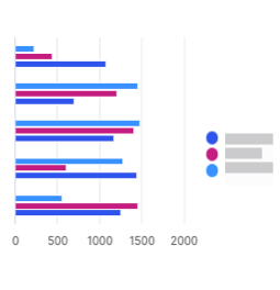 | A clustered bar chart shows more than one data set in clustered horizontal columns. | Use when you want to compare multiple data sets in a given category. | Qualitative, divergent, and sequential. |
Area chart 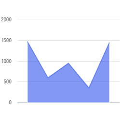 | An area chart is similar to a line chart, but with shaded areas between the line and the axis. | Use when you want to show magnitude or change over time. | Qualitative. |
Stacked area chart 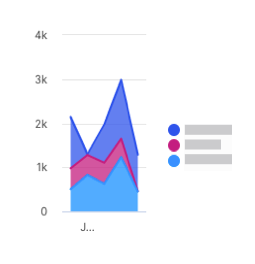 | A stacked area chart is a type of area chart that shows connected data points with comparative values stacked on top of each other. This chart shows a starting set of values, and then uses shading to show values above the starting values. | Use when you want to show the total value of some data broken down by sub-groups. | Qualitative. |
Multiple area chart 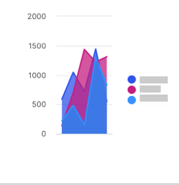 | A multiple area chart is a type of area chart that shows connected data points where each data point is compared to the same baseline value. Since data points will sometimes overlap in a multiple area chart, you will see some transparency in the shading so that all the lines can be easily seen. The data point with the most visible color is the largest value. | Use when you want to compare data points across the same baseline. | Qualitative. |
Multiple scatter chart 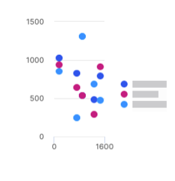 | A multiple scatter chart is similar to a scatter plot chart, but uses multiple data sets instead of a singular data set. | Use this chart to compare how multiple data sets intersect values on each axis. | Qualitative and sequential. |
Line and column chart 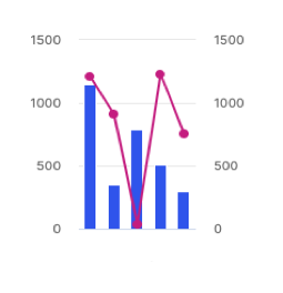 | A line and column chart combines a line chart and a column chart. Both the line and column charts will share an x-axis, but each has its own y-axis. | Use to display two data sets together when the ranges between the two greatly vary. | Qualitative. |
Lines and columns chart 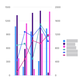 | A lines and columns chart uses multiple bars and lines to show different data sets through the use of multiple y-axes, where each series has a separate axis. | Use when you want to compare and analyze trends in a single visualization. | Qualitative. |
Radar chart 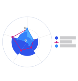 | A radar chart shows 3 or more variables represented on an axis starting from the same point. | Use this chart to show how qualitative data points compare to one another. | Qualitative. |
KPI chart 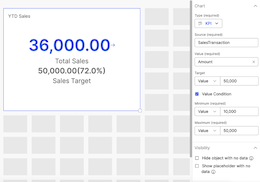 | A KPI chart displays key values with customizable visualizations and styling options. | Use this chart to track progress towards a numeric goal. | None. Default colors are available for the user to change. |
Adding tables to an agreement
Add tables to your agreement to systematically present your data insights.
Click the
 button to open the menu. Drag and drop a object onto the canvas.
Drag the corner of the table on the canvas to resize it.
From the tab, select the data source for your chart. Choose the columns that you want to display in the table. Configure the sort order of how you want to display the columns.
Under settings, you can choose how the object renders if there is no data to show. The Show object with no data option will have objects with no data render as empty. The Hide object with no data option hides the object and other objects in the report shift up to fill the space. The Show placeholder with no data option gives the user a "No data to show" message.
Note
Adding external links to columns is disabled.
From the tab, you can change how your table looks.
From the tab, you can apply filters to the data in your table.
Basic filters allow you to filter out data based on a value in a column. Advanced filters allow you to filter out data based on complex rules. For more information on filters, read: Adding filters to an agreement.
Aggregating table values in an agreement
Change how numeric data is aggregated in the table.
Note
Aggregating data disables column edits.
From the Data tab, under Row Groups, select a column to group table row data by. You can add multiple row groups.
Drag and drop the selected columns to change the hierarchy of row groups.
Under Values, select a column to aggregate its values. You can aggregate multiple columns.
A default aggregate function is applied, and a row total displays at the bottom of the table.
Next to the aggregated value, click the more options menu (...).
Select one of the following aggregate functions:
Sum: the total value of the column.
Average: the average value of the column.
Count: the number of rows that are in the columns.
Maximum: the highest value in the column.
Minimum: the lowest value in the column.
From the Style tab, under Values, you can change how the row total looks:
Type a title.
From the Style drop-down menu, select Custom and edit as needed.
To hide the row total, select the Hide row total checkbox.
Adding calculated columns to tables
Create calculations in your tables using a combination of table elements, operators, formulas, and numbers.
Drag and drop a table object into the canvas.
Select a Source table with a numeric value and select Columns that you wish to add to your plan document.
Click Save.
Click on the
 button.
Enter a Name for your calculation, and create a Formula using the available operators, functions, and sources.
Important
Aggregation functions such as average, sum, minimum, and maximum cannot be used for calculated column row groups at this time.
You can use several formula functions to set up the calculations in your Presenter Adaptive report.
Table 75. Formula functionsFunction
Description
Example
Syntax
Notes
ABS()You can use this operator to take the value within the brackets and show the number as a positive, regardless of whether the value within the brackets is positive or negative.
If you want to show the difference between this month's sales and last month's sales as a percentage, but you do not want the percent change to be a negative value, use a formula similar to the following example:
ABS(Current - Prior)/PriorABS(Value)AND()This operator returns results if all conditions are true. If you use the
ANDoperator to return results for Logical Test 1 and Logical Test 2, results that include both Value 1 and Value 2 are returned.If you want to show results for transactions that are bigger than $1,000 and less than $10,000, use a formula similar to the following example:
AND(SourceTable.ValueColumn > 1000, SourceTable.ValueColumn < 10000)AND(Logical Test 1, Logical Test 2)AVG()This operator takes the average of the value within the brackets.
If a product has a set price, but sales reps can sell above or below this price, the following formula compares their average monthly sale value to the set price and pays commission based on their gross margin:
(AVG Sale - Set Price)/ Set PriceAVG(Value)COUNT()This operator gives a value of 1+ for each record that has a value. The value of each record is one more than the previous amount.
To calculate the total number of deals in a period:
COUNT(SourceTable.ValueColumn)Count(Value)If the data is partitioned by PayeeID and Month, the count will reset back to zero after each month and start again.
IF()You can use this operator to perform a logical test and provide a true and false result.
If the sale amount is greater than $100, you receive a 5% commission. Otherwise, you receive a 2% commission.
IF(Data.Value > 100, Data.Value * 0.05, Data.Value * 0.02)Nested
IF()example:If your sale amount is greater than $100, you receive 5% commission. If your sale is greater than $50, you receive 3%; otherwise, you receive 2%.
IF(Data.Value > 100, Data.Value * 0.05, IF(Data.Value > 50, Data.Value * 0.03, Data.Value * 0.02))IF(Logical Test, True Result, False Result)To include text columns in IF functions, you must disable the Enforce best practices for formulas option in Model settings
→ More options → Calculation.
ISEMPTY()This operator takes a numeric or text field and provides a true result if the field does not have a value (the equivalent of NULL in the database).
IF(ISEMPTY(Source.Salary), Source.Wage, Source.Payout)ISEMPTY (Value)NOT()This operator returns results when a condition is not met. You can use this function to exclude records from your results.
If you want to apply a 5% commission to all transactions, except when the transaction value is less than $1,000, use a formula similar to the following example:
SUM((SourceTable.ValueColumn) *0.05, NOT(SourceTable.ValueColumn < 1000))NOT(Logical Test)OR()This operator returns results if one or more conditions are true. If you use the
ORoperator to return results for Logical Test 1 or Logical Test 2, any records with either value are returned.If you want to show a result of 1 for values that fall between 10,000 and 20,000 and a result of zero for all other values, use a formula similar to the following example:
IF(OR(SourceTable.ValueColumn < 10,000, SourceTable.ValueColumn > 20,000),0,1)OR(Logical Test 1, Logical Test 2)POW()This is used to create an exponent. Instead of using A^B for A to the power of B, Incentiveswill use the formula
POW(A,B).If you want to calculate the value of a deal which is sold today but paid upon completion in 5 years, use a formula similar to the following example:
Present Value = Future Value / (1+Interest Rate)^TermIf you will be paid 20,000 in 5 years where the interest rate is 5% the formula would look like this:
20,000 / POW((1+.05),5)POW(Value, Exponent)ROUND()This operator uses round-to-even rounding (also known as Banker's Rounding) to round the results in the brackets. You can find more information about rounding below this table.
If you want to round your results to the nearest cent, use a formula similar to this example:
ROUND(Result, 2)ROUND (Value, Decimal Places)You must specify the value you want to round, then the amount of decimal places you want to round to. Type 0 for a whole number, 1 for one decimal place, 2 for two decimal places, etc.
ROUND DOWN()This operator rounds the results in the brackets down by the number of defined decimal places.
If you want to round your results down to two decimal places, use a formula similar to the following example:
ROUNDDOWN(Result, 2)ROUND DOWN (Source Table. ValueColumn, num_digits)num_digitsin the number of digits to which you want to round the number.If
num_digits> 0, then the number rounds down to the specified number of decimal places.If
num_digits= 0, then the number rounds down to the nearest integer.If
num_digits< 0, then the number is rounded down after the decimal point.SUM()This operator takes the aggregate of whatever is within the brackets and provides a total.
To calculate 5% of the value of each sale as commission:
Sum(SourceTable.ValueColumn) *0.05Sum(Value)The use of
SUMis recommended for most calculations as it will provide you with the proper summed amount for your calculation.MIN()This operator takes the minimum value of a set of results.
If 5% commission is paid on each deal to a maximum of $100, the following formula pays either 5% commission or $100, whichever is less:
MIN(Data.Value*0.05 , 100)MIN()can also be used on a single value to be used as an aggregate function (likeSUM, AVG, COUNT):MIN(Data.Value)MIN(Value1, Value2, Value3, etc.)MAX()This operator takes the maximum value of a set of results.
If, for each deal, you receive a 5% commission but there is a minimum of $5 per deal you earn, you can use the following formula to determine whether the 5% commission is higher than the $5 minimum:
MAX(Data.Value*0.05, $5)MAXcan also be used on a single value to be used as an aggregate function (likeSUM,AVG,COUNT). For example,MAX(Data.Value)MAX(Value1, Value2, Value3, etc.)If you have an if statement similar to the following example:
IF(A>B,A,B), you may want to use theMAXoperator.How does rounding work? In Incentives, the rounding function uses round-to-even rounding (also known as Banker's Rounding) to round the results in the brackets. The round-to-even method is similar to the common method of rounding, except when the digits following the rounding digit start with a five and have no non-zero digits after it. For example, with common rounding, 4.5 is rounded to 5, but this value is just as close to 4 as it is to 5. With the round-to-even method, 0.51 rounds to 1, but 0.5 rounds to 0.
When a negative value is passed in the second parameter, the value is rounded up or down at the index to the nearest even integer.
Table 76. Comparing the round-to-even and common methods of roundingRound-to-even method
Common method
3.016 rounded to hundredths is 3.02
3.016 rounded to hundredths is 3.02
3.013 rounded to hundredths is 3.01
3.013 rounded to hundredths is 3.01
3.045 rounded to hundredths is 3.04
3.045 rounded to hundredths is 3.05
Select the value format, number of decimal places, display units, and decide whether you want to use the thousands separator.
Click Add.
Under the Style tab, you can change the styling and formatting of the columns.
Important
Aggregation functions such as average, sum, minimum, and maximum cannot be used for calculated column row groups at this time.
You'll notice that the added calculation is now one of the columns on the data grid. From the Data tab, you can drag and drop to rearrange the order of how the columns are displayed on the table.
Note
You have the option to hide, add links, edit the calculation, rename, and delete the calculation column by clicking on the more options menu (...) of the calculation.
Click Save.
Default custom sort columns in tables
Customize the order of how the data in a column is displayed in tables for an Admin or Payee. You can set the default order and sort one or more columns in an ascending or descending order. This enables you to quickly visualize and analyze your data.
Drag and drop a table object into the canvas.
Select a Source and the Columns you want to show.
Under the Default sort header, select Configure sort order.
Select the column you want to sort and the order in which it will be sorted.
Note
To sort additional columns or to identify the sort order of two or more columns that have the same values, click the + Add sort button (which can be found in the Configure sort order tab) and arrange the sort order.
Click Done, and Save your report.
In the Sales Portal, you can see that the data table has now sorted the columns in the order you indicated. The numbers beside the column names serve as an index and indicate the order of how the columns are sorted.
Tip
In the Sales Portal, you can add another column to sort by clicking and holding the Shift key on the header of a specific column. To go back to how the columns were originally sorted in the Admin page, click refresh.
Adding conditional formatting to an agreement
Change how values are formatted in a table.
From the tab, under , click .
Choose whether to apply conditional formatting to the table header or to the table values.
Select the columns where you want to apply conditional formatting.
Click .
Type a formula to define the condition under which you want a value to render.
Or use the , , and menus to define your formula.
Tip
If you are applying conditional formatting to a table header, you must aggregate the source in your formula.
Click .
Define how the cell should appear if the condition is met by changing the font style, cell colors, or how the value is displayed.
Click .
If you want to edit a condition, from the tab, under , click the more options menu (...) and then click .
Setting wrap text for editable text input fields
Editable text fields in agreement tables (including text, email, URL, or comments) configured with Wrap text will utilize a multi-line scrollable text area to accommodate larger text values. When the Wrap text option is enabled, the text area will dynamically adjust based on the content - displaying as a single line for short entries and expanding to fit multiple lines as needed. For content that exceeds the maximum height threshold (approximately 3.5 lines or the height of the tallest column), a vertical scroll bar will appear for easy navigation when column editing is allowed.
Drag and drop a table object onto the canvas.
Select a data source, and add table columns.
To set editable columns:
From the Data tab, under Web user options, turn on the Allow column edit toggle.
Click Column edit settings.
Turn on the toggle for the columns that you want to make editable.
From the Style tab, under Column, select an editable column.
From the Style tab, under Column, turn on the Wrap text toggle.
To set auto-expanding text fields:
Make sure that the column is editable.
Turn on the Wrap text toggle for that column.
Save your report.
Adding a reshaped table object to an agreement
You can add a reshaped table to your plan document agreement to quickly aggregate and showcase large datasets, facilitating data analysis and comprehension for your payees.
Click
Add object.
Select Reshaped table, then drag and drop the object to your desired position on the canvas.
In the Data tab, select a data source type.
Select the source.
If data source is selected as the source type, choose the columns you want to display in the reshaped table.
If workflow is selected as the source type, choose between workflow status and workflow history as the source.
In the Table configuration section, select the columns to include. You can rearrange the order of the columns by clicking the sort button
and dragging into the desired order.
Select a single column as the Header.
Select a single column as the Values.
In the Style tab, you can add a colored background to the tile and format each of the columns.
In the Filters tab, you can add filters to your agreement to control what data is available for web users.
In the Visibility tab, you can add conditional visibility rules to the reshaped table.
Click Save.
Adding values to an agreement
Add values to your agreement to show additional data or to scale back the results of a data source to a single cell.
Click on the
 icon, and click .
Add a name for the value and select the data source. Select the column that contains the values you want to display.
Set the ID column values. The number of values you have to set depends on the number of key columns in the source table.
Click .
To edit a value, click on the ellipses beside the value's name. Click after editing.
Adding images to an agreement
Click the
 button to open the menu. Drag and drop an object onto the canvas.
Drag the corner of the image on the canvas to resize it.
On the Style tab, select the image file you want to upload and add a colored background to the tile.
Enable Display tile to stretch the uploaded image to fit your image tile.
Click Save.
Adding an image that links to an external page or a report
You can add a http/https link to a web address or any corresponding report. To add a link to an image object in your agreement:
Click the
 button to open the menu. Drag and drop an object onto the canvas.
Drag the corner of the image on the canvas to resize it.
On the Style menu, select the image file you want to upload.
Click , and select or under .
To link a web address, select if the web address is a secure (https) or non-secure (http) URL.
If you want to insert a variable in the URL, place your cursor in the URL where you want to insert the value and select a value from the menu. In the text box, enter the URL. Click .
To link a report, select either or and select the report you want to add.
If a report has more than one assigned web tab, select a web tab and add any necessary parameters. Click .
Click .
Adding images based on conditions
You can set conditions for when specific images should appear in your agreement.
Click the Add object
 button to open the menu. Drag and drop an image object onto the canvas.
Drag the corner of the image on the canvas to resize it.
Select Upload image based on set conditions.
Upload a default image that will be displayed when no conditions are met.
Click Add condition to create a new condition.
Enter a name of the condition.
From the Result pane, upload an image that will be displayed when this condition is met.
From the Condition pane, set the condition based on any existing parameter or stored value, and click Add to save the condition
From the Condition pane, click
 to add multiple conditions.
Note
The image associated with the first valid condition in the list will be displayed. If no conditions are met in the list, then the default image will be displayed.
Click Save.
Duplicating a component
To reduce the time it takes to build agreements, we now bring you the ability to duplicate charts, tables, images, text, and pick list in your agreement.
To duplicate a component:
Select an exiting component and click on the duplicate
 icon on the bottom left corner.
A duplicate version of the component will be created. The duplicate component will include 'Copy' within it's name - for example, Transaction (Copy).
The duplicate component retains all the styling components of the original including color, font size, conditional formatting, palettes and more.
Place the duplicated component anywhere on the agreement canvas.
Update the duplicate component as you would an item created using the left panel. You can change source, update styles and tiles and more as you see fit.
Adding filters to an agreement
You can add filters to your agreement to control what data is available for web users. You can add filters to the following objects:
Table object
Reshaped table object
Chart object
Metric object
List object
Payee object
Select the object you want to filter.
Select the Filter tab.
Click .
Adding a basic filter
A basic filter controls which data users can see based on a value in a column you select.
Select from the menu.
Select the column that contains the values you want to filter on.
Select whether you want to filter by or .
If you are filtering by , select the values you want to filter on.
If you are filtering by , create a rule by selecting an operator and a value. You can also select a global value like the web user ID (the user currently logged in) or the current date.
Tip
You can add one additional rule to basic filters. For more complex filters with 3 or more rules, use an advanced filter instead.
Adding an advanced filter
Advanced filters allow for a more customized interaction with your data.
Select from the menu.
Type a description for your filter.
Tip
A detailed description can help you remember the purpose of your filter. This is useful if you have many complex filters in the same report.
Select the first filter rule by selecting a source column, an operator, and a value. You can also select a global value like the web user ID (the user currently logged in) or the current date.
Click the
 button to add another rule or group.
When you add a group, it adds a sub-level underneath the first group. You can then select or to change the operation type.
You can drag and drop your rules and group to reorder the operations.
Linking a text item to a report or a web address
Create a link from a text item to a Presenter Adaptive report, Presenter Structured report, or a web address.
Click the
 button to open the menu. Drag and drop a object onto the canvas.
Drag the corner of the text box on the canvas to resize it.
Enter the text and highlight the text where you want to create a link towards.
Click on the Add link
 button, and select or under . You have the option to open the link in a new tab. To do so, check Open link in new tab under Options.
To link a web address, select if the web address is a secure (https) or non-secure (http) URL.
If you want to insert a variable in the URL, place your cursor in the URL where you want to insert the value and select a value from the menu. In the text box, enter the URL. Click .
To link a report, select either or and select the report you want to add.
If a report has more than one assigned web tab, select a web tab and add any necessary parameters. Click .
Click .
Adding a payee object to an agreement
You can add a Payee object to your agreement for a convenient way to view payee information.
Click
Add object.
Select Payee then drag and drop the object to your desired position on the canvas.
Select a data source with your payee information.
In the Filter tab, add a filter to ensure that you're only viewing one payee's data at a time.
Note
The Payee object can only support one row of data per payee at this time.
Select a column to populate the Name field of the Payee object.
Select columns to populate the Payee ID and Title fields of the Payee object.
Note
To add a payee profile picture, first add a column to the Payee ID field.
Add any additional custom fields by selecting the columns you want to add. To change the name of the field, click ... → Rename.
You can rearrange the order of the fields as they appear on the Payee object by clicking
and dragging the fields into the desired order.
In the Style tab, you can add a colored background to the tile and format each of the fields.
In the Visibility tab, you can add conditional visibility rules to the Payee object.
Click Save.
Adding a metric object to an agreement
With the Metric object, you can access essential summary metrics about your sales with ease.
Click
Add object.
Select Metric, then drag and drop the object to your desired position on the canvas.
Under the Data tab, select a data source with your metric information.
Enter a column name for the Metric value.
Note
If the source column has multiple rows, the resulting Metric value will be the sum of all rows.
Under Format, select the Metric value format, Currency type, number of decimal places, display units, and decide whether you want to use the thousands separator.
Under Icon and label, select icon, label, and description for the Metric value.
Under Links, click + Add link to add a link to the Metric object.
To link to a web address, select if the web address is a secure or a non-secure URL. If you want to insert a variable in the URL, place your cursor in the URL where you want to insert the value and select a value from the menu. In the text box, enter the URL, and click Add.
To link to a report, select either Presenter Adaptive or Presenter Structured and select the report you want to add. If a report has more than one assigned web tab, select a web tab and add any necessary parameters, and click Add.
To apply filters to your list object, read: Adding filters to Presenter Adaptive reports. If you wish to set conditional visibility rules to your list object, see: Setting conditional visibility rules for Presenter Adaptive objects.
Applying conditional formatting to a Metric object
You can define conditional formatting rules that determine the text and background color of a Metric object based on its value. By setting a threshold using a source column or numeric value, the formatting will automatically apply when the Metric value meets or exceeds that threshold. You can choose the formatting style that applies to the Metric object including options for value, description, label, and link. The preview feature allows you to see real-time changes, and view the formatting before finalizing it.
Note
Conditional formatting will be applied on the Metric value greater than or equal to the set threshold.
Click the Add object
 button to open the menu. Drag and drop a Metric object onto the canvas.
Refer to Add Metric object for selecting a data source and setting Metric value, format, icon, and link.
Under Conditional format, click + Add condition.
Set the Threshold by selecting a source column or a static value.
Under Tile background, turn on the Display background toggle if you wish to apply background color to your Metric object tile.
You can choose between a Solid or Gradient background color.
Click on the Metric value formatting color block and choose a color to apply to the Metric value.
Under Label and description, click on the individual color block and choose a color to apply to the label and description of the Metric object.
Click on the Link formatting color block and choose a color to apply to the link of the Metric object.
Preview the formatting of the Metric object, and click Add.
The saved condition will appear under Conditions.
Note
You can create multiple conditions for a single Metric object. Conditional formatting will apply to the first valid condition in the list.
Adding a group object to an agreement
You can add a Group object to your agreement for an easy way to group multiple objects into one tile.
Note
You need to add at-least one visible object for your Group object to show up on your agreement canvas. If your Group object contains only hidden objects, it will stay hidden as well.
Click
Add object.
Select Group then drag and drop the object to your desired position on the canvas.
Click Configure group to add objects to the group. From the drop-down list, click
 next to the name of the existing object you want to add. You can also search for a specific object's name.
Click Add new object to group , and select an object from the list to add a new object to the Group object. Set up each item within the group just as you would individually on the agreement canvas.
Note
To remove an object from the group, click
next to the name of the object you want to remove.
To configure the layout of the group, click the object you want to move and drag it to your desired position on the group canvas.
Note
If you change the size of an object in the group canvas, the size of the object will also change in the report canvas.
In the Style tab, you can add a header or a colored background to the tile.
Tip
If you add a header to the tile, you can choose whether to allow the group to be collapsible in Sales Portal, or to expand the group by default.
In the Visibility tab, you can add conditional visibility rules to the Group object.
Adding a list object to an agreement
With the List object, you can create visually appealing and highly customizable lists.
Click
Add object.
Select List, then drag and drop the object to your desired position on the canvas.
Under the Data tab, select a data source.
Under Items, select the items you want to display on your list.
Under Count, turn on the Display numbered list toggle to number the items on your list.
Select and drag the Number of items scroll bar to decide how many items you want to display on the list. The default items on the list is restricted to 5, and the list cannot exceed to more than 20 items.
Under Values, click + Add column to add a corresponding value to each item in the list.
Choose to display the list in Ascending or Descending order.
Note
For date fields, the oldest date will be considered the lowest value, and the latest date (could be a future date) will be considered the highest value.
Under Links, click + Add link to add a link to the List object.
To link to a web address, select if the web address is a secure or a non-secure URL. If you want to insert a variable in the URL, place your cursor in the URL where you want to insert the value and select a value from the menu. In the text box, enter the URL, and click Add.
To link to a report, select either Presenter Adaptive or Presenter Structured and select the report you want to add. If a report has more than one assigned web tab, select a web tab and add any necessary parameters, and click Add.
Turn on the Enable export to Excel toggle to export the list to Excel.
Note
Only records shown in the List object will be exported to Excel.
To apply filter to your List object, read: Adding filters to an agreement. you wish to set conditional visibility rules to your List object, read Setting Conditional Visibility rules for agreement objects.
Adding a divider object to an agreement
Keep your agreement organized with the Divider object to visually separate sections of your agreement.
Click
Add object.
Select Divider, then drag and drop the object to your desired position on the canvas.
Drag the corner of the divider on the canvas to resize it.
Under the Data tab, turn on the Display divider in PDF export toggle to display the divider in the PDF file export.
Under the Style tab, select the color palette menu to select a color for the divider. You can also select a custom color with the color picker or enter a hex code into the color field.
If you wish to set conditional visibility rules to your Divider object, read: Setting Conditional Visibility rules for agreement objects.
Adding a callout object to an agreement
Add callouts to help engage your readers when you need them. We have different callout types to help your message stand out. Control when your callouts appear with conditional visibility.
Click the Add object
 button to open the menu. Drag and drop a callout object onto the canvas.
Drag the corner of the callout on the canvas to resize it.
From the Data tab, you can choose to display a title. To display a title, turn the toggle on. Enter the title in the text box that appears.
Enter your callout message in the Message text box.
To add a link, click Add link.
Add a Label in the text box.
You can choose to open the link in a new tab using the toggle.
Select a Web address or Report as the link destination.
Click Add.
In the Style tab, you can select the message type. To display or remove the icon at the start of your callout, use the Display icon toggle.
Use the Alignment section to set the vertical alignment of the callout message within the designated space on the canvas.
From the Visibility tab, you can choose to set conditional visibility for the callout object.
Click the Add condition button to open the menu.
Set the dropdown to either If any or If all as required.
Select a source from the dropdown and configure your rule.
Click on the plus button
 to add additional conditions or sub-conditions as needed.
Click Save.
Adding a colored background to your agreement objects
You can add a colored background to your tiles for Text, Image, Table, Chart, Payee, Metric, Group, and List objects. The background can be a solid color or a color gradient.
Add a Text, Image, Table, Chart, Payee, Metric, Group, or List object to your agreement.
In the Style tab, under Tile background, turn on the Display background toggle.
For a solid color background, select
Solid and choose your color.
For a gradient background, select
Gradient.
Choose a starting and ending color for your gradient.
Select the angle of the gradient.
Click Save.
Adding a header to your agreement objects
You can add a header to your tiles for Image, Chart, Table, Group, and List objects.
Add an Image, Chart, Table, Group, or List object to your report.
In the Style tab, under Tile header, turn on the Display header toggle.
Add a title and description. You can change the font color of the title and description and style it to be bolded, italicized, or underlined.
Click Save.
Adding dynamic currencies to agreement objects
You can dynamically display different currencies in the following objects:
Table object
Chart object
Metric object
You can use parameters and stored values to dynamically display different currencies based on the payee viewing the objects. This will allow you to add custom currencies not included in our system table.
Select an agreement object.
Add parameter or stored value that will determine the currency symbol.
Note
The source table for your stored value must include Payee ID and Currency columns.
You can customize your source table with any currency of your choosing.
Under Format, choose the stored value as your currency.
When the payee views their report, they will see the currency symbol associated with their Payee ID.
Modern agreement style
Agreements can be created in two different report styles:
Modern: this matches the latest agreement experience
Classic: this is the classic agreement style
Note
All new Plan document agreements will be created in the Modernstyle.
In the Modern style, you will see these differences:
Rounded corners for all the tiles in your agreement
A rounded grid style in a darker color
An update to the styling of the header, border, and padding of charts
An update to the styling of the header, border, and padding of tables
An update to the styling of the title, border, and padding of pick lists
The ability to add a gradient background to Bubble and Simple Gauge charts
If you would like to change the agreement style back to Classic, follow these steps:
From the agreement canvas, click Report options
.
Under General style, click Classic.