Presenter Adaptive
In Varicent Incentives, use Presenter Adaptive to create flexible reports for any device.
To access Presenter Adaptive reports, click the Reports module, select Create and Presenter Adaptive in the drop-down menu.
To learn more about building and using Presenter Adaptive reports, refer to the following training material on the Varicent Academy:
Creating a Presenter Adaptive report
You can create a Presenter Adaptive report through the Reports module in the Incentives sidebar.
In the Reports module, click Create and select .
Choose between creating a blank report or one of the report templates.
Click Next.
Choose between creating a Presenter Adaptive report that connects to a Report Data Model or creating a Presenter Adaptive report that does not connect to a Report Data Model.
Click Create report.
Add a report name.
Note
You can save your report only after you add a report name.
To add objects to your report, click the Add object
 icon on the sidebar. Select the object that you want to add and drop it onto the report canvas. You can resize the object from the canvas.
If you are using a template that already contains content, you can resize the existing objects as needed. Add content to the objects as described below.
You can add both static text and dynamic values to many objects. Dynamic values include values like the current web user name or any stored values you've added to the report. For more information on adding dynamic text to your report, read: Adding dynamic text to a Presenter Adaptive report
You can add these objects:
Text
You can add text, choose from different available fonts, add a colored background, format the text style and change alignment of the text object. By checking the Hide tile option, the background of the object becomes transparent. To find out more about adding a text object, see: Adding a text object to a Presenter Adaptive report.
Image
You can upload an image or use the current web user's uploaded profile picture by selecting Use current web user image. You can also add a colored background to image objects.
Table
You can add a table by adding a data source under the Data tab. From this tab, you can format the data and table and add filters and links. For more information about filters, read: Adding filters to a Presenter Adaptive report.
Reshaped table
You can add a reshaped table to aggregate and showcase large datasets, facilitating data analysis and comprehension for your payees. To learn more about reshaped tables, see: Adding a reshaped table object to a Presenter Adaptive report.
Chart
You can add charts to enhance your reports. For more information about charts, read: Presenter Adaptive charts.
Pick list
You can add a pick list by adding a data source under the Data tab. From this tab, you can format the data and pick list and add filters. For more information about pick lists, read: Adding a pick list object to a Presenter Adaptive report.
Multi-select pick list
You can add a multi-select pick list to select multiple values to control your report content. You can filter conditions throughout the report to limit records displayed or hide objects on the report. To learn more about multi-select pick lists, see: Adding a multi-select pick list to a Presenter Adaptive report.
Date picker
You can add a single Date picker object to set up filters on your Presenter Adaptive report to limit displayed records. For more information about this object, read: Adding a single date picker object to a Presenter Adaptive report.
Date range picker
You can add a date range picker to allow users to filter your reports by start and end dates. The Date range picker can be used to filter results on a table, chart, or pick list. For more information about date range pickers, read: Adding a date range picker object to a Presenter Adaptive report.
Control menu
You can add pick lists, single date pickers, and date range pickers directly to a drop-down Control menu making your report layout more clean and organized. For more information about control menus, read: Adding a control menu object to a Presenter Adaptive report.
Row input form
You can add a row input form to submit new rows of data into a table. To learn more about row input forms, read: Adding a row input form object to a Presenter Adaptive report.
Video
You can add videos and set up how they will be shown on your reports. To learn more about adding videos to Presenter Adaptive reports, read: Adding a video object to a Presenter Adaptive report.
Payee
You can add a Payee object to your Presenter Adaptive report for a convenient way to view payee information. For more information, read: Adding a payee object to a Presenter Adaptive report.
Metric
Adding a Metric object allows you to access essential summary metrics. For more information, read: Adding a metric object to a Presenter Adaptive report.
Group
Adding a group is an effective way to organize objects into one tile. To add a group, read: Adding a group object to a Presenter Adaptive report.
List
You can use the List object in your reports to add visual appeal. For more information, read: Adding a list object to a Presenter Adaptive report.
Divider
A divider is a great way to keep your reports organized by adding visual separations. For more information, read: Adding a divider object to a Presenter Adaptive report.
Callout
You can add callouts to grab attention in your reports. Control when your callouts appear with conditional visibility. To learn more about callouts, read: Adding callouts to a Presenter Adaptive report.
The object will have a default name. The object name can also be customized. A description can be added and formatted.
Note
The object name will help identify which object is being used by a specific parameter or stored value.
To build and view the report with actual data instead of placeholder data, complete the following steps:
Click on the Report options
 icon and turn on the Display data toggle.
Select a web user to populate the report with their data, and click Apply.
For more customization options, click on the Report options
 icon. From here, you can:
Upload a background image or color
Set preferences for PDF downloads and specify PDF settings
Allow single save
Set general style preferences
Toggle between a Modern or Classic style. For more information about the different report styles, read Modern report style.
Note
All new reports are created in the Modern report style.
Manage chart palettes
Manage report security
You can assign a workflow to the report while editing a Presenter Adaptive Report. Assigning a workflow in Presenter Adaptive allows you to assign Workflows to Reports that have not yet been published to payees. For more information see: Assigning workflows to a report.
Connect to a Report Data Model
Click Save as to save your report.
Choose Draft to save a report in progress, not yet ready for sharing. This allows you to save your report before configuring all data sources, and return later to finish your report.
Choose Published to save a report that is completely configured. You can still return and make edits to these reports, but they cannot return to draft status. Saving a report as published for the first time does not share it to sales portal. To share your report see: Sharing and publishing Presenter Adaptive reports.
Click Preview to see a preview of your report.
There are three views for your Presenter Adaptive report:
Desktop
Tablet
Mobile
Each view can be formatted differently, so make sure to set the layout for desktop, tablet, and mobile separately.
For help with publishing and sharing your report, read: Sharing and publishing Presenter Adaptive reports.
Caution
If you're creating reports with a lot of data, you could encounter errors. Pick list selections are limited to 10,000 rows. Publishing large tables is also limited at 10,000 rows and could lead to timeout errors.
To learn more about creating Presenter Adaptive reports, take the Creating Presenter Adaptive Reports course.
Adding a colored background to your objects
You can add a colored background to your tiles to enhance the look and feel of your Presenter Adaptive report.
From the Reports module, click the
 Add object button to open the menu.
You can add a colored background to the following Presenter Adaptive objects:
Text
Image
Table
Chart
Video
Row input form
Payee
Metric
Group
List
In the Style tab, under Tile background, enable the Display background toggle.
Select one of the following options:
Solid
Click
Solid and select a color.
Gradient
Click
Gradient, then select a starting and ending color, and the angle of the gradient.
Click Save.
Adding a header to your objects
You can add a header to your tiles for Image, Video, Chart, Table, Row input form, Group, and List objects.
From the Reports module, open a Presenter Adaptive report by clicking on it, or create a new Presenter Adaptive report.
Click the + Add object icon and select an Image, Video, Chart, Table, Row input form, Group, or List object to add to your report.
Drag and drop the object to your desired position on the canvas.
In the Style tab, under Tile header, turn on the Display header toggle.
Add a title and description. You can change the font color of the title and description and style it to be bolded, italicized, or underlined.
[Optional] Click on the Insert value
 icon to select a value as the title and the description.
Click Save.
Adding a background color or image to a Presenter Adaptive report
Enhance the look and feel of your Presenter Adaptive report by adding a background color or image.
From the Reports module, click the Reports tab.
Click a Presenter Adaptive report to open it.
Click Report Options
 .
.Under Background, select one of the following options:
Color
Adds a colored background to your report.
Under Color, select a color from the palette, or click HEX or RGB to add a specific color.
Image
Adds an image background to your report.
Under File, drag and drop a file, or click to browse through your files. Once a file has been selected, click Open. The image file size must be less than 2 MB.
[Optional] Under General style, disable the Display all tiles toggle to hide object tile backgrounds. This means objects such as charts or tables appear directly on the report without a different colored tile background.
[Optional] Under General style, enable the Set font color to white toggle. This option is useful if you've chosen a dark background color with tiles hidden or a dark background color for your tiles.
Click Save.
Exploring Sales Portal options in Presenter Adaptive reports
Within Presenter Adaptive reports, admins can find different Sales Portal options where they can allow PDF download, allow single save for table and row input form objects, and manually apply object selections for pick lists and date pickers.
To access the Sales Portal options in Presenter Adaptive:
From the Reports module, open a Presenter Adaptive report by clicking on it, or create a new Presenter Adaptive report.
Click Report Options
 .
.Within Sales Portal options, you can do the following:
Allow PDF download
Enables you to download a PDF of your report in Sales Portal.
To find out more about PDF download in Sales Portal, see: Downloading a PDF of a Presenter Adaptive report in Sales Portal.
Allow single save
Enables editable table and row input form objects to save all at once.
To learn more about the single save option, read: Creating a single save button for editable tables and row input forms.
Manually apply object selections
Creates a customizable button that delays the report refresh until clicked. This button applicable to pick lists, date pickers, and control menu objects.
To read more about manually applying object selections, see: Creating a button to manually apply object selections.
Opening reports in a new tab in Sales Portal
The text, image, chart, control menu, row input form, metric, list, and callout objects in Presenter Adaptive reports can be set up to open in a new tab in Sales Portal. This can be useful to provide better visibility, especially for complex or large reports. You may also want to compare the report with data from another tab.
From the Reports module, click the Reports tab.
Create a new Presenter Adaptive report, or click an existing report. Read Creating a Presenter Adaptive report to learn more.
Click the Add object
 icon.
icon.Select a report object noted above.
From the Data tab, click + Add link.
Under Options, turn on the Open link in new tab toggle.
Under Destination, select one of the following options:
Web/Web address
Under Destination, click Web. Under Web address, click
 Insert value and select the value. Click Add.
Email
Under Destination, click Email. Follow the steps outlined here: Creating email links in Presenter Adaptive objects.
Note
This option might not be visible to all objects mentioned.
Report
Under Destination, click Report. Under Report type, select Presenter Adaptive. Under Report name, select the report you want to add. If a report has more than one assigned web tab, select a web tab and add any necessary parameters, and click Add.
Downloading a PDF of a Presenter Adaptive report in Sales Portal
After you create and save your Presenter Adaptive report as published, you can share it through Sales Portal.
From the Reports module, open a Presenter Adaptive report by clicking on it.
Click Report Options
 .
.Under Sales Portal options, turn on the Allow PDF download toggle to enable Sales Portal payees to download PDF versions of the report.
Click Web user PDF settings to choose the PDF format.
[Optional] Turn on the toggle to Include page numbers on the PDF.
[Optional] Turn on the toggle to Show the total page number.
Set the PDF's orientation as portrait or landscape.
Set the page scaling of the PDF. Page scaling lets you shrink or enlarge the PDF to a specific amount when you print or view the report.
Set the table width in pixels.
[Optional] Add in footer text.
Click Save.
To find out more about viewing a Presenter Adaptive report in Sales Portal, read: Viewing a Presenter Adaptive report in Sales Portal.
Creating a single save button for editable tables and row input forms
From the Reports module, create a single save button to save editable table and row input form objects all at once in Sales Portal. With the single save button, you can maintain data integrity when multiple tables are edited or updated through calculations from the report.
From the Reports module, click the Reports tab.
Click a Presenter Adaptive report to open it.
On the side panel, click the Add object
 icon.
icon.Select Table or Row input form, then drag and drop the object to your desired position on the canvas.
For more information on adding tables to a report, see: Adding a table object to a Presenter Adaptive report.
To learn more about adding row input forms to a report, read: Adding a row input form object to a Presenter Adaptive report.
Create a unique name for the table or row input form to easily identify the object upon export.
Click Report Options
 .
.Under Sales Portal options, enable the Allow single save toggle.
Click Single save settings to edit the single save settings.
In the Data tab, you can edit the text of the single save button. In the Used by section, you can see which tables and row input forms are using the button.
Enable the Redirect on submission toggle to configure the save button to link to a website, email, or report.
For more information on the Redirect on submission feature, read: Configuring the save button on your report.
In the Style tab, you can do the following:
Select the button color
Select the text color
Turn on the toggle to Display icon
Select an icon for the button
Select the position to align horizontal left or align horizontal right
Click Reset to default to restore the single save button to its original settings.
Click Save.
Important
Allow column edit settings are not available when single save is enabled.
Configuring the save button on your report
The save button on tables, row input forms, and on the single save button for your report can be configured to link to other content, such as a website, email, or report. For example, you can configure your save button to link to a thank you message screen, or a screen with additional instructions on what the user needs to do offline after saving. You can also use this feature to link to another website where a user must perform additional actions.
Enabling the Redirect on submission toggle for tables
From the Reports module, select the Reports tab.
Click a Presenter Adaptive report to open it.
On the side panel, click the Add object
 icon.
icon.Select Table, then drag and drop the object to your desired position on the canvas.
In the configuration pane, under the Data tab and Web user options, enable the Allow column edit toggle.
For more information on the Allow column edit feature, read: Table editing in Presenter Adaptive.
Click Column edit settings.
Enable the toggle on the column to select the editable columns.
Under Rules, click + Add rule.
Select a rule type.
If you select input as the rule type, select the column for the input rule, and add the error message.
If you select validation formula as the rule type, set the formula, and add the error message.
Click Done.
Under Button, enter the text for the button label. You can also click
 Insert value to add a text value.
Enable the Redirect on submission toggle.
Select one of the following destination types:
Web
Under Destination, click Web. Under Web address, click
 Insert value and select the value.
Email
Under Destination, click Email. For more information, see: Creating email links in Presenter Adaptive objects.
Report
Under Destination, click Report. Under Report type, select Presenter Adaptive. Under Report name, select the report you want to add. If a report has more than one assigned web tab, select a web tab and add any necessary parameters.
Click Done.
Click Save.
Enabling the Redirect on submission toggle for row input forms
From the Reports module, select the Reports tab.
Click a Presenter Adaptive report to open it.
On the side panel, click the Add object
 icon.
icon.Select Row input form, then drag and drop the object to your desired position on the canvas.
In the configuration pane, under the Data tab and Button, enable the Redirect on submission toggle.
Select one of the following destination types:
Web
Under Destination, click Web. Under Web address, click
 Insert value and select the value.
Email
Under Destination, click Email. For more information, see: Creating email links in Presenter Adaptive objects.
Report
Under Destination, click Report. Under Report type, select Presenter Adaptive. Under Report name, select the report you want to add. If a report has more than one assigned web tab, select a web tab and add any necessary parameters.
Click Done.
Click Save.
Enabling the Redirect on submission toggle for the single save button
From the Reports module, click the Reports tab.
Click a Presenter Adaptive report to open it.
On the side panel, click the Add object
 icon.
icon.Select Table or Row input form, then drag and drop the object to your desired position on the canvas.
For more information on adding tables to a report, see: Adding a table object to a Presenter Adaptive report.
To learn more about adding row input forms to a report, read: Adding a row input form object to a Presenter Adaptive report.
Create a unique name for the table or row input form to easily identify the object upon export.
Click Report Options
 .
.Under Sales Portal options, enable the Allow single save toggle.
Click Single save settings to edit the single save settings.
In the Data tab, you can edit the text of the single save button. In the Used by section, you can see which tables and row input forms are using the button.
Enable the Redirect on submission toggle to configure the save button to link to a website, email, or report.
Select one of the following destination types:
Web
Under Destination, click Web. Under Web address, click
 Insert value and select the value.
Email
Under Destination, click Email. For more information, see: Creating email links in Presenter Adaptive objects.
Report
Under Destination, click Report. Under Report type, select Presenter Adaptive. Under Report name, select the report you want to add. If a report has more than one assigned web tab, select a web tab and add any necessary parameters.
Click Done.
Click Save.
Creating a button to manually apply object selections
Create a customizable button that delays the report refresh until clicked. This lets you choose everything you need, such as items from pick lists, date pickers, and the control menu, and update it all at once with a single click. This feature is applicable to pick lists, multi-select pick lists, date pickers, date range pickers, and control menu objects.
From the Reports module, open a Presenter Adaptive report by clicking on it.
Click the Add object icon
 .
.Select Pick list, Multi-select pick list, Date picker, Date range picker, or Control menu then drag and drop the object to your desired position on the canvas.
Click Report Options
 .
.Under Sales Portal options, turn on the Manually apply object selections toggle to postpone refreshing the report until the button is clicked.
Click Apply selections settings to customize the button.
[Optional] In the Data tab, customize the button text and in the Used by section, view the objects that the button will impact.
[Optional] In the Style tab, select your desired button and text color.
Click Save.
Applying report styles to Presenter Adaptive reports
Apply a classic, modern, or custom report style to display tiles. Set the spacing and customize the margins and padding on your report.
From the Reports module, select the Reports tab.
Click a Presenter Adaptive report to open it.
Click Report Options
 .
.Under General style, select one of the following report styles:
Note
You can click through each of the options to see a preview of the report style.
Classic
No changes will be made to the look of your report. Applies a classic Presenter Adaptive report styling.
Modern
Applies enhanced styling for greater visual appeal.
Custom
Click Edit custom report style. Under the Spacing tab, select Compact, Default, or Spacious as the spacing between and around the report objects, then click Save. This applies your custom report style.
Tip
If you haven't set one up yet, read: Creating a custom report style.
[Optional] Enable the toggle to Display all tiles.
[Optional] Turn off the Set font color to white toggle. This option would work best for tiles that have a white or light color.
Click Save.
Report style in Presenter Adaptive
You can apply a custom report style to Presenter Adaptive reports. From here, you can adjust the spacing between and around objects.
From the Reports module, select the Report style tab.
Under Spacing, select compact, default, or spacious.
Click Save.
Modern report style
Presenter Adaptive reports can be created in two different report styles:
Modern: this matches the latest reporting experience
Classic: this is the classic report style
Note
All new Presenter Adaptive reports will be created in the Modern report style.
In the Modern style, you will see these differences:
Rounded corners for all the tiles in your report
A rounded grid style in a darker color
An update to the styling of the header, border, and padding of charts
An update to the styling of the header, border, and padding of tables
An update to the styling of the title, border, and padding of pick lists
The ability to add a gradient background to Bubble and Simple Gauge charts
If you would like to change the report style back to Classic, follow these steps:
From the report, click Report options
.
Under General style, click Classic.
Creating a custom report style
A custom report style allows you to apply various styling customizations to your Presenter Adaptive report.
From the Reports module, select the Reports tab.
Click a Presenter Adaptive report to open it.
Click Report Options
 .
.Under General style, select Custom.
Click Edit custom report style.
Under Spacing, select compact, default, or spacious.
Click Save.
Global Parameters
Global Parameters enable you to retain pick list, multi-select pick list, date picker, and date range picker selections as you navigate to other web tabs and reports in Sales Portal.
With Global Parameters, you can keep track of selections such as currency, time period, or specific payees as you move between reports. For example, you're viewing Emily Snow’s Compensation Summary and now you want to dig a little deeper and view her transaction details. When you open the Transaction Details report, Emily is still your selected payee.
Global Parameters can only be mapped to pick lists or date pickers that have the same data and value type. They cannot be used within the rules and conditions that determine how data is displayed in the report. For example, to filter records, you can only connect directly to a pick list or date picker, and continue to use these within the rest of the logic of the report.
Workflows are exempt from Global Parameters. Instead, they will continue to use the parameter values specified within the report. This exemption ensures that as reports move through approval steps, they maintain a consistent display for the same set of parameter values.
To learn more about how to create and apply Global Parameters, see: Creating and applying Global Parameters to Presenter Adaptive reports.
Creating and applying Global Parameters to Presenter Adaptive reports
A Global Parameter can be applied to a pick list, multi-select pick list, date picker, and date range picker in Presenter Adaptive. For example, you're viewing Emily Snow’s Compensation Summary and now you want to dig a little deeper and view her transaction details. When you open the Transaction Details report, Emily is still your selected payee. In this scenario, the Global Parameter was applied to Emily Snow who was the payee selected in the pick list.
Global Parameters can only be mapped to pick lists or date pickers that have the same data and value type. A single pick list and date picker can map to single value Global Parameters, while a multi-select pick list and date range picker can map to a list of Global Parameters.
Here's how you can create Global Parameters in Presenter Adaptive:
Creating Global Parameters in the Reports tab
From the Reports module, click the Global Parameters tab.
Click + Add global parameter.
Enter a unique name.
Select the data type.
Select the value type.
Click + Add.
Creating Global Parameters in a Presenter Adaptive report
From the Reports module, click the Reports tab.
Click a Presenter Adaptive report to open it.
Click the Add object
 icon.
icon.Select pick list, date picker, multi-select pick list, or date range picker, then drag and drop the object to your desired position on the canvas.
In the configuration pane, under the Data tab, click
 Connect value to global parameter.
Click + Add global parameter.
Enter a unique name.
Click + Add.
Click the Remove item
 icon to remove the global parameter from the object.
Click Save.
Applying Global Parameters to Presenter Adaptive reports
From the Reports module, click the Reports tab.
Click a Presenter Adaptive report to open it.
Click the Add object
 icon.
icon.Select pick list, date picker, multi-select pick list, or date range picker, then drag and drop the object to your desired position on the canvas.
In the configuration pane, under the Data tab, click
 Connect value to global parameter.
Select a Global Parameter from the list or enter a Global Parameter in the Search field.
Renaming Global Parameters
Created Global Parameters can be renamed. Renamed Global Parameters must have a unique name.
From the Reports module, click the Global Parameters tab.
Click the More options
 icon on the Global Parameter you want to rename.
Click the Rename
icon.
Enter a unique name.
Click Rename
.
Deleting Global Parameters
Created Global Parameters can be deleted.
From the Reports module, click the Global Parameters tab.
Click the More options
 icon on the Global Parameter you want to delete.
Click the Delete
icon.
Click Delete
.
Using a template in a Presenter Adaptive report
Report templates are pre-designed structures that help you quickly create reports with a consistent format and layout. These templates provide a foundation, reducing the time and effort required to build reports from scratch. Each template is designed with specific reporting needs in mind, making it easier to create insightful, well-organized reports tailored to various use cases.
Report templates in Presenter Adaptive enable you to create visually appealing and insightful reports with ease. Start with a template that fits your needs. It will be populated with sample data. Select an object and customize it with your own source data to make it your own.
To learn more about how to create and customize reports, see Creating a Presenter Adaptive Report.
Available report templates:
This table provides an overview of the report templates available in Presenter Adaptive and describes their purpose and usage. You can preview the templates before creating your report.
Template name | Description |
|---|---|
Blank Report | A blank slate that you can customize to meet your unique reporting needs. Choose this option if you want to create a report from scratch without any pre-existing report objects. |
Compensation Summary | A comprehensive breakdown of a payee’s compensation for a specific period. Designed with the payee in mind, it provides insights into earnings, performance metrics, and transaction details. Its easy exportability as a PDF ensures convenient sharing and reference. |
Manager Dashboard | A high-level overview of both team performance and personal contributions toward key metrics. Ideal for managers and team leaders, it serves as a central hub and landing page to monitor overall performance and gain quick insights. |
Manager Summary | An in-depth overview of metrics at the team level. A valuable resource for managers and team leaders seeking to monitor progress toward targets and pinpoint key areas for improvement. Covers performance, payout, and transactions, and can be easily exported as a PDF for convenient sharing. |
Payee Dashboard | A high-level overview of the primary metrics influencing a payee's overall compensation. Serving as a landing page for payees, it allows for easy monitoring of attainment and offers quick insight into performance. |
Payout Summary | An overview of an individual’s payouts for a specified period. Tailored for digital viewing, this report breaks down earnings, ensuring clarity and comprehensive insights into compensation details. |
Performance Summary | A concise report of an individual’s performance metrics. Perfect for digital use, this report highlights key achievements and areas needing improvement, offering a clear snapshot of individual performance. |
President's Club Rewards | Designed to inspire and motivate, this dashboard highlights exceptional dedication and outstanding results, encouraging all to strive for excellence. Use this template to track status, rewards, and progress. |
Team Payout | A management report providing managers with an overview of team payouts over a designated period. Ideal for digital viewing, this report details collective earnings, progress towards targets, and related performance metrics, providing a clear understanding of overall team compensation. |
Team Performance | A digital-first, high-level summary of team performance metrics. Designed for team leaders and managers, it offers a quick overview of how the team is performing against key targets, pinpointing strengths and areas for development. |
Team Transactions | A comprehensive breakdown of team transactions. Perfect for digital analysis, this summary helps managers and team leaders track, review, and analyze transaction data to identify trends and areas for improvement. |
Transaction Details | A versatile detail-level report offering a closer look at a specific area of information. It can be used to focus on aspects of higher-level reports or areas requiring deeper analysis. Customize with your data to create a Line of Business Details, Customer Details, and more. |
Transaction Summary | A detailed report of transactions within a specific timeframe. Optimized for digital platforms, it allows for easy tracking and analysis of financial activities, helping users understand transaction flows and trends. |
These report templates provide a starting point, but you can modify the content to suit your specific needs. Adjust data sources, layout, and visual elements to ensure your reports align with your unique business requirements. Presenter Adaptive makes it easy to tailor each report template to reflect the insights that matter most to your organization.
By leveraging report templates, you can streamline your report creation process, ensuring your reports are well-designed and completed efficiently.
To learn more about creating Presenter Adaptive reports, take the Creating Presenter Adaptive Reports course.
Adding a text object to a Presenter Adaptive report
Use the text object to choose from different available fonts, add a colored background, format the text style, and change the alignment of the text object.
From the Reports module, click the Reports tab.
Click a Presenter Adaptive report to open it.
Click
Add object.
Select Text, then drag and drop the object to your desired position on the canvas.
In the Data tab, type in your desired text and format the text by changing the font, size, style, and color.
To apply a font to the text, highlight the text, then click the font drop-down menu, and select your desired font from the list.
Note
You cannot use CSS to customize fonts on reports or Sales Portal.
Click the Style tab to display a background and set the vertical alignment.
In the Visibility tab, set the condition for which the text object will be visible.
To create a mailto link, click Creating email links in Presenter Adaptive objects.
Add a name for your text object.
Click Save.
Creating a divider in Presenter Adaptive using a text object
Add a divider to your Presenter Adaptive report to visually separate related information. For example, you might want to subdivide the top section of your report to show quotas and the bottom section to display client information. Using a divider helps to visually guide the eye to different report sections.
Click Add to add an object.
Drag and drop the text object into the canvas.
Tip
You can resize and stretch the text box to your desired length and height. To avoid a scroll bar, the text object containing the horizontal line either needs to have the tile togged off or be two tiles in height.
Click the Insert divider
 icon.
icon.Click Save.
Optional: Click on the Style tab and disable the Display tile toggle to hide the tile.
Click Preview to see how your report will look like to report viewers.
Linking a text object to a report, email, or a web address
Create a link from a text item to a Presenter Adaptive report, email, or web address.
From the Reports module, click the Reports tab.
Click a Presenter Adaptive report to open it.
Click the
 button to open the menu. Drag and drop a object onto the canvas.
Drag the corner of the text box on the canvas to resize it.
Type the text into the text box. Highlight the text you want to hyperlink.
Click on the Add link
 button, and select Web, Email, or Report under Destination. You have the option to open the link in a new tab. To do so, check Open link in new tab under Options.
To link a web address, select if the web address is a secure (https) or non-secure (http) URL.
If you want to insert a variable in the URL, place your cursor in the URL where you want to insert the value and select a value from the menu. In the text box, enter the URL. Click .
To link a report, select and the report you want to add.
If a report has more than one assigned web tab, select a web tab and add any necessary parameters. Click .
To link to an email, read: Creating email links in Presenter Adaptive objects.
Click .
Click Save.
Adding an image object to a Presenter Adaptive report
Add images to simplify complex data and enhance the accessibility of your report.
From the Reports module, click the Reports tab.
Click a Presenter Adaptive report to open it.
Click the Add object
 icon.
icon.Select Image, then drag and drop the object to your desired position on the canvas.
In the Settings pane, give the image a relevant and unique name to easily identify the object upon export.
From the Data tab, select one of the following image types to upload:
Important
The image file size must be less than 2 MB.
Upload image
This option uploads a static image.
Under File, drop a file or click the button to upload an image. You can also add alt text.
Upload images based on set conditions
Set the conditions that should be met for the result image to appear.
Upload a default image that will be displayed when no conditions are met by dropping a file or clicking the button to upload an image. Click
Add condition. Enter the Condition name. Under Result, upload an image that will be displayed when the condition is met. Under Condition, set the condition → Click Add.
Use web user image
This option will display the web user's image based on defined values.
Select the web user ID and the desired image alignment.
Under Image scaling, select one of the following options:
Note
You can click through each of the options to see a preview of how the image will scale.
Retain original size
Adjust to use entire space
Scale to space
[Optional] Click +Add link.
You can choose to enable the toggle to open the link in a new tab.
Choose one of the following Destination types:
Web address
This option allows you to link the image to a web address. The web address uses the selected value to create the URL.
Under Web address, type the web address, then select the value, and click Add.
Report
This option allows you to link an image to a specific report.
Under Report type, select Presenter Adaptive, and select the report, then click Add.
[Optional] From the Style tab, toggle Display header if you'd like to to enable the header, then add a title and description. You can also change the header's font color and styling. Click the Insert value icon
 to select a value.
[Optional] The Display background toggle is enabled by default. Select a Solid or Gradient background and select the color. To find out more about displaying a background color, see: Adding a colored background to your objects.
From the Visibility tab, you can set the conditions for which the image will be visible. To read more about conditional visibility rules, see: Setting conditional visibility rules for Presenter Adaptive objects.
Click Save.
Adding a table object to a Presenter Adaptive report
Add tables to your report to compare individual values, find, and filter records that fit a specific criteria, or show precise values involving multiple units of measure.
From the Reports module, click the Reports tab.
Click a Presenter Adaptive report to open it.
On the side panel, click the Add object
 icon.
icon.Select Table, then drag and drop the object to your desired position on the canvas.
Create a relevant and unique name for the table to easily identify the object upon export.
In the configuration pane, under the Data tab, select a source type.
Select the source.
If you select a data source as the source type, choose the columns you want to display in the table.
If you select workflow as the source type, choose between workflow status and workflow history as the source.
Click the More options
 button on a column to hide, add a link, pin, open the settings, add the column to a new group, rename, or remove the column.
For more information on adding links to a table, see: Adding links to a table in your Presenter Adaptive report.
For more information on creating custom tooltips for table columns and column groups, read: Creating custom tooltips for table columns and column groups.
[Optional] Drag and drop the columns to configure the sort order of how you want them to display.
[Optional] Click + Add calculation.
Create a name and formula.
Under Value format, set the value format, display units, decimal places, and set whether you want to use a thousands separator.
Click Add.
Select the Row groups for the table.
Under Values, select the value column.
[Optional] Under Default sort, click Configure sort order. Select the column and the order. To add another column to sort, click + Add sort. Click Done.
[Optional] Turn off the Display sort order toggle to hide the sort order.
[Optional] Under Web user options, enable the Export to Microsoft Excel toggle to download the table data into Excel.
Read Exporting report table data to .csv or Microsoft Excel to find out more.
[Optional] Assign an inquiry workflow to enable mapping, by turning on the Copy row to inquiry toggle.
Click Inquiry form mappings and select the source columns that map to the inquiry form fields.
Click Done.
[Optional] Enable the Allow table customization toggle to pin, hide, move, and reorder columns.
Read Pinning columns on a table in your Presenter Adaptive report and Showing or hiding table columns in Sales Portal to learn more.
[Optional] Enable the Allow column edit toggle to update table data.
Read Table editing in Presenter Adaptive and Configuring the save button on your report to learn more.
[Optional] Under the Style tab and Tile header, enable the Display header toggle.
Add a title and description.
Add formatting to the header.
Click
 Insert value to add a header value.
[Optional] Under the Style tab and Tile buttons, select a default, light, or dark button style.
[Optional] Under Tile background, disable the Display background toggle to hide the tile background.
[Optional] Under Table, enable the toggle to Show pagination and the Compact view of the table. Select the font size, formatting, and alignment. Turn off the Display table background toggle to hide the table background.
[Optional] Under Border, enable the Custom borders toggle. Select the table section and the border style.
[Optional] Under Header, enable the toggle to Display header and Wrap text.
Select the font size, format, and alignment.
Turn off the Display background toggle to hide the background.
To set the column width, click Column width and select one of the following options:
Auto-fit data (exclude header) - Auto-fits the content to the table body.
Auto-fit data (include header) - Auto-fits the content to the header.
Turn on the Compact width toggle if you want to set a smaller minimum width than the standard setting.
Fill table width - Columns are automatically resized to fit contents within the table width.
Enable the Specify column width ratio toggle to modify the ratio to expand or shrink the column width.
Specify the width ratio for each of the columns.
Enable the Specify column width ratio toggle to modify the ratio to expand or shrink the column width.
Click Done.
[Optional] Under Row, enable the Display row background toggle, and select the row background color. Enable the Display alternating rows toggle, and select the background color and font color.
[Optional] Under Column, enable the Wrap text toggle.
Select the font size, format, and alignment.
Enable the Display background toggle to show the background, and select the background color.
To set the column width, click Column width and select one of the following options (these options are the same as the column width options for the Header):
Auto-fit data (exclude header) - Auto-fits the content to the table body.
Auto-fit data (include header) - Auto-fits the content to the header.
Turn on the Compact width toggle if you want to set a smaller minimum width than the standard setting.
Fill table width - Columns are automatically resized to fit contents within the table width.
Enable the Specify column width ratio toggle to modify the ratio to expand or shrink the column width.
Specify the width ratio for each of the columns.
Click Done.
[Optional] Under Row group, enable the Expand all rows by default toggle. Enable the Hide count and Display value toggle. Select the font size, format, and background color.
[Optional] Under Conditional format, click + Add condition. Select to apply the condition to the header or values. Select the columns and set the formula. Select the font size, format, alignment, background color, and value format. Click Add.
[Optional] Under Values, when the Display row total toggle is enabled, add a title and select the style. You can add a value as the title by clicking the Insert value
 icon.
icon.[Optional] From the Filters tab, you can apply filters to the data in your table.
Basic filters allow you to filter out data based on a value in a column. Advanced filters allow you to filter out data based on complex rules. For more information on filters, read: Adding filters to Presenter Adaptive reports.
[Optional] Under the Visibility tab, you can choose how the object renders if there is no data to show. The Show object with no data option will have objects with no data render as empty. The Hide object with no data option hides the object and other objects in the report shift up to fill the space. The Show placeholder with no data option gives the user a "No data to show" message.
For more information, see: Setting conditional visibility rules for Presenter Adaptive objects.
Click Save.
[Optional] Click Preview to see a preview of the report.
[Optional] When you enable the Allow table customization toggle, click the Column Settings
 icon.
icon.[Optional] On each column, click the More options
 icon to group by row, move up, or move down.
[Optional] Click the Reset
 icon to revert the table to its default settings.
Table editing in Presenter Adaptive
In , you can allow users to submit new data or make edits to tables. For example, you can enable users to correct missing or incorrect data on one or more columns in a table. You can also allow users to submit new rows to a table. Only one user can edit a table at a given time. Enabling column edit also disables auto-aggregation.
Not all sources can be made editable. Trying to make these sources editable can lead to errors. The source requirements are:
The source cannot be a calculation or a data store.
The source cannot be effective-dated.
To make columns in a table editable:
From the Reports module, click the Reports tab.
Click a Presenter Adaptive report to open it.
Select the table that you want to make editable.
In the Data tab, under Web user options, enable the toggle to Allow column edit.
Click .
Enable the toggle for each column you want to make editable.
To add a rule, click and then select the type of rule you want to add.
Tip
Validation rules are used to validate an aggregation of data for the whole table such as a maximum or minimum, average, or sum of all the data. Input rules are used to validate on individual values, like not allowing a value to exceed a certain amount.
[Optional] Change the button text. By default, the button is labelled as Submit.
Click .
Click Save As then Published.
Click Publish report to see the report.
Click Preview.
Type in different values in the columns to edit table record/s.
Creating custom tooltips for table columns and column groups
You can create custom tooltips for table columns and column groups in Presenter Adaptive reports. These tooltips provide additional information and context at a glance.
Note
This feature is not available for reshaped tables.
From the Reports module, click the Reports tab.
Create a new Presenter Adaptive report, or click an existing report. Read Creating a Presenter Adaptive report to learn more.
On the side panel, click the Add object
 icon.
icon.Select Table, then drag and drop the object to your desired position on the canvas or click an existing table.
Select the source type and source.
Select the columns.
Click the More options
 menu on the column where you want to add a tooltip.
Click Settings.
Under Column tooltip, enter text.
If you wish to add global values and user-defined values, click the Insert value
 icon.
icon.To add global values or user-defined values, select from the following options:
Current date - Adds the current date to the tooltip.
Current web user - Dynamically sets the value to the logged-in user's ID.
Workflow Form ID - Links the value to an inquiry workflow's ID.
Under Web user options, when the Allow column edit toggle is enabled, you have the option to turn the Enable editable column toggle on or off.
When enabled, you can edit column data in the table from Sales Portal. For example, you might want to change values in a data table such as an updated salary or employee status.
Click Save.
Pinning columns on a table in your Presenter Adaptive report
Pin columns to easily track the subject of each row as you scroll horizontally. Pinning columns also ensures visibility and context of important columns in tables, where not all the columns can fit.
From the Reports module, click the Reports tab.
Click a Presenter Adaptive report to open it.
On the side panel, click the Add object button
 to open the menu. Drag and drop the table object onto the canvas.
Select a source.
Select the column(s).
Click the more options
 button.
Click Pin.
To unpin, click the more options
 button and select Unpin.
Multiple columns can be pinned. Drag and drop the columns to rearrange the column order.
Note
Row Groups and Row Group styling options are disabled when there are pinned columns.
Payees can also pin columns in Sales Portal to customize their local view.
Grouping columns on a table in your Presenter Adaptive report
Group columns to organize your tables and reduce repetitive column names. To create a column group:
Select the table.
From the Data tab select the column. Click the more options
 button.
Click Add column to new group. A group header will appear with a default name.
Click the more options
 button in the group header in the data tab to rename or delete the group.
Click the more options
 button in other columns as needed, and select Add column to group.
You can create multiple column groups as needed. Drag and drop the column groups within the data tab to reorder your table columns by group.
Adding links to a table in your Presenter Adaptive report
To add links to one or more columns in the table:
From the Reports module, open a Presenter Adaptive report by clicking on it.
Click the Add object
icon.
Select Table, then drag and drop the object to your desired position on the canvas.
Enter a unique name for the table to easily identify the object upon export.
From the Data tab, select the source type.
Select the source.
If data source is selected as the source type, choose the columns you want to display in the table.
If workflow is selected as the source type, choose between workflow status and workflow history as the source.
For each column added onto the table, you can click the more options
 button, select , and choose Web, Email, or Report under Destination.
To link to a web address and insert a variable in the URL, place your cursor in the URL where you want to insert the value and select a value from the menu. In the text box, enter the URL. Click .
To link to a report, select and the report you want to add.If a report has more than one assigned web tab, select a web tab and add any necessary parameters. Click .
To link to an email, read: Creating email links in Presenter Adaptive objects.
Click Add.
Click Save.
Showing or hiding table columns in Sales Portal
Payees can show or hide columns when viewing report tables in Sales Portal.
From the Reports module, select the table where you want payees to show or hide table columns.
In the Data tab, under Web user options, turn on the toggle to Allow table customization.
Click Save.
In Sales Portal, payees can click on the Table customization
 button.
Show or hide the desired columns by clicking on the more options
 button beside each column.
Click Show all to show all columns that have been hidden.
Exporting report table data to .csv or Microsoft Excel
Presenter Adaptive report table data can be exported to .csv format or Microsoft Excel. When exporting report table data, different settings such as applied filters, sorting, or any hidden columns are preserved.
From the Reports module, click the Reports tab.
Click a Presenter Adaptive report to open it.
On the side panel, click the Add object
 icon. Add a table object to the report and configure all the table data.
Read Adding a table object to a Presenter Adaptive report to learn more.
Under Web user options, enable the toggle to Export to Microsoft Excel.
Enable the Allow table customization toggle to allow column pinning and hiding.
Read Pinning columns on a table in your Presenter Adaptive report and Showing or hiding table columns in Sales Portal to learn more.
Click Save to save the report.
Click Preview to see a preview of the report.
Click Export to Excel
to download your report.
Aggregating table values in your Presenter Adaptive report
Change how numeric data is aggregated in the table.
Important
Aggregating data disables column edits.
From the Data tab, under Row Groups, select a column to group table row data by. You can add multiple row groups.
Drag and drop the selected columns to change the hierarchy of row groups.
Under Values, select a column to aggregate its values. You can aggregate multiple columns.
A default aggregate function is applied, and a row total displays at the bottom of the table.
Next to the aggregated value, click the more options menu (...).
Select one of the following aggregate functions:
Sum: the total value of the column.
Average: the average value of the column.
Count: the number of rows that are in the columns.
Maximum: the highest value in the column.
Minimum: the lowest value in the column.
From the Style tab, under Values, you can change how the row total looks:
Type a title.
From the Style drop-down menu, select Custom and edit as needed.
To display the row total, turn on the Display row total toggle.
From the Style tab, under Row group, you can choose to expand or collapse row groups by default:
Turn on the Expand all rows by default toggle to automatically expand all row groups by default.
Note
You can only view 500 rows at once. To view all rows, export the table to Microsoft Excel.
Make sure to enable the Export to Microsoft Excel toggle in the Web users section of the Data tab.
Adding calculations to tables in a Presenter Adaptive report
Create calculations in your tables using a combination of table elements, operators, formulas, and numbers.
Drag and drop a table object into the canvas.
Select a Source table with a numeric value and select Columns that you wish to add to your Presenter Adaptive report.
Edit Report name, and click Save.
Click on the
 button.
Enter a Name for your calculation, and create a Formula using the available operators, functions, and sources.
Important
Aggregation functions such as average, sum, minimum, and maximum cannot be used for calculated column row groups at this time.
You can use several formula functions to set up the calculations in your Presenter Adaptive report.
Table 61. Formula functionsFunction
Description
Example
Syntax
Notes
ABS()You can use this operator to take the value within the brackets and show the number as a positive, regardless of whether the value within the brackets is positive or negative.
If you want to show the difference between this month's sales and last month's sales as a percentage, but you do not want the percent change to be a negative value, use a formula similar to the following example:
ABS(Current - Prior)/PriorABS(Value)AND()This operator returns results if all conditions are true. If you use the
ANDoperator to return results for Logical Test 1 and Logical Test 2, results that include both Value 1 and Value 2 are returned.If you want to show results for transactions that are bigger than $1,000 and less than $10,000, use a formula similar to the following example:
AND(SourceTable.ValueColumn > 1000, SourceTable.ValueColumn < 10000)AND(Logical Test 1, Logical Test 2)AVG()This operator takes the average of the value within the brackets.
If a product has a set price, but sales reps can sell above or below this price, the following formula compares their average monthly sale value to the set price and pays commission based on their gross margin:
(AVG Sale - Set Price)/ Set PriceAVG(Value)COUNT()This operator gives a value of 1+ for each record that has a value. The value of each record is one more than the previous amount.
To calculate the total number of deals in a period:
COUNT(SourceTable.ValueColumn)Count(Value)If the data is partitioned by PayeeID and Month, the count will reset back to zero after each month and start again.
IF()You can use this operator to perform a logical test and provide a true and false result.
If the sale amount is greater than $100, you receive a 5% commission. Otherwise, you receive a 2% commission.
IF(Data.Value > 100, Data.Value * 0.05, Data.Value * 0.02)Nested
IF()example:If your sale amount is greater than $100, you receive 5% commission. If your sale is greater than $50, you receive 3%; otherwise, you receive 2%.
IF(Data.Value > 100, Data.Value * 0.05, IF(Data.Value > 50, Data.Value * 0.03, Data.Value * 0.02))IF(Logical Test, True Result, False Result)To include text columns in IF functions, you must disable the Enforce best practices for formulas option in Model settings
→ More options → Calculation.
ISEMPTY()This operator takes a numeric or text field and provides a true result if the field does not have a value (the equivalent of NULL in the database).
IF(ISEMPTY(Source.Salary), Source.Wage, Source.Payout)ISEMPTY (Value)NOT()This operator returns results when a condition is not met. You can use this function to exclude records from your results.
If you want to apply a 5% commission to all transactions, except when the transaction value is less than $1,000, use a formula similar to the following example:
SUM((SourceTable.ValueColumn) *0.05, NOT(SourceTable.ValueColumn < 1000))NOT(Logical Test)OR()This operator returns results if one or more conditions are true. If you use the
ORoperator to return results for Logical Test 1 or Logical Test 2, any records with either value are returned.If you want to show a result of 1 for values that fall between 10,000 and 20,000 and a result of zero for all other values, use a formula similar to the following example:
IF(OR(SourceTable.ValueColumn < 10,000, SourceTable.ValueColumn > 20,000),0,1)OR(Logical Test 1, Logical Test 2)POW()This is used to create an exponent. Instead of using A^B for A to the power of B, Incentiveswill use the formula
POW(A,B).If you want to calculate the value of a deal which is sold today but paid upon completion in 5 years, use a formula similar to the following example:
Present Value = Future Value / (1+Interest Rate)^TermIf you will be paid 20,000 in 5 years where the interest rate is 5% the formula would look like this:
20,000 / POW((1+.05),5)POW(Value, Exponent)ROUND()This operator uses round-to-even rounding (also known as Banker's Rounding) to round the results in the brackets. You can find more information about rounding below this table.
If you want to round your results to the nearest cent, use a formula similar to this example:
ROUND(Result, 2)ROUND (Value, Decimal Places)You must specify the value you want to round, then the amount of decimal places you want to round to. Type 0 for a whole number, 1 for one decimal place, 2 for two decimal places, etc.
ROUND DOWN()This operator rounds the results in the brackets down by the number of defined decimal places.
If you want to round your results down to two decimal places, use a formula similar to the following example:
ROUNDDOWN(Result, 2)ROUND DOWN (Source Table. ValueColumn, num_digits)num_digitsin the number of digits to which you want to round the number.If
num_digits> 0, then the number rounds down to the specified number of decimal places.If
num_digits= 0, then the number rounds down to the nearest integer.If
num_digits< 0, then the number is rounded down after the decimal point.SUM()This operator takes the aggregate of whatever is within the brackets and provides a total.
To calculate 5% of the value of each sale as commission:
Sum(SourceTable.ValueColumn) *0.05Sum(Value)The use of
SUMis recommended for most calculations as it will provide you with the proper summed amount for your calculation.MIN()This operator takes the minimum value of a set of results.
If 5% commission is paid on each deal to a maximum of $100, the following formula pays either 5% commission or $100, whichever is less:
MIN(Data.Value*0.05 , 100)MIN()can also be used on a single value to be used as an aggregate function (likeSUM, AVG, COUNT):MIN(Data.Value)MIN(Value1, Value2, Value3, etc.)MAX()This operator takes the maximum value of a set of results.
If, for each deal, you receive a 5% commission but there is a minimum of $5 per deal you earn, you can use the following formula to determine whether the 5% commission is higher than the $5 minimum:
MAX(Data.Value*0.05, $5)MAXcan also be used on a single value to be used as an aggregate function (likeSUM,AVG,COUNT). For example,MAX(Data.Value)MAX(Value1, Value2, Value3, etc.)If you have an if statement similar to the following example:
IF(A>B,A,B), you may want to use theMAXoperator.How does rounding work? In Incentives, the rounding function uses round-to-even rounding (also known as Banker's Rounding) to round the results in the brackets. The round-to-even method is similar to the common method of rounding, except when the digits following the rounding digit start with a five and have no non-zero digits after it. For example, with common rounding, 4.5 is rounded to 5, but this value is just as close to 4 as it is to 5. With the round-to-even method, 0.51 rounds to 1, but 0.5 rounds to 0.
When a negative value is passed in the second parameter, the value is rounded up or down at the index to the nearest even integer.
Table 62. Comparing the round-to-even and common methods of roundingRound-to-even method
Common method
3.016 rounded to hundredths is 3.02
3.016 rounded to hundredths is 3.02
3.013 rounded to hundredths is 3.01
3.013 rounded to hundredths is 3.01
3.045 rounded to hundredths is 3.04
3.045 rounded to hundredths is 3.05
Select the value format, number of decimal places, display units, and decide whether you want to use the thousands separator.
Click Add.
Under the Style tab, you can change the styling and formatting of the columns.
Important
Aggregation functions such as average, sum, minimum, and maximum cannot be used for calculated column row groups at this time.
You'll notice that the added calculation is now one of the columns on the data grid. From the Data tab, you can drag and drop to rearrange the order of how the columns are displayed on the table.
Note
You have the option to hide, add links, edit the calculation, rename, and delete the calculation column by clicking on the more options menu (...) of the calculation.
Click Save.
Default custom sort columns in tables
Customize the order of how the data in a column is displayed in tables for an Admin or Payee. You can set the default order and sort one or more columns in an ascending or descending order. This enables you to quickly visualize and analyze your data.
Drag and drop a table object into the canvas.
Select a Source and the Columns you want to show.
Under the Default sort header, select Configure sort order.
Select the column you want to sort and the order in which it will be sorted.
Note
To sort additional columns or to identify the sort order of two or more columns that have the same values, click the + Add sort button (which can be found in the Configure sort order tab) and arrange the sort order.
Click Done, and Save your report.
In the Sales Portal, you can see that the data table has now sorted the columns in the order you indicated. The numbers beside the column names serve as an index and indicate the order of how the columns are sorted.
Tip
In the Sales Portal, you can add another column to sort by clicking and holding the Shift key on the header of a specific column. To go back to how the columns were originally sorted in the Admin page, click refresh.
Enabling copying a row of a Presenter Adaptive table to an Inquiry
In Presenter Adaptive, you can allow users to map and copy a row on a table to an Inquiry from within a report. For an Inquiry workflow assigned to a report, you will be able to map the columns on the report table to fields of an Inquiry form. When users select a row on the report table, the column values will automatically populate on the mapped Inquiry form fields.
Note
This feature is available to users who have enabled Inquiries. To get started working with Inquiries, please contact Support.
To allow copying a row of a report table to an Inquiry:
From the Reports module, click a Presenter Adaptive report to open it.
Assign a workflow to the report.
Click the Report Options icon
.
Under the Inquiry workflow section, choose a workflow from the list of available workflows.
Note
The list displays only running Inquiry workflows.
Map the table columns to Inquiry form fields.
Select a table on the report
On the Data tab, turn on the Copy row to Inquiry toggle.
Click the Inquiry form mappings link. You will see mapping options for columns on the table that are marked as visible.
For each column, open the dropdown list to see the Inquiry form fields that you can map the column to.
Note
Once a particular form field has been mapped to a column, you can't use the same form field to map to a different column.
Click Done.
Click Save to save changes to your report.
Setting wrap text for editable text input fields
Editable text fields in Presenter Adaptive tables (including text, email, URL, or comments) configured with Wrap text will utilize a multi-line scrollable text area to accommodate larger text values. When the Wrap text option is enabled, the text area will dynamically adjust based on the content - displaying as a single line for short entries and expanding to fit multiple lines as needed. For content that exceeds the maximum height threshold (approximately 3.5 lines or the height of the tallest column), a vertical scroll bar will appear for easy navigation when column editing is allowed.
Drag and drop a table object onto the canvas.
Select a data source, and add table columns.
To set editable columns:
From the Data tab, under Web user options, turn on the Allow column edit toggle.
Click Column edit settings.
Turn on the toggle for the columns that you want to make editable.
From the Style tab, under Column, select an editable column.
From the Style tab, under Column, turn on the Wrap text toggle.
To set auto-expanding text fields:
Make sure that the column is editable.
Turn on the Wrap text toggle for that column.
Save your report.
Adding conditional formatting to a Presenter Adaptive table
Conditional formatting in a table helps highlight key data points, making it easier to spot trends, outliers, or important values at a glance. By adding color or formatting based on specific criteria, you can quickly draw attention to the most relevant information in your data.
Note
Conditional formatting can be added to all table columns, including calculated columns.
Add a table to your report.
From the Style tab, under Conditional format, click + Add condition.
Note
To access this option, you must have a numeric column selected in the Data tab of your table settings.
Choose whether to apply conditional formatting to the table header or to the table values.
Select the columns where you want to apply conditional formatting.
Use the Functions, Operators, and Source mentu to create a formula, or type the formula manually to define the condition under which you want a value to render.
Tip
If you are applying conditional formatting to a table header, you must aggregate the source in your formula.
Define how the cell should appear if the condition is met by changing the font size, cell colors, or how the value is displayed.
Click Add.
To edit a condition, from the Style tab, under Conditional format, click the more options icon
 and then click Edit.
Adding a reshaped table object to a Presenter Adaptive report
You can add a reshaped table to your Presenter Adaptive report to help summarize and present large datasets more effectively. This makes it easier for your payees to analyze and understand the data.
A reshaped table allows you to configure the display so that rows of information are converted into columns. This transformation vastly increases data readability—especially for scenarios where comparing values across time periods or categories is important.
For example, monthly data is often stored as individual records for each month. With the reshaped table, you can display each month as a column, making trends and patterns easier to spot.
From the Reports module, click the Reports tab.
Click a Presenter Adaptive report to open it.
Click
Add object.
Select Reshaped table, then drag and drop the object to your desired position on the canvas.
Create a relevant and unique name for the table to easily identify the object upon export.
In the Data tab, select a data source type.
Select the source.
If data source is selected as the source type, choose the columns you want to display in the reshaped table.
If workflow is selected as the source type, choose between workflow status and workflow history as the source.
In the Table configuration section, select the columns to include. You can rearrange the order of the columns by clicking the sort button
and dragging into the desired order. These columns from the source table are kept as columns in the resulting reshaped table, showing the data organized by their unique values. For example, for a company selling electronics, the columns selected could be their payees and associated accounts.
Select a single column as the Header. The header column serves as the pivot column. This is the column selected from the source table to turn each of their unique values into separate columns in your table. For example, you select a column in your data, such as product. For each unique value in that column (such as a laptop, keyboard, and computer mouse), the reshaped table creates a new column. These new columns show summarized data (such as total sales) for each of those unique values.
Select a single column as the Values. The values column is the column selected from the reshaped table to display as values for the pivoted columns. From the example above, the value column would be the total sales revenue for each product, or the quantity sold.
In the Style tab, you can add a colored background to the tile and format each of the columns.
In the Filters tab, you can add filters to your report to control what data is available for web users.
In the Visibility tab, you can add conditional visibility rules to the reshaped table.
Click Save.
Adding links to a reshaped table in your Presenter Adaptive report
To add links to one or more columns in the reshaped table:
From the Reports module, open a Presenter Adaptive report by clicking on it.
Click the Add object
icon.
Select Reshaped table, then drag and drop the object to your desired position on the canvas.
Enter a unique name for the reshaped table to easily identify the object upon export.
From the Data tab, select the source type.
Select the source.
If data source is selected as the source type, choose the columns you want to display in the table.
If workflow is selected as the source type, choose between workflow status and workflow history as the source.
For each column added onto the reshaped table, you can click the more options
 button, select , and choose Web, Email, or Report under Destination.
To link to a web address and insert a variable in the URL, place your cursor in the URL where you want to insert the value and select a value from the menu. In the text box, enter the URL. Click .
To link to a report, select and the report you want to add.If a report has more than one assigned web tab, select a web tab and add any necessary parameters. Click .
To link to an email, read: Creating email links in Presenter Adaptive objects.
Click Add.
Click Save.
Adding a chart object to a Presenter Adaptive report
Add visualizations to enhance your Presenter Adaptive report.
From the Reports module, open a Presenter Adaptive report by clicking on it.
Click the
 button to open the object menu. Drag and drop a object onto the canvas.
Drag the corner of the chart on the canvas to resize it.
Create a relevant and unique name for the chart to easily identify the object upon export.
In the Data tab, under source type, select data source or workflow.
Select the source.
If data source is selected as the source type, choose the columns you want to use for the axes.
If workflow is selected as the source type, choose between workflow status and workflow history as the source.
Choose the columns you want to use for the axes.
To download the chart data into Excel, under Web user options, turn on the toggle for Export to Microsoft Excel.
Click + Add link to add an external link or an existing report to the chart. For more information, read: Adding links to charts.
Note
KPI chart does not support links.
In the tab, you can change how your chart looks.
In the tab, you can apply filters. Basic filters allow you to filter out data based on a value in a column. Advanced filters allow you to filter out data based on complex rules. For more information on filters, read: Adding Filters to a Presenter Adaptive report.
Under settings, you can choose how the object renders if there is no data to show. The Show object with no data option will have objects with no data render as empty. The Hide object with no data option hides the object and other objects in the report shift up to fill the space. The Show placeholder with no data option gives the user a "No data to show" message.
You can now go back into your chart and click on the three dotted icon on the top right and select Download chart data.
Note
Chart data can be downloaded for all chart types except for KPI charts.
Adding value labels to charts
You can add value labels to your Presenter Adaptive charts and customize how they appear on your chart.
To add value labels:
Select a chart from the report canvas.
Go to the Style tab and navigate to the Value labels section.
The Value format drop-down field has different value format types that you can choose from:
Percentage
Number
Currency
To add custom currencies not included in the system table, read: Adding dynamic currencies to Presenter Adaptive objects.
Custom
Select the desired value format type. Each selection gives you the capability to choose from additional options to customize how the value labels appear on your chart.
Check the thousands separator option to customize which character will be used to separate thousands.
Designing your Presenter Adaptive reports
Use the color palettes in Presenter Adaptive to customize your reports to meet your business needs. You can choose from out-of-the-box palettes or create your own to match your company colors.
To add a color palette to a chart:
From the canvas in Presenter Adaptive, select the chart you would like to add a color palette to.
In the Style tab, click Colors → Palettes.
Note
If you have already chosen a default color palette, it will automatically be selected.
Choose from one of the out-of-the-box Qualitative, Divergent, or Sequential color palettes.
To create a custom palette click .
Type a palette name and select either Qualitative, Divergent, or Sequential from the Palette type menu.
Click to add more colors to the palette. You can add up to 10 colors to each palette.
Click on the color picker or type a hex code to change the colors in the palette.
Note
You can also quickly manage the color palettes for your reports by going to  Report options → Manage Palettes.
To add a background color to charts:
From the canvas in Presenter Adaptive, select the chart you would like to add a background color to.
In the Style tab, click Chart Styling.
Enable the Display background toggle.
Click on the Background color picker or type a hex code to change the background color in the chart.
Note
Chart background color is turned off by default. Background color will only be applied on charts and not on the object tile.
Setting a color palette as the default for charts
You can set a color palette as the default palette for the charts in your report. When setting a new default palette, you can choose to apply it to just the current report or all Presenter Adaptive reports.
To set a custom color palette as the default, from the Add palette menu, click the Set as default toggle.
To set one of the pre-installed color palettes as the default, click the more options menu (…) → Edit palette. From here, click the Set as default toggle.
When you set a color palette as the default, you can also choose to apply that color palette as the default for your whole model so that any charts using the old default palette will automatically update to use the new palette.. To do this, select the Apply to all charts using a default palette checkbox.
Setting gradient effect to charts
Note
Gradient effect will only be applied to Qualitative palettes in Waterfall, circle-based, line-based, and bar-based charts.
You can apply gradient effect to all charts in your report once you switch to a Modern Report style. To add gradient effect to charts:
From the canvas in Presenter Adaptive, add charts you would like to add a gradient effect to.
Click Report Options
 .
.From Report Style tab, click Modern.
All charts in your report will have the gradient effect applied.
To switch back to solid colored charts, click Classic in the Report style tab.
You can also create and edit different color palettes for your charts. To edit a Qualitative palette:
From the canvas in Presenter Adaptive, add charts you would like to add a gradient effect to.
Click Report Options
 .
.From Report Style tab, click Modern.
From Chart palettes, click Manage palettes.
Select Qualitative palette.
Click the more options menu (…) → Edit palette.
Edit Palette name.
To set the color palette as the default, click the Set as default toggle.
From the Colors tab, click on the color picker or hex code to select a different color or click Add a color to add a new custom color to the gradient.
Click Save.
Adding links to charts
You can incorporate links directly into various charts within your Presenter Adaptive report, making your data even more accessible and interactive. You can easily link chart objects to either a web address or another existing report.
Note
KPI chart does not support links.
To link a chart to an external web address:
From the Reports module, open a Presenter Adaptive report by clicking on it.
Click the Add object
icon.
Select Charts, then drag and drop the object to your desired position on the canvas.
From the Data tab, click Add link.
From Destination, select Web address.
In the text box, enter a web address you'd like to link your chart to .
To insert a variable in the URL, place your cursor in the URL where you want to insert the value, and choose a value from the menu.
Click Add.
Save and preview the report. Click on any chart element, such as a bar in the bar chart, and it will be redirected to the specified web address.
To link a chart to an existing report:
Note
You can only link a chart to an existing Presenter Adaptive report.
Select a chart from the report canvas.
From the Data tab, click Add link.
From Destination, select Report.
Choose an existing report from the drop-down list.
If a report has more than one assigned web tab, select a web tab to redirect to that specific tab. If a report has only one web tab, it will redirect to the same page of the report.
Select parameters, and choose a value type and column from the drop-down.
Make sure that the parameters in your chart also exist in your target report.
Note
Simple gauge and Bullet charts can have a link assigned to them, but parameters cannot be assigned because these charts only accept numeric columns.
Chart value: This option determines which target report the user will see when a column is clicked.
Example: As a report admin, you can connect charts to reference various users' reports. For instance, clicking on 'US2002' (PayeeID) in the chart would immediately redirect you to Jane Doe's report.
Value: This option lets you choose a report parameter or a stored value.
Example: When setting up links to your charts, it's important to make sure that users can easily navigate to relevant reports while also maintaining access restrictions. For example, by adding a link parameter within a chart, users can drill down to associated reports based on specific elements, like bars in the chart. If you want to restrict access, you can configure parameters to limit who can view certain reports. For instance, you can set a parameter based on 'Payee name' and make sure that only individuals with that name can drill down into their respective reports. This means that user John Doe can click on their own bar in the chart to view their report, while not being to access reports associated with other users.
Click Add, and Save your report.
To add an email link, see Creating email links in Presenter Adaptive objects.
Presenter Adaptive charts
You can add a variety of different charts to enhance your Presenter Adaptive report.
Chart | Description | When to use? | Compatible palettes |
|---|---|---|---|
Column chart 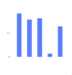 | A column chart shows data represented by vertical rectangular bars. The length of the rectangle is proportional to the value it represents. | The Column chart requires numeric columns. | Qualitative, divergent, and sequential. |
Bar chart 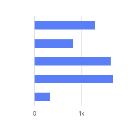 | A bar chart shows data represented by horizontal rectangular bars. The length of the rectangle is proportional to the value it represents. | The Column chart requires numeric columns. | Qualitative, divergent, and sequential. |
Line chart 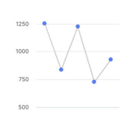 | A line chart shows information as a series of data points connected by a line. | Use when you want to show magnitude or change over time. | Qualitative. |
Pie chart 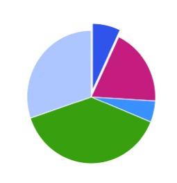 | A pie chart shows proportions of values in a data set. | Use when you want to show how the proportion of different groupings relate to one another. | Qualitative. |
Donut chart 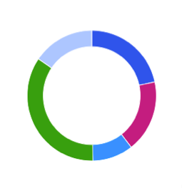 | A donut chart shows proportions of values in a data set. | Use when you want to show how the proportion of different groupings relate to one another. | Qualitative. |
Scatter plot 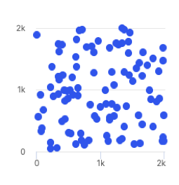 | A scatter plot uses coordinates to show values for two or more variables in a data set. Each point represents one value. The position on the horizontal and vertical axis are determined by two variables. | Use when you want to show correlation between two variables. Use caution when showing correlation - remember, correlation does not equal causation. Good for exploring relationships rather than drawing conclusions. | Qualitative, divergent, and sequential. |
Treemap  | A treemap helps you find patterns in your data by providing a hierarchical view of your data. | Use when you want to compare proportions within the hierarchy. | Divergent and sequential. |
Dumbbell chart 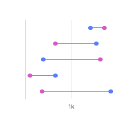 | A dumbbell chart shows the change between two data points using circles and lines. | Use when you want to display the change and distance between two data points. | Not compatible with palettes, but you can customize the displayed colors. |
Simple gauge chart 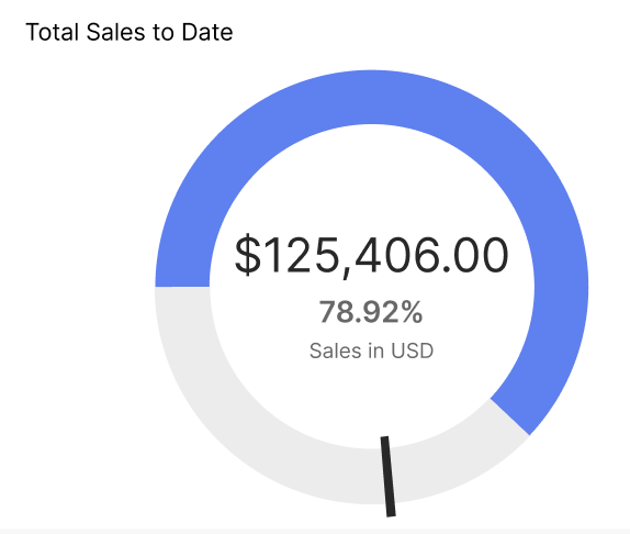 | A simple gauge chart uses a dedicated dial with different colours and a needle pointing to a numeric value from a minimum to a maximum. With this chart, you can easily visualize linear progressive data on the colour-coded dial and see the change in values using the scale. | Use to depict sales performance by representing targets and if they've been achieved. | Not compatible with palettes, but you can customize the displayed colors. |
Activity gauge  | An activity gauge shows whether values fall within an acceptable range by having multiple panes circle around a center point. | Use when you want to show where data points fall within a range. | Qualitative. |
Heat map chart 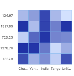 | A heat map uses color to show how a variable is clustered or occurs most frequently. | Use when you want to reveal patterns or show the concentration of events. | Divergent and sequential. |
Bubble chart 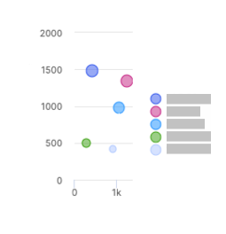 | A bubble chart shows three dimensions of data. Each bubble represents a data point with 3 variables. Variable 1 and variable 2 determines the bubble's location on the horizontal and vertical axis. Variable 3 determines the bubble's size. | The Bubble chart can use both text and numeric input. | Qualitative. |
Waterfall chart 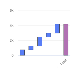 | A waterfall chart shows an initial value and final value with floating intermediate values that affect the initial value positively or negatively. | A waterfall chart can help you understand cumulative effects of values. | Not compatible with palettes, but you can customize the displayed colors. |
Clustered column chart 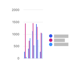 | A clustered column chart represents two fields from the same source for the same value in clustered vertical columns. | Use when you want to compare multiple series of data. | Qualitative, divergent, and sequential. |
Multiple lines chart 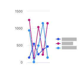 | A multiple lines chart uses multiple lines to show the correlation between data from the same source. | Use to show the relationship between data from the same source. | Qualitative. |
Bullet chart 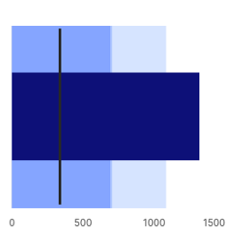 | A bullet chart is a variation of a bar graph that can be used as an alternative to gauges and meters. | Use to compare the performance of a value to other values. | Not compatible with palettes, but you can customize the displayed colors. |
Stacked column chart 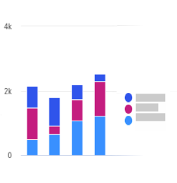 | A stacked column chart shows data represented by vertical rectangular bars with comparative values stacked on top of each other. Each group is represented by two or more vertical bars. The length of the rectangle is proportional to the value it represents. | The Column chart requires numeric columns. | Qualitative and sequential. |
100% stacked column chart 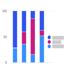 | A 100% stacked column chart shows the relative percentage of multiple data sets in stacked columns, where the total of the stacked columns equals 100%. | Use this chart to show how parts of the data relates to the whole data set. | Qualitative and sequential. |
Stacked bar chart 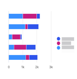 | A stacked bar chart shows data represented by horizontal rectangular bars with comparative values stacked on top of each other. The length of the rectangle is proportional to the value it represents. Each group is represented by two or more horizontal bars. | The Column chart requires numeric columns. | Qualitative and sequential. |
100% stacked bar chart 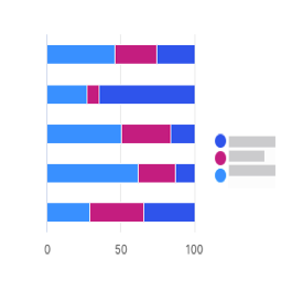 | A 100% stacked bar chart shows the relative percentage of multiple data sets in stacked bars, where the total of the stacked bar equals 100%. | Use this chart to show how parts of the data relates to the whole data set. | Qualitative and sequential. |
Clustered bar chart 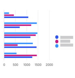 | A clustered bar chart shows more than one data set in clustered horizontal columns. | Use when you want to compare multiple data sets in a given category. | Qualitative, divergent, and sequential. |
Area chart 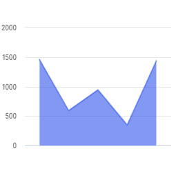 | An area chart is similar to a line chart, but with shaded areas between the line and the axis. | Use when you want to show magnitude or change over time. | Qualitative. |
Stacked area chart 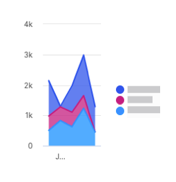 | A stacked area chart is a type of area chart that shows connected data points with comparative values stacked on top of each other. This chart shows a starting set of values, and then uses shading to show values above the starting values. | Use when you want to show the total value of some data broken down by sub-groups. | Qualitative. |
Multiple area chart 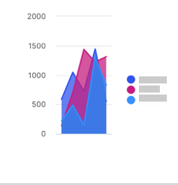 | A multiple area chart is a type of area chart that shows connected data points where each data point is compared to the same baseline value. Since data points will sometimes overlap in a multiple area chart, you will see some transparency in the shading so that all the lines can be easily seen. The data point with the most visible color is the largest value. | Use when you want to compare data points across the same baseline. | Qualitative. |
Multiple scatter chart 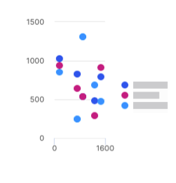 | A multiple scatter chart is similar to a scatter plot chart, but uses multiple data sets instead of a singular data set. | Use this chart to compare how multiple data sets intersect values on each axis. | Qualitative and sequential. |
Line and column chart 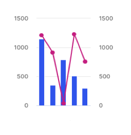 | A line and column chart combines a line chart and a column chart. Both the line and column charts will share an x-axis, but each has its own y-axis. | Use to display two data sets together when the ranges between the two greatly vary. | Qualitative. |
Lines and columns chart 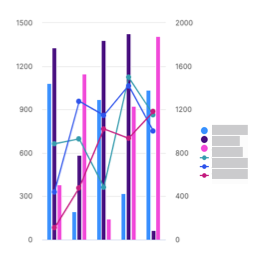 | A lines and columns chart uses multiple bars and lines to show different data sets through the use of multiple y-axes, where each series has a separate axis. | Use when you want to compare and analyze trends in a single visualization. | Qualitative. |
Radar chart 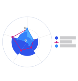 | A radar chart shows 3 or more variables represented on an axis starting from the same point. | Use this chart to show how qualitative data points compare to one another. | Qualitative. |
KPI chart 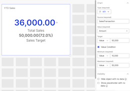 | A KPI chart displays key values with customizable visualizations and styling options. | Use this chart to track progress towards a numeric goal. | None. Default colors are available for the user to change. |
Applying multiple colors to a single series of data for bar and column charts
In the Style tab of your bar or column chart, turn on the Enable multiple colors toggle to apply multiple colors to your chart.
Click on the Palettes button. Select a palette from one of the pre-set palettes or click +Add palette to create your own.
When adding a new palette, create a palette name.
Select a palette type.
Turn on the toggle to set the palette as default.
Click Add a color to set the palette colors.
Click Save.
Click Done.
Adding a pick list object to a Presenter Adaptive report
Add pick lists to your Presenter Adaptive report to create a list of options for payees to choose from.
From the Reports module, click the Reports tab.
Click a Presenter Adaptive report to open it.
Click the Add object
 icon.
icon.Select pick list, then drag and drop the object to your desired position on the canvas.
Enter a relevant and unique name for the pick list to easily identify the object upon export.
In the configuration pane, under Data tab, select a data source for the pick list.
Select the ID column and Display column.
Under Sort, select a column to organize its data.
Under Order, select the sort order of the column to be either in Ascending or Descending order.
In the Control panel, turn on Display title toggle to show the pick list's name and give it a custom title in the provided text area.
Select the Default value.
Turn on the Value required toggle to make the value a required field.
Turn on the Display ID column and Display value on export toggles.
Enter text to be shown as a Placeholder text on the pick list.
The Used by section lists any other object in the report where the pick list is used.
Under Slack pick list configuration, turn on the Display in Slack toggle to display the pick list on the Varicent Incentives Slack app.
Note
The Incentives Slack app feature is available to select Varicent Incentives customers in North America. Please contact your CSM for more information or open a Support case ticket if you require assistance.
In the Style tab, select the alignment option you prefer, either Horizontal or Vertical.
The Fill horizontal space toggle helps to stretch the object to occupy the full horizontal space or retain its original size. By turning this toggle off, you can freely place it in any horizontal manner within the container.
Note
The pick list object will be adjusted within its container to align with the selected alignment axis.
In the Filters tab, you can add filters to the pick list object.
In the Visibility tab, you can add conditional visibility rules to the pick list object.
Adding a multi-select pick list to a Presenter Adaptive report
Select multiple values with the multi-select pick list to control your report content. You can filter conditions throughout the report to limit records displayed or hide objects on the report.
Important
Any locations in the report that have been built to support a single value will not be able to work with a multi-select pick list. These include row input forms and dynamic text.
From the Reports module, click the Reports tab.
Click a Presenter Adaptive report to open it.
Click the Add object icon
.
Select Multi-select pick list, then drag and drop the object to your desired position on the canvas.
Create a unique name for the multi-select pick list to easily identify the object upon export.
In the Data tab, select a data source for the multi-select pick list.
Select the ID column and Display column.
Choose the column you want to determine the sort order.
Choose whether you want the columns to be in an ascending or descending order.
In the Control tab, enable the toggle to display the title.
Under Default value, select one of the following options:
No default value
No default value will be set.
Specify report values
The report values will pull from global values, parameters, or stored values and set them as the default value.
All multi-select pick list values
All multi-select pick list values will be set as the default value, however, if the values exceed the maximum of 500, no default value will be set.
Under Options, the toggle to have the value required, display the ID column, and display the value on export are enabled by default. You can choose to disable them, depending on your preference.
Select the value for the placeholder text.
In the Style tab, set the alignment of the pick list.
The Fill horizontal space toggle helps to stretch the object to occupy the full horizontal space or retain its original size. By turning this toggle off, you can freely place it in any horizontal manner within the container.
In the Filters tab, add filters to the multi-select pick list.
Note
Multi-select pick lists have the option to select from "Is included in" and "Is not included in" filters.
Click Add.
In the Visibility tab, add conditional visibility rules to the multi-select pick list.
Click Save.
Click Save as. Select whether you want to save the report as a draft or published.
Important
You can use the multi-select pick list with other objects in Presenter Adaptive. For example, you can add a table that uses the created multi-select pick list as a source type. Along with the filters and conditions that have been set, different users can access specific data.
Important
If a report with a multi-select pick list is linked to another Presenter Adaptive report, the multi-select pick list will be available as a parameter to specify the values that will be passed. The list of values passed can be a combination of multi-select pick list, global values, parameters, stored values, and text values.
Click Preview to see the report.
Note
Multi-select pick lists with a higher number of records will display the records in batches of 50.
For multi-select pick lists with multiple items, click Select all to select all items at once. Click Clear selection to deselect all items.
Note
This functionality is limited to 500 items.
Linking to multi-select pick lists
Link to reports containing multi-select pick lists to easily access and share reports that pass through pick list selections. A multi-select pick list can be linked to the following Presenter Adaptive objects: text, image, table, chart, reshaped table, metric, list, and callout.
Important
Multi-select pick list values from a source report cannot be passed to pick list objects in a target report.
From the Reports module, open a Presenter Adaptive report by clicking on it.
Click the Add object
icon.
Select Multi-select pick list, then drag and drop the object to your desired position on the canvas.
Enter a unique name for the multi-select pick list to easily identify the object upon export.
Select the object that will link to the multi-select pick list by clicking the Add object
icon.
Text
Refer to: Linking a text object to a report, email, or a web address
Table
Refer to: Adding links to a table in your Presenter Adaptive report
Chart
Refer to: Adding links to charts
Image
Refer to: Adding an image that links to an external page or a report
Reshaped table
Refer to: Adding links to a reshaped table in your Presenter Adaptive report
Metric object
Refer to: Adding a metric object to a Presenter Adaptive report
List object
Refer to: Adding a list object to a Presenter Adaptive report
Callout object
Refer to: Adding a callout object to a Presenter Adaptive report
Added links can include a web address with a multi-select pick list value, an email address, or a report that contains a multi-select pick list.
Click Add.
Adding a single date picker object to a Presenter Adaptive report
Add a single Date picker object to set up filters on your Presenter Adaptive report to limit displayed records. The Date picker can also be used to configure conditional display rules and control which objects are displayed or hidden based on the selected date.
From the Reports module, click the Reports tab.
Click a Presenter Adaptive report to open it.
Click the Add object
 icon.
icon.Select Date picker, then drag and drop the object to your desired position on the canvas.
In the configuration pane, under Data tab, you can choose to display the label. To display the label, turn the toggle on.
Create a label and set the date format.
Set the default value and add a placeholder text.
To require the date to filter records, turn the toggle on.
To display the value on export, turn the toggle on.
From the Style tab, you can select the horizontal and vertical alignment and enable the toggle to Fill horizontal space.
From the Visibility tab, you can set the conditions for which the image will be visible.
To learn more about conditional visibility, read: Setting conditional visibility rules for Presenter Adaptive objects.
Click Save.
Adding a date range picker object to a Presenter Adaptive report
Add a Date range picker object to filter data on your Presenter Adaptive reports by start and end dates. The Date range picker can be used to filter results on a table, chart, or pick list.
From the Reports module, click the Reports tab.
Click a Presenter Adaptive report to open it.
Click the Add object
 icon.
icon.Select Date range picker, then drag and drop the object to your desired position on the canvas.
From the Data tab, you can choose to display the label. To display the label, turn the toggle on.
Create a label and set the date format.
Note
Only North American (MM/DD/YYYY) date formats for input forms are supported. For assistance, please contact support.
Set the default value for the start and end date and add a placeholder text.
Toggle on the toggle to require the end date to filter records and/ display the value on export.
From the Style tab, you can select the horizontal and vertical alignment and toggle on to fill the horizontal space.
From the Visibility tab, you can set the conditions for which the image will be visible.
Click Save.
Select your table, chart, or pick list.
Add filters by clicking the Filters tab.
Click Add filter.
Select the filter type.
Define the rules the Date range picker will use to filter the results.
Click Add.
Click Save.
Click Preview to filter by date within your report.
Adding a control menu object to a Presenter Adaptive report
You can add pick lists, single date pickers, and date range pickers directly to a drop-down Control menu making your report layout more clean and organized. It also simplifies the process by allowing you to add both new and existing objects to the report directly from the Control menu, eliminating the need to add them individually.
From the Reports module, open a Presenter Adaptive report by clicking on it.
Click the Add object
icon.
Select Control menu, then drag and drop the object to your desired position on the canvas.
Update the Control menu name on the text box in the side settings panel.
In the Data tab, click Configure menu to add objects to the menu.
From the drop-down list, hover over Add new object to menu, and click the type of object you want to add. You can also search for a specific object's name.
Note
To remove an object from the group, click
next to the name of the object you want to remove.
Once you have selected an object, the setting panel will allow you to configure the object. Click the
 back arrow with the Control menu name to continue configuring the Control menu object.
Under Label create a name for the Control menu object.
Under Export, turn on the Display control menu in PDF export toggle to display the Control menu in the PDF file export.
Note
You can only choose to display the Control menu when exporting. All objects inside the Control menu are not available for export within the Control menu. To include the objects in an export, you'd need to remove it from the Control menu and display it independently in the report canvas.
In the Style tab, select the alignment option you prefer, either Horizontal or Vertical.
The Fill horizontal space toggle helps to stretch the object to occupy the full horizontal space or retain its original size. By turning this toggle off, you can freely place it in any horizontal manner within the container.
Note
The Control menu object will be adjusted within its container to align with the selected alignment axis.
In the Visibility tab, you can add conditional visibility rules to the Control menu object.
To delete a Control menu, hover over the object and click Delete
.
Note
Deleting a Control menu will delete all associated objects, along with the objects or stored values linked to them.
Adding a row input form object to a Presenter Adaptive report
Add a row input form to your report to allow web users to submit data in to tables.
From the Reports module, click the Reports tab.
Click a Presenter Adaptive report to open it.
On the side panel, click the Add object
 icon.
icon.Select Row input form, then drag and drop the object to your desired position on the canvas.
In the configuration pane, under the Data tab, select a source type. Choose the columns that you want users to be able to submit data for.
Click the More options (...) icon beside the name of the column and click to add a label, placeholder text, default value, and description of the selected column.
To add a rule, click and then select the type of rule you want to add.
Tip
Validation rules are used to validate an aggregation of data for the whole table such as a maximum or minimum, average, or sum of all the data. Input rules are used to validate on individual values, like not allowing a value to exceed a certain amount.
Under Button, enable the Redirect on submission toggle to configure the save button to link to a website, email, or report.
For more information, see: Configuring the save button on your report.
In the Style tab, you can change how your row input form looks by formatting the header, input, and button, and adding a colored background.
Adding a video object to a Presenter Adaptive report
Add videos to enhance your report.
From the Reports module, click a Presenter Adaptive report to open it.
Click the Add object icon
 .
.Select Video then drag and drop the object to your desired position on the canvas.
From the Style tab, choose whether or not to add a header for your video. To add a header:
Expand the Tile header section.
Turn on the Display header toggle.
Enter a title for your video and apply formatting to the text, such as bold, italics, underline, and font color.
Enter an optional description for the video and apply formatting to the text, such as bold, italics, underline, and font color.
From the Tile background section, choose whether or not to display a background color for your video. To display a background color, read: Adding a colored background to your objects
From the Video section, add the video URL.
Note
Only YouTube and Vimeo videos with correctly formatted URLs are supported.
From the Video settings section, you can turn on the toggles to autoplay, mute, or loop the video.
Click the Visibility tab and set the conditions for when the video will be visible.
Click + Add condition.
Select one of the following:
If any - your video will be visible if any of your conditions are true.
If all - your video will be visible if all of your conditions are true.
Select a value for your condition. You can select a global value like current date, workflow form ID, or current web user (the currently logged in user), or a stored value.
Select an operator.
Type or select a value. For example, a condition could be Current Date is after 01/01/2024. This means the video will only be visible in the report after Jan 1, 2024.
Click Save.
Note
Video tiles will not show up when publishing the report as a PDF.
Adding a payee object to a Presenter Adaptive report
You can add a Payee object to your Presenter Adaptive report for a convenient way to view payee information.
From the Reports module, open a Presenter Adaptive report by clicking on it.
Click
Add object.
Select Payee then drag and drop the object to your desired position on the canvas.
Select a data source with your payee information.
In the Filter tab, add a filter to ensure that you're only viewing one payee's data at a time.
Note
The Payee object can only support one row of data per payee at this time.
Select a column to populate the Name field of the Payee object.
Select columns to populate the Payee ID and Title fields of the Payee object.
Note
To add a payee profile picture, first add a column to the Payee ID field.
Add any additional custom fields by selecting the columns you want to add. To change the name of the field, click ... → Rename.
You can rearrange the order of the fields as they appear on the Payee object by clicking
and dragging the fields into the desired order.
In the Style tab, you can add a colored background to the tile and format each of the fields.
In the Visibility tab, you can add conditional visibility rules to the Payee object.
Click Save.
Adding a metric object to a Presenter Adaptive report
With the Metric object, you can access essential summary metrics about your sales with ease.
From the Reports module, click a Presenter Adaptive report to open it.
Click the Add object icon
.
Select Metric, then drag and drop the object to your desired position on the canvas.
Under the Data tab, select the source type.
Select the source.
If Data source is selected as the source type, choose the source for the metric object.
If Workflow is selected as the source type, choose between Workflow status and Workflow history as the source.
Select a column for the Metric value.
Note
If the source column has multiple rows, the resulting Metric value will be the sum of all rows.
Under Format, select the Metric value format, number of decimal places, display units, and decide whether you want to use the thousands separator.
To add custom currencies which are not included in the system table, read: Adding dynamic currencies to Presenter Adaptive objects.
Under Icon and label, select icon, label, and description for the Metric value.
Under Links, click + Add link to add a link to the Metric object.
To link to a web address and insert a variable in the URL, place your cursor in the URL where you want to insert the value and select a value from the menu. In the text box, enter the URL, and click Add.
To link to an email, see Creating email links in Presenter Adaptive objects.
To link to a report, select Presenter Adaptive and the report you want to add. If a report has more than one assigned web tab, select a web tab and add any necessary parameters, and click Add.
To apply filters to your list object, read: Adding filters to Presenter Adaptive reports. If you wish to set conditional visibility rules to your list object, see: Setting conditional visibility rules for Presenter Adaptive objects.
Applying conditional formatting to a Metric object
You can define conditional formatting rules that determine the text and background color of a Metric object based on its value. By setting a threshold using a source column or numeric value, the formatting will automatically apply when the Metric value meets or exceeds that threshold. You can choose the formatting style that applies to the Metric object including options for value, description, label, and link. The preview feature allows you to see real-time changes, and view the formatting before finalizing it.
Note
Conditional formatting will be applied on the Metric value greater than or equal to the set threshold.
From the Reports module, click a Presenter Adaptive report to open it.
Click the Add object icon
.
Select Metric, then drag and drop the object to your desired position on the canvas.
Configure your metric object.
Read ??? for steps to select a data source and set Metric value, format, icon, and link.
At the bottom of the Data tab, under Conditional format, click + Add condition.
Set the Threshold by selecting a source column or a static value.
Under Tile background, enable the Display background toggle if you wish to apply a background color to your Metric object tile.
You can choose between a Solid or Gradient background color.
Click the Metric value formatting color block and choose a color to apply to the Metric value.
Under Label and description, click the individual color block and choose a color to apply to the label and description of the Metric object.
Click the Link formatting color block and choose a color to apply to the link of the Metric object.
Preview the formatting of the Metric object, and click Add.
The saved condition will appear under Conditions.
Note
You can create multiple conditions for a single Metric object. Conditional formatting will apply to the first valid condition in the list.
Adding a group object to a Presenter Adaptive report
You can add a Group object to your Presenter Adaptive report for an easy way to group multiple objects into one tile.
Note
You need to add at-least one visible object for your Group object to show up on your report canvas. If your Group object contains only hidden objects, it will stay hidden as well.
From the Reports module, open a Presenter Adaptive report by clicking on it.
Click
Add object.
Select Group then drag and drop the object to your desired position on the canvas.
Update the Group name using the text box in the group settings pane.
Click Configure group to add objects to the group. From the drop-down list, click
 next to the name of the existing object you want to add. You can also search for a specific object's name.
You can also choose to add a new object to the group by clicking Add new object to group , and select an object from the list to add a new object to the Group object. Set up each item within the group just as you would individually on the report canvas.
From configuring an object within the group, click the
 back arrow with the group name to continue configuring the group object.
Note
To remove an object from the group, click
next to the name of the object you want to remove.
To configure the layout of the group, click the object you want to move and drag it to your desired position on the group canvas.
Note
If you change the size of an object in the group canvas, the size of the object will also change in the report canvas.
In the Style tab, you can add a header or a colored background to the tile.
Tip
If you add a header to the tile, you can choose whether to allow the group to be collapsible in Sales Portal, or to expand the group by default.
In the Visibility tab, you can add conditional visibility rules to the Group object.
Adding a list object to a Presenter Adaptive report
With the list object, you can display up to three fields from a data source, while emphasizing one of the fields. Create an ordered or unordered list and select the number of items to display. The list object helps emphasize important data and aids the decision-making process through the report.
From the Reports module, click the Reports tab.
Click a Presenter Adaptive report to open it.
On the side panel, click the Add object
 icon.
icon.Select List, then drag and drop the object to your desired position on the canvas.
In the configuration pane, under the Data tab, select a source type.
Select the source.
If you select a data source as the source type, choose the source for the list object.
If you select workflow as the source type, choose between workflow status and workflow history as the source.
Under Items, select the following items to display on your list:
Main
Click + Add column and select the main column. Click Remove column
 to remove the column and select a different main column.
[Optional] Description
Click + Add column and select the description column. Click Remove column
 to remove the column and select a different description column.
Under Count, select and drag the Number of items scroll bar to set how many items you want to display on the list. The default items on the list is five, and the list cannot exceed 20 items.
[Optional] Disable the Display numbered list toggle to hide the number the items on your list.
Under Values, click + Add column to show the corresponding value to each item on the list.
Choose to display the list in an Ascending or Descending order.
Note
For date fields, the oldest date is considered the lowest value, and the latest date (which could be a future date) is considered the highest value.
[Optional] If the selected data source contains a numeric value, under Data aggregation, enable the Aggregate values toggle to show the value total on the list.
[Optional] Under Value total, disable the Display total toggle to hide the list total.
Under Numeric Format, select the value format, display units, and decimal places of the list.
[Optional] Enable the Use thousands separator toggle to add a comma to the list value. You can also select where the comma will be placed in the value.
[Optional] Under Link, click + Add link to add a link to the list, and select one of the following options:
Web
Under Destination, click Web. Under Web address, click
 Insert value and select the value. Click Add.
Email
Under Destination, click Email. Follow the steps outlined here: Creating email links in Presenter Adaptive objects.
Report
Under Destination, click Report. Under Report type, select Presenter Adaptive. Under Report name, select the report you want to add. If a report has more than one assigned web tab, select a web tab and add any necessary parameters, and click Add.
[Optional] Turn on the Enable export to Excel toggle to export the list to Excel.
Note
Only records shown in the list object will be exported to Excel.
[Optional] Under the Style tab and Tile header, enable the Display header toggle. Add a title and description, and add formatting to the header. Click
 Insert value to add header value.
[Optional] Under Tile buttons, select the button style.
[Optional] Under Tile background, disable the Display background toggle to hide the tile background.
[Optional] Under Items, set the formatting for the name, description, and list number.
[Optional] Under Values, set the formatting for the value and total.
[Optional] Under Item background, disable the Display background toggle to hide the item background.
[Optional] Under Link, set the label formatting.
[Optional] To apply filters to your list object, read: Adding filters to Presenter Adaptive reports.
[Optional] To set conditional visibility rules to your table, see: Setting conditional visibility rules for Presenter Adaptive objects.
Click Save.
Adding a divider object to a Presenter Adaptive report
Keep your reports organized with the Divider object to visually separate report sections.
From the Reports module, open a Presenter Adaptive report by clicking on it.
Click
Add object.
Select Divider, then drag and drop the object to your desired position on the canvas.
Drag the corner of the divider on the canvas to resize it.
Under the Data tab, turn on the Display divider in PDF export toggle to display the divider in the PDF file export.
Under the Style tab, select the color palette menu to select a color for the divider. You can also select a custom color with the color picker or enter a hex code into the color field.
If you wish to set conditional visibility rules to your Divider object, read: Setting conditional visibility rules for Presenter Adaptive objects.
Adding a callout object to a Presenter Adaptive report
Add callouts to help engage your readers when you need them. We have different callout types to help your message stand out. Control when your callouts appear with conditional visibility.
From the Reports module, open a Presenter Adaptive report by clicking on it.
Click the Add object
 button to open the menu. Drag and drop a callout object onto the canvas.
Drag the corner of the callout on the canvas to resize it.
From the Data tab, you can choose to display a title. To display a title, turn the toggle on. Enter the title in the text box that appears.
Enter your callout message in the Message text box.
To add a link, click Add link.
Add a Label in the text box.
You can choose to open the link in a new tab using the toggle.
Select a Web address or Report as the link destination.
To link to a web address and insert a variable in the URL, place your cursor in the URL where you want to insert the value and select a value from the menu. In the text box, enter the URL, and click Add.
To link to an email, see Creating email links in Presenter Adaptive objects.
To link to a report, select Presenter Adaptive and the report you want to add. If a report has more than one assigned web tab, select a web tab and add any necessary parameters, and click Add.
Click Add.
In the Style tab, you can select the message type. To display or remove the icon at the start of your callout, use the Display icon toggle.
Use the Alignment section to set the vertical alignment of the callout message within the designated space on the canvas.
From the Visibility tab, you can choose to set conditional visibility for the callout object.
Click the Add condition button to open the menu.
Set the dropdown to either If any or If all as required.
Select a source from the dropdown and configure your rule.
Click on the plus button
 to add additional conditions or sub-conditions as needed.
Click Save.
Tracking workflow status and history in Presenter Adaptive reports
Workflow status and history can be selected as data stores for the table, reshaped table, chart, metric, and list objects. The workflow status is represented as a percentage based on action nodes in the workflow. Workflow history shows the full history of in-progress and completed workflows.
Create or edit a report.
System data stores, workflow status and workflow history can be added as data sources to the following Presenter Adaptive objects:
Chart
Table
Reshaped table
Metric
List
Select the workflow source type.
Select either the workflow status or workflow history data source.
Choose the columns you want to use for the report.
Note
For more detailed steps, see the corresponding documentation for adding each object type.
Adding filters on pick list fields in tables
Add filters on pick list fields in tables to set limitations to the values available for the pick list field.
From the Reports module, open a Presenter Adaptive report by clicking on it.
Click
 Add object and select Table.
Select a data source.
Select the columns.
Under Web user options, enable Allow column edit.
On a pick list column, click the more options button
 .
.Click Settings.
Toggle on to Enable editable column.
Click
Add filter.
Note
For more information on filters, read: Adding filters to Presenter Adaptive reports.
Select the filter type and column, whether you want to filter by text or display values, and the rule.
Click Add.
Click Save.
To edit the filter on the pick list field in the table, click on the filter and more options
 .
.Click Edit.
To delete the filter on the pick list field in the table, click on the filter and more options
 .
.Click Delete.
Adding filters to Presenter Adaptive reports
Add filters to your report to control which data is available for web users. You can add filters to the following objects:
Tables
Reshape tables
Charts
Pick lists
Multi-select pick lists
Payee
Metric
List
There are two types of filters:
Adding basic filters
A basic filter controls which data users can see based on values in a selected column.
From the Reports module, click the Reports tab.
Click a Presenter Adaptive report to open it.
Click the object where you want to apply a filter.
Click the Filters tab.
Click + Add filter.
From the Filter type drop-down menu, select Basic.
Select the column that contains the values that you want to filter.
In the Filter by field, select if you want to filter by column type (Text, Date, or Numeric), or by Display values.
Column type (Text, Date, or Numeric) - proceed to step 8 to apply a rule for your filter.
Display values - select values from the list that you want to filter for, and then click Add.
Select an operator for your rule.
Note
When adding a date filter, the following rules are equivalent to these restriction symbols:
Before/Prior to is equivalent to < is less than
After/Later than is equivalent to > is greater than
This and after is equivalent to >= is greater than or equal to
This and prior is equivalent to <= is less than or equal to
Type a value for your rule or select a stored or global value.
Tip
Global values include the current web user (the user currently logged in), the workflow form ID, or the current date.
Enable the Case sensitive toggle to filter values that match the case exactly. Or disable the toggle to ignore the case.
If required, add an additional rule.
Tip
You can add one additional rule to basic filters. For more complex filters with three or more rules, use an advanced filter instead.
Click Add.
Adding advanced filters
Advanced filters allow for a more customized interaction with your data.
From the Reports module, click the Reports tab.
Click a Presenter Adaptive report to open it.
Click the object where you want to apply a filter.
Click the Filters tab.
Click + Add filter.
From the Filter type drop-down menu, select Advanced.
Type a description for your filter.
Tip
A detailed description can help you remember the purpose of your filter. This is useful if you have many complex filters in the same report.
Click Next.
Select the first filter rule by selecting a source column, an operator, and a value. You can also select a global value like the current web user (the user currently logged in), the workflow form ID, or the current date.
Note
When adding a date filter, the following rules are equivalent to these restriction symbols:
Before/Prior to is equivalent to < is less than
After/Later than is equivalent to > is greater than
This and after is equivalent to >= is greater than or equal to
This and prior is equivalent to <= is less than or equal to
Click the Add icon
 and select one of the following:
Add rule - to add another rule.
Add group - to add a group. When you add a group, it adds a sub-level underneath the first group. You can then select or to change the operation type.
Tip
Drag and drop your rules and groups to reorder the operations.
When you're finished setting up your rules and groups, click Add.
Adding values to a Presenter Adaptive report
Add values to your report to show additional data or to scale back the results of a data source to a single cell. You can incorporate values which include: Stored values and Parameter.
Stored values are variables that return a single value pulled from a data source in your Varicent Incentives model. You can dynamically display these stored values in a variety of your report objects. You can also use stored values within the data, filter, and visibility tabs of many of the report objects.
Parameter is a variable that is loaded by a pick-list selection, or a value you hard code or pass in from another linked report.
In comparison, a stored value pulls a value from a data source in your model. The data source could be a table, calculation, or data store. A stored value often uses the value within a parameter to pull the desired record from its data source.
To add values to your Presenter Adaptive report:
From the Reports module, create a new or select an existing Presenter Adaptive report.
From the sidebar, click the Values icon, and then click + Add.
To add a parameter:
Select Add parameter.
Enter a name for the parameter
Select the appropriate Data type for the parameter from the following options: Text, Numeric or Date, depending on the type of data you want to capture.
Set the input or default value for the parameter.
You can choose from the available Global Values:
Current Web User: Dynamically sets the parameter to the ID of the logged-in user
Workflow Form ID: Links the parameter to an inquiry workflow's ID
If applicable, you can select a value from a list of existing stored values or parameters in the system. Alternatively, you can manually input a fixed value.
Turn on the Value required toggle to require the parameter to be selected before the report displays results.
Click Add.
To add a stored value:
Select Add stored value.
Enter a name for the stored value.
In the Source field, choose the data source that contains the information you want to query.
For example, if you are retrieving payee names, select your Payee table.
In the Column field, select the column in the data source that holds the desired information. (for example, "Name").
In the Set the ID column values section, map the appropriate ID column (for example, "PayeeID") to a corresponding parameter or value. The number of values you have to set depends on the number of key columns in the source table.
For example, if the stored value is linked to a pick list parameter, select the parameter that corresponds to the set pick list.
Click Add.
To edit a value, click on the more options button beside the value's name, and select Edit.
Click Save.
To check where a parameter or value is being used, click on the More options menu (...) beside the value's name, and select Used by. If the parameter or value is used in other reports, they will be listed under the Used by section.
Refer to Lessons 2 and 3 of the Creating Presenter Adaptive Reports course for more detailed information.
Adding dynamic currencies to Presenter Adaptive objects
You can dynamically display different currencies in the following Presenter Adaptive objects:
Table object
Chart object
Metric object
You can use parameters and stored values to dynamically display different currencies based on the payee viewing the Presenter Adaptive objects. This will allow you to add custom currencies not included in our system table.
Select a Presenter Adaptive object.
Add parameter or stored value that will determine the currency symbol.
Note
The source table for your stored value must include Payee ID and Currency columns.
You can customize your source table with any currency of your choosing.
Under Format, choose the stored value as your currency.
When the payee views their report, they will see the currency symbol associated with their Payee ID.
Adding conditional formatting to a Presenter Adaptive table
Conditional formatting in a table helps highlight key data points, making it easier to spot trends, outliers, or important values at a glance. By adding color or formatting based on specific criteria, you can quickly draw attention to the most relevant information in your data.
Note
Conditional formatting can be added to all table columns, including calculated columns.
Add a table to your report.
From the Style tab, under Conditional format, click + Add condition.
Note
To access this option, you must have a numeric column selected in the Data tab of your table settings.
Choose whether to apply conditional formatting to the table header or to the table values.
Select the columns where you want to apply conditional formatting.
Use the Functions, Operators, and Source mentu to create a formula, or type the formula manually to define the condition under which you want a value to render.
Tip
If you are applying conditional formatting to a table header, you must aggregate the source in your formula.
Define how the cell should appear if the condition is met by changing the font size, cell colors, or how the value is displayed.
Click Add.
To edit a condition, from the Style tab, under Conditional format, click the more options icon
 and then click Edit.
Setting conditional visibility rules for Presenter Adaptive objects
Set conditional visibility rules to display or hide objects in your Presenter Adaptive report.
From the Reports module, click the Reports tab.
Click a Presenter Adaptive report to open it.
Click the Add object icon
and drag and drop the object onto the canvas to resize.
To set the conditional visibility rules for the object, click on the Visibility tab.
Click
Add condition.
Select whether you want to apply the condition if all or if any of the rules are true.
Select a source, an operator, and a value.
Click Save.
To edit a condition, click
Edit.
To delete a condition, click
Delete.
To add another condition, click
Add condition.
Note
Objects with a condition set will have an
 icon.
icon.You can add one sub-condition for each condition set by clicking
 Add sub-condition.
For tables and charts, you can also select whether to show or hide objects with no data and/ show placeholder with no data.
Adding dynamic text to a Presenter Adaptive report
Dynamic text gives you the ability to personalize reports for payees and efficiently manage reports with dynamically changing content. There are many places within your Presenter Adaptive reports that you can make use of dynamic text.
Click the
 insert values button to add parameters and stored values to your report. Parameters can be added directly, or stored values can be imported from data sources.
When configuring an object in your report, the
 insert values button will be visible next to the fields where dynamic text can be used. Click the
  insert values button, and select the dynamic field you want to add from the drop down list.
Note
Some fields will allow a combination of dynamic and static text elements. Others will allow only dynamic or static text to be used.
Seeing a preview of a Presenter Adaptive report
You can preview Presenter Adaptive reports via the Reports module.
Note
Changes cannot be submitted while in Preview mode - the submit button will be disabled.
Option 1:
From the Reports module, click the Report Viewer button to immediately open the report viewer.
In the Report viewer, you can select a report from the dropdown at the centre of the page.
You can select the user you are previewing your report as.
Option 2:
Note
The preview feature is only available once the Presenter Adaptive report has been saved.
From the Reports module, select the report you would like to preview.
Click the Preview button. This will open this specific report in the Report Viewer.
You can select the user you are previewing the report as.
Checking your Presenter Adaptive report's performance
Check the performance of your report and see which components are causing the report to load slowly. Change the different components to speed up your report loading time.
From the Reports module, click a Presenter Adaptive report to open it.
Click on Preview on your report.
Select the admin or payee with the report performance you want to check.
Click Check performance.
Click Start.
Select different report components to test the report's performance.
Click Stop to show the results of the performance check.
The performance check shows the loading time and number of components for each object.
Stored value evaluation: Time spent generating the values associated with the report’s local stored values.
Source data fetch: Time spent fetching the object’s filtered source data.
Visibility calculation: Time spent determining the objects’ visibility conditions.
Click on the colored bars on the chart to identify the actions and processes affecting report performance.
To export the performance log as a .json file, click Export log file.
Creating email links in Presenter Adaptive objects
Notice
This functionality requires both Admin and Payee users to have a default email client. We recommend contacting your organization's IT department to ensure all machines accessing a report using the email mailto feature have a default email client configured.
You can add email hyperlinks to the following Presenter Adaptive objects:
From the Reports module, click the Reports tab.
Click a Presenter Adaptive report to open it.
Click the Add object
 icon.
icon.Select one of the objects listed above.
For the text object, highlight the text which you want to use as a link, and click the Add link
 icon.
icon.In the Data tab, under Link, click + Add link.
Select Email as the link destination.
Enter email addresses in the To and Cc section, and add a Subject.
Note
Press enter after each email address or click anywhere outside the field to register it.
Click the Insert values
 icon to use existing stored values and parameters for your recipient and subject fields.
Click Add, and Save your report.
Click on the set link, and your default email client will open with pre-filled fields, if any.
Adding an image that links to an external page or a report
From the Reports module, open a Presenter Adaptive report by clicking on it.
Click the Add object
icon.
Select Image, then drag and drop the object to your desired position on the canvas.
Enter a unique name for the multi-select pick list to easily identify the object upon export.
On the Data tab, select the image type and file you want to upload.
Click Add link, and select Web address or Report under Destination type.
To link a web address and insert a variable in the URL, place your cursor in the URL where you want to insert the value and select a value from the menu. In the text box, enter the URL. Click .
To link a report, select and search for the report you want to add.
If a report has more than one assigned web tab, select a web tab and add any necessary parameters. Click .
Include a Report name and click .
Duplicating Presenter Adaptive report components
To reduce the time it takes to build reports, we now bring you the ability to duplicate report components. The duplicate component retains all the styling components of the original including color, font size, conditional formatting, palettes and more.
To duplicate a report component:
Select an existing component, and click the duplicate
 icon.
icon.Move your cursor to the report canvas. You'll see a preview of the duplicated component.
Click on the desired location in the report grid to place the duplicated component.
Each duplicate is named sequentially. For example, duplicating "Transaction chart" creates "Chart 1", and duplicating "Chart 1" creates "Chart 2", and so on.
To give the duplicated component a custom name, select the duplicated component, and go to the Data tab. In the text box displaying the component's name, click to edit and rename as needed.
Update the duplicate component as you would any created item. You can modify settings in the Data, Style, Filters, and Visibility tabs to change the source, update styles, and more as needed.
Migrating Presenter Adaptive reports
Migrating Presenter Adaptive reports from one model to another works the same way as other migrations. You can migrate Presenter Adaptive reports as part of your regular migration process or you can migrate them separately.
Log in to the target model you want to migrate your reports to.
From the admin panel, click Model settings
→ Migration.
Select the source model (the model you want to migrate from) and then click .
A list of objects in the model appears.
Select the objects you want to migrate.
Click Select dependencies to automatically select all items in the source model that an object depends on.
For example, if you select a Presenter Adaptive report, when you click , data sources and calendars used by those reports are selected. This step ensures that all dependent objects are migrated. If this option is not selected, you must use remapping to resolve dependencies. During migration, you are prompted to remap items that are used outside of a component to matching local items. If there is no matching, local item migration cannot proceed.
Select the Replace Conflicts checkbox to overwrite objects with the same name in the destination model with those from the source model.
Click .
The Status page shows any issues with the migration. Click the name of the object to get more details on how to resolve the error.
If there are no issues, click .
Exporting PDF versions of Presenter Adaptive reports
As an Varicent Incentives admin, you now have the capability to bulk export PDF versions of Presenter Adaptive reports. There are no file size limits for exports in Presenter Adaptive. This feature provides flexible options for managing your report exports efficiently:
One-time publication: Export reports as a one-time publication for immediate use.
Saved publication: Save the exported PDFs for future access, with added functionalities like email distributions and automated scheduling.
Exporting one-time publications to PDF
You have the option to export your Presenter Adaptive report immediately without saving it as a publication. This is especially useful if you want to quickly share or archive a snapshot of the report without creating a formal version in the system. Additionally, Presenter Adaptive one-time exports have no file size limits, giving you the flexibility to export even large reports without restrictions.
From the Reports module, click the Reports tab.
Click a Presenter Adaptive report to open it.
From your Presenter Adaptive report, click Export
.
Hover over New publication → One-time publication.
Select a Portal access group from the drop-down. A PDF report will be generated for each member of the selected Portal access group.
Click Next.
Under PDF options, customize the PDF formatting:
Orientation: Select either Portrait or Landscape.
Statements: Choose to consolidate all statements into a single PDF or separate them into individual PDF files.
Scaling: Opt for auto scale or input a custom scaling value. Select auto scale to automatically adjust the size of the report content to fit within the PDF page dimensions.
Header image: Add a header image by dragging and dropping your image file or uploading directly from your computer.
Under Tables, customize the column settings:
Turn on the Fill column width to table width toggle to resize table columns so they evenly span the full width of the table, eliminating any unused space.
Turn on the Expand all table row groups toggle to see the contents of every group in the table without having to expand them one by one.
Turn on the Compact view toggle to reduce extra spacing and condense the layout. This is especially useful for exporting summary reports or when printing is limited.
Under Footer, add footer text and include page numbers by selecting the Include page numbers checkbox. If you're exporting a report with multiple pages, you can also select the Show total page numbers checkbox to see the overall page count of the report.
Click Next.
Define the publication path under My account\Downloads\Publisher. You can customize the file path by using folder names separated by backslashes and add a prefix to the file name if desired.
Click Export
.
You can navigate to the Activity module
to monitor the publishing process.
If necessary, you can cancel the export by clicking the Delete
icon next to the respective export activity log.
To view and download your PDF export to your local device:
From the Admin panel, click My account
, and then select Downloads
.
Click the Publisher tab.
Click on the More options icon (...) of the export that you want to download, and select Download.
Exporting saved publications
By selecting the Saved publication option, you can export your report to PDF while simultaneously saving it as a publication. This feature streamlines report distribution by allowing admins to efficiently export and send saved reports to selected recipients.
From the Reports module, click the Reports tab.
Click a Presenter Adaptive report to open it.
From your Presenter Adaptive report, click Export
.
Hover over New publication, and then select Saved publication.
Select the Portal access group from the drop-down. A PDF report will be generated for each member of the selected Portal access group.
Apply parameters to generate the report. The parameter selections will be populated based on the report.
Click Next.
Under PDF options, customize the PDF formatting:
Orientation: Select either Portrait or Landscape.
Statements: Choose to consolidate all statements into a single PDF or separate them into individual PDF files.
Scaling: Opt for auto scale or input a custom scaling value. Select auto scale to automatically adjust the size of the report content to fit within the PDF page dimensions.
Header image: Add a header image by dragging and dropping your image file or uploading directly from your computer.
Under Tables, you can customize the column settings:
Turning on the Fill column width to table width toggle will resize table columns so they evenly span the full width of the table, eliminating any unused space.
Turning on the Expand all table row groups toggle will enable you to see the contents of every group in the table without having to expand them one by one.
Turning on the Compact view toggle will reduce extra spacing and condense the layout. This is especially useful for exporting summary reports or when printing is limited.
Under Footer, you can add footer text and include page numbers by selecting the Include page numbers checkbox. If you're exporting a report with multiple pages, you can also select the Show total page numbers checkbox to see the overall page count of the report.
Click Next.
Customize how the email will appear to recipients using the following options:
To: Select the main recipient from this drop-down.
Additional recipients: Enter additional email addresses, separated by new lines.
Email each payee their individual report (BCC): Select this option if you would like to send separate PDF files to individual payees.
Customize email: Click to add or change the subject and body of the email. Use dynamic variables like Recipient name and Report name for personalization.
Click Save to store your email settings and make any necessary final adjustments to your list of email recipients before exporting.
Click Next.
You can define the file path under the publication path setting My account\Downloads\Publisher. You can customize the file path by using folder names separated by backslashes and add a prefix to the file name if desired. For example, you can type "prefix-filename.pdf". The prefix is a set of characters or text added at the beginning of a file's name.
To rename your exported report, enter a new title in the Publication name field.
Deselect the Run this export now checkbox if you are not exporting the file immediately. The file will be available to publish as needed from Saved publications or available to schedule from the Scheduler module.
Click Export.
Viewing saved publications
You can access your saved publication by following the steps outlined here: Managing Saved Publications.
Monitoring the publication process
Navigate to the Activity
module to see the status of the publication.
To cancel the export, click the Delete
icon next to the respective export activity log.
Scheduling exports
Exports can also be scheduled by following the steps outlined here: Scheduling saved publications.
Downloading PDFs exports to your local device
From the Admin panel, click My account
, and then select Downloads
.
Click the Publisher tab.
Click on the More options (...) icon of the export that you want to download, and select Download.
Managing saved publications
You can run, edit, and delete your saved publications from Model settings.
From the admin panel, click Model settings
.
Click the Manage tab, and then select Saved publications.
For any saved publication, click the More options menu (...) to explore these actions:
Run: Export your report immediately by clicking Run.
Edit: Modify your export settings by clicking Edit, which opens the export to PDF wizard.
Delete: Permanently delete a publication by choosing the Delete option.
All saved publications can be viewed within the Presenter Adaptive report.
From the Reports
module, open your Presenter Adaptive report.
Click Export.
Any saved reports will be listed in the dropdown menu, redirecting you to the Saved Publications section within Model Settings.
Scheduling saved publications
By scheduling publications, you automate routine tasks, ensuring that your reports are consistently published without any manual intervention. Once a publication is saved in the Reports module, it can be added as a task to run at set intervals in the Scheduler module.
From the Scheduler module
, click on an existing schedule, or create a new schedule.
Click Add task.
From the Task type dropdown, select Publish.
Select your pre-existing saved publications from the Select publications dropdown.
From the Frequency section, turn on the Add run toggle to run this schedule automatically on a set frequency.
Configure the task to run at a daily, weekly, monthly, or yearly frequency at any designated time.
Click Save.
Viewing a Presenter Adaptive report in Sales Portal
In the Sales Portal, users can dynamically adjust input criteria, such as sales periods or team members, and see updated calculations and visualizations in real time.
When you first create a Presenter Adaptive report in the Incentives Admin client, it will not automatically be visible in the Sales Portal to your users. To enable your payee users to view a Presenter Adaptive report in the Sales Portal, you must first activate it in the Portal Access module:
From the Portal Access module:
Configure web tab:
Click the Web Tabs tab, and expand the web tab group for the section where the report will be displayed.
Confirm that the desired web tab is present, or create a new web tab.
Assign a name to the web tab and specify the Presenter Adaptive report to which it should be pointing.
For more information on creating a web tab group, read: Adding web tab groups.
Manage report visibility:
In the Web tab configuration, review and configure visibility toggles:
Visibility option
Description
Display in main navigation
Shows the web tab in the top navigation bar of the Sales Portal.
Display in footer navigation
Shows the web tab in the footer navigation.
Note
Make sure the Enable footer toggle is turned on in the More options tab of Model Settings.
Display in mobile app
Allows the web tab to appear in the Varicent mobile app.
For additional Sales Portal configurations, read: Customizing Sales Portal Menu position, and Display navigation icons in Sales Portal.
Configure report assignment:
Click the Assignment tab, expand the Web Tabs folder, and locate the web tab you created in the previous step.
From the Access column, assign the appropriate access tree to the web tab.
The access tree determines which groups of users can view the web tab and its associated report.
Expand the Presenter Adaptive folder and locate your report.
From the Access column, assign the report to the same access tree as step 3b.
For more information on Portal Access assignments, read: Assignments.
Verify tree access:
Click the Trees tab, and select the same access tree assigned in the previous step.
Verify that the access tree contains the correct groups (for example, Account Executives, Sales Managers) who should have permission to view the report.
For more information on Portal Access trees, read: Creating Portal Access trees.
Verify group membership:
Click the Groups tab, and locate the relevant group(s) associated with the previously assigned access tree.
Verify that all intended Sales Portal users are members of the group.
For more information on Portal Access groups, read: Portal Access groups.
Test the configuration:
Log in to the Sales Portal as a user who belongs to the set access tree.
Navigate to the section where the web tab was configured (for example, main navigation or footer).
Confirm that the report is displayed and accessible.
The above procedure is further illustrated with an example demonstrating how the Portal Access module is configured to display a Presenter Adaptive report on the Sales Portal. For a detailed video demonstration, take the Explain how reports are made accessible on the Sales Portal course.
For more information on how to download a Presenter Adaptive report in Sales Portal, read: Downloading a PDF of a Presenter Adaptive report in Sales Portal.